INTRODUCTION
I have always found myself associating art with objects and architecture with experience. Although a stubborn comparison, that is how I have come to make sense of the two discussions. With that said, I have also seen these distinctions within a particular grey area that exists between the two discussions at hand. The architectural (and temporary) exhibit, in my opinion, lies somewhere in this grey area; where its neither purely architecture nor art. The architectural exhibit is architecture in the sense that one does experience it and that it is a physically built construction. On the other hand, the architectural exhibit is also art in the sense that it involves a technology or technique in order to produce the piece. This is as though the architectural exhibit is a sculptural, function and sometimes prototypical object. Taking from the lecture on temporary architecture, I found enthusiasm in the annual exhibitions held at the Serpentine Gallery in London’s Kensington Gardens.
THE SERPENTINE GALLERY PAVILIONS
London’s Serpentine Gallery has hosted successful examples of what I would nominate as architectural exhibits for just over the past decade. The Gallery hosts an annual showcase of sorts, each year selecting a new architect to fill the lawn just outside the Gallery. A few projects really stand out as examples in pursuit of making my point between architecture and art.
The Pavilion of 2002 by Toyo Ito and Cecil Balmond is an example of prototypical construction and techniques. From structure to detailing, this pavilion demonstrated a high complexity of new joineries and conditions of construction. Another great example, for its constructed structural ingenuity, was Alvaro Siza and Eduardo Souto de Moura’s Pavilion of 2005. Both of these pavilions offered a great sense of space where planes were somewhat delineating horizontal ground and ceiling lines and verticals.
The Pavilion of 2009 by SANAA on the other hand featured a more ambiguous relationship between horizontal and vertical readings of the space. Supported by a forest of extremely slender columns, this pavilion seemed to simply be a floating plane above the ground line. The pavilion separates itself from purely an art exhibit by way of its materiality in the floating plane. A mirrored surface covers the ceiling of this floating plane. Due to this material adjustment, the pavilion is immediately activated as an experiential event as reflections dominate and distort your visual interpretations of the space.
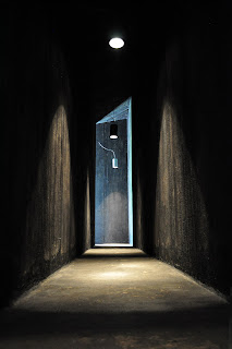
Lastly and quite possibly my favorite was the Pavilion of 2011 by Peter Zumthor. Structurally and constructively, this pavilion was an example of simple and efficient wood framing project. However more impression is the experiential effect the pavilion has from the outside going in. From the exterior, the pavilion is completely undescriptive and void of any hint of what lies beyond its walls. A successful and slowly revealing passage allows you to slip between two double walls. Light and perspective vision is only directed at the Zumthor’s discretion. Upon traversing these double wall cavity you find yourself immersed into a courted indigenous garden.


No comments:
Post a Comment