Showing posts with label Arif Javed. Show all posts

11/21/12

Pavilions that Communicate


By: Arif Javed

            What is the function of architecture that has little to no programmatic elements? Pavillionaire architecture is architecture that generally houses almost no program and is oftentimes temporary in nature. Though it might seem that designing something with no program would be an architect’s easiest job, I think it is the biggest test of an architect’s skill. The function of a pavilion is solely to create a meaningful, memorable spatial experience. In some of the pavilions we looked at in class I noticed that due to this being the central function of this type of architecture some of the projects actually worked as physical commentaries or dialogues on the nature of architecture. In particular, I thought the Barcelona Pavilion by Mies Van der Rohe and Peter Zumthor’s Serpentine Pavilion functioned as such essays on architecture.
            The Barcelona Pavilion represents not only a singular vision for what a piece of temporary architecture can be, but also a singular vision for what an architectural space can be.  The pavilion is a deep, multi-layered essay on architecture that makes its points while providing examples of them. Mies managed to take all the most basic elements of what constitutes an architectural space and mould them into a spatial experience unlike any other. His consideration for form, material, light, vision, and detail is shown in the way all of these factors form a constant dialogue with each other throughout the project. In this way, it could even be said that the Mies created a communicative building; one that is a treatise on the architect’s ideas of how to use each of the elements to add to the spatial experience. I think that the clarity with which the pavilion communicates Mies’ ideas proves that it is truly a genius work.
            Peter Zumthor’s temporary project, his take on the Serpentine Pavilion, was another such project that manages to communicate the architect’s ideas on the nature of architecture with clarity. Ironically, Zumthor made his pavilion a communicative piece of architecture by reducing the actual architectural form of the building. The only things left after his reduction were black rectangular walls that defined a path through the space into a central green space. This reduction of the physical elements showed that Zumthor considered the path or the physical and emotional experience of being led through a space to be the dominant part of the spatial experience. I think that with this project Zumthor truly managed to find his own language with which he could shape a unique and rewarding experience and communicate the idea that the procession or path through a space is just as important, if not more so, than more physical architectural elements. Despite his use of a highly conceptual architectural language for this project, I think the real strength of it is that the average viewer could probably easily understand the underlying concept of the project.
            These two projects are both notable examples of pavillionaire architecture simply because they manage to use unimposing architectural elements to define significant spatial experiences. I think the key idea found in both of these projects is that they both stick to a specific language and then use this language to communicate the ideals and motifs that the architects hoped to imbue within the architecture.


Plan diagram of Zumthor's Serpentine Gallery

Perspective of Mies' Barcelona Pavilion, shows overlapping plans and material palette
Sketch used to explore Mies' language of overlapping rectangles and overhanging roof


The Stockholm Public Library: Artistic Functionalism

By: Arif Javed


            Few buildings that I have studied are as perplexing to me as the Stockholm Public Library by Gunnar Asplund. The project was completed in 1928, and is essentially done in what could be classified as a neoclassical style. It is a monumental project, with a clear parti of a circle inscribed in a square. The project is perplexing to me because on paper it sounds rather odd: a symmetrical, monumental orange library with a central drum and rectangular geometry aside from that. However, I have fallen in love with Asplund’s library because once I studied it I realized that it a strong and pure embodiment of architectural ideals. As I learned more and more about the ideas that shaped the building I began to appreciate the purity of the geometry, the functionalism of the plan, the simplicity of the way he used the Classical language, the beauty of the path, and most of all the underlying artistic thoughts behind the project.
            My last blog post brought up the ideas of the language of a piece of architecture as well as whether or not that building is communicative of the concept that the architect wanted the space to embody. I don’t think Asplund could have used the classical language in a more effective way than he did in the library: the stark exterior is only marked by a band of classical ornament that solidifies the language into one that suggests the solemn, scholarly nature of the buildings function. This lack of ornament emphasizes the classical geometries that Asplund chose as the skin for his monument to the search for knowledge. Though the language is classical, the ideas behind the geometry ring of contemporary lessons: the main space is immediately apparent from any view of the building and it is simple to read the function of the interior spaces simply from looking at the exterior. The lay out of the plan is also more contemporary than classic in conception; it is a purely functionalist lay out that works in a very open and free manner. However, a perhaps more beautiful aspect of the plan is that it facilitates the occupants quest for knowledge and books due to its lay out.
             The nature of the genius of Gunnar Asplund is shown by this lay out; it is clear that Asplund thought of the beauty of the functional lay out to be a form of art. Asplund drew no division lines between the artistic and the architectural; his attention to practicality was also his aesthetic of simplicity and clarity. Asplund the artist can also be seen in the more experiential qualities of the interior of the space. Asplund’s lay out and design carefully formed the procession from the ground floor lobby space to the main cylindrical space. The occupants enter in a small, black marble clad lobby space and are then directed up a relatively narrow staircase. However, this succession of smaller spaces artfully sets up the grand entry into the cylindrical lending room due to the sudden and beautiful widening of the space into the main space. Asplund considered this procession to be something akin to the viewer walking into a metaphorical brain (the cylinder) and searching for knowledge.
            The way Asplund worked with absolutely no distinction between the artistic nature of the building and the architectural functions is true genius in my opinion. It is shown in every aspect of the building, from its exterior geometry to the path dictated by the lay out of the interior. In creating a library that not only houses knowledge but actively facilitates the quest for it Asplund truly managed to find beauty in the functional and make function beautiful.

Plan of the library, shows the narrow procession into the main space

Exterior view, showing Asplund's inventive use of the Neoclassical language

The functional yet beautiful and grand interior main space 

Paradoxes in Architecture: The Artistic Expression of Zaha Hadid


By: Arif Javed


Architecture is a constant paradox. It has to be simultaneously concrete and abstract, theoretical and practical, conceptual and physical. To me, Zaha Hadid’s Vitra Campus fire station (and maybe her entire career) is an examination of this constant paradoxical nature of architecture. I think the fire station also is at the crossroads of what classifies as architecture and what classifies as art. Zaha Hadid absolutely refutes the notion of form following function and chooses instead to base her form on the statement or artistic expression that she wanted to present through the architecture.
            The fire station is essentially a manifesto that is articulated through the composition of forms that are derived from highly conceptual and theoretical ideas. This project is a bold manifestation of Zaha Hadid’s personal takes on the nature of architecture and how space should be conceived as well as realized. To me, the project stands out because it almost occupies a space that is somewhere between physical and conceptual. This was an intentional effect of the building, shown by the acute attention to keeping the pureness of the concrete plane unadorned by roof edges or cladding. The glazing even lacks framing, yet another detail that heightens the impression of the building as abstract idea that people can somehow move through than an actual concrete artifact. Even though I do not necessarily find every aspect of the building to be appealing, when I look at it I can clearly see what the architect’s concept was.  It is impossible to look at the building and not see exactly what Hadid had in her mind; her statement that architecture should be a composition of forms dictated by spatial relationships derived from factors such as function, landscape, movement, etc. can be read clearly.
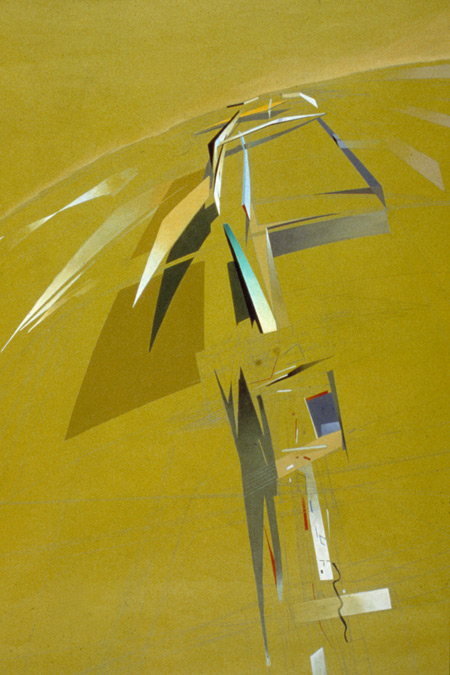
            Hadid’s fire station also explored the relationship of art and architecture, as well as blurred the division line between the two. The project began as a series of abstract paintings by Hadid that were the “conceptual mediator of finding spatial relationships and form (Kroll, 2011).” To me, this means that Zaha Hadid approached the project with an idea of composition that was more artistic in nature than architectural. This shows that Hadid’s conceptions of her forms are completely divorced from what their possible functions would be. The architectural language that Hadid uses comes directly from the paintings. It is thus a language that is derived from the idea that simple, hard edged forms can be composed in such a manner that the space formed with them and around them is complex and expressive. Though as a building the project might not have functioned as a fire station as well as it should have it clearly succeeds in its more grand purpose: being a bold artistic statement of Zaha Hadid’s Deconstructivist ideals.
             All architecture exists in the paradox of what is physically realized and theoretically conceived. Zaha Hadid’s project embraces this idea by truly being the concrete manifestation of abstract theoretical ideas. It rejects the traditional Modernist notions of form and function in favor of a completely personal view of form being generated by an artistic synthesis of philosophy and architecture.


Perspective painting by Hadid, first stage o f design process

Sketch of Hadid's artistic exploration of spatial relationships on the site


Perspective view of the resulting forms and theoretical language

Sources:
Kroll , Andrew. "AD Classics: Vitra Fire Station / Zaha Hadid" 19 Feb 2011. ArchDaily. Accessed 24 Nov 2012. <http://www.archdaily.com/112681>

10/31/12

Architects as Artists: The City as the Medium

By Arif Javed


            What defines an artist? I think a true artist is someone who uses a creative medium to produce a truly unique and powerful expression. What is this expression? It can be anything, from an expression of an emotion, an outcry for help, or an interpretation of some form of human spirit. Are architects artists? I strongly believe that architects have the possibility to be artists, just as much as any painter or sculptor or musician. My examinations in my past blog posts would seem to indicate that space is the paint that the architect controls and composes onto the canvas of the city. But what happens when the city is not just the architect’s canvas but the medium that is used to form the artistic expression? The group Coop Himmelb(l)au and the architect Francois Roche have both explored this in their work.
            Coop Himmelb(l)au’s 1971 project “Restless Ball” was essentially an urban experiment that used an architectural idea interpreted through a radical lens. The idea of this small, inhabitable sphere that they walked around the city in was to embody the spirit of approaching old spaces in new ways. The “Restless Ball” was both symbolic and completely literal. It was an actual, physical space that a person could inhabit and use to walk around the city. Thus, this was the concrete aspect of getting around the city in a different way and the literal modification of how someone sees the city. Symbolically, I think that Coop Himmelb(l)au were trying to show, using a radical and strange approach, that the city is not static and rigid, that architecture can be perceived in many different ways, and that sometimes the spirit of play and whimsy have a place in the architecture of the city. This “Restless Ball” was a truly powerful artistic expression, especially considering its simplicity. I think Coop Himmelb(l)au successfully used the city as a canvas to make a discourse on the spirit of change that dominated the 60’s and 70’s and how the old can coexist with the new.
            The next project that seemed to show this idea of the city as an artistic medium was Francois Roche’s I’mLostinParis project. I think that this project has some conceptual similarity to the “Restless Ball” project because they both in a way take the city and give it back to itself. I see the radical, invisible form of the Roche house as an interesting expression of individuality in the courtyard of a rather public piece of urban development. Roche covers his project in the vegetation of the site, essentially retreating within the city without changing its fabric. In this context, the fabric of the city is Roche’s medium that he uses as the driving concept of his expression. By this I mean that the architect managed to coax the materiality of the city into allowing him become a part of the city while also expressing his own individual interpretation of how the city should be experienced. The project is a completely unique way to experience the city and is thus a completely unique artistic expression of the spirit of individuality and the ability of every person to create their own view of a place.
            Defining what makes a true artist is a difficult task, but I think it can safely be said that some architects can be considered artists in the purest sense. These two projects showed me just how powerful an expression architects can produce through using the city as their artistic medium. I think at the heart of both the “Restless Ball” and the I’mLostinParis projects is the idea of that there is no one correct way to view and interpret the city. Though they are both very different works, they both manage to embody what is, in my opinion, a strong artistic expression working with the city as the medium.

Sketch of Restless Ball by Coop Himmelb(l)au

Restless Ball in the context of the city

Francois Roche's home disappearing into the city

Sources:
"I’m lost in Paris / R&Sie(n)" 23 Jan 2009. ArchDaily. Accessed 24 Nov 2012. <http://www.archdaily.com/12212>


10/3/12

Lessons Learned from the Biennale


by: Arif Javed

What is architecture in its purest form? In my past two blog posts I arrived at the conclusion that reduced to its rawest and most essential qualities architecture is the meaningful shaping of space to serve a specific function. The Venice Biennale was as much an exhibition of architectural works as well as a tribute to the ability of architects to shape the experience of walking through a space. There were two exhibits in particular in the Arsenale section that stuck out to me because the architects really managed to treat their exhibition spaces in a way that, to me, spoke to what the nature of architecture really is.
The first exhibit was called the Vessel by O’Donnell + Tuomey architects. This was basically a wooden structure that was erected along the path through the exhibits within the Arsenale, which is an old brick building where ships used to be built. The structure, as the first picture below shows, is an irregularly geometric form that is composed of stacked wooden planks. These reference both the stacked brick construction of the Arsenale as well as the wood of the ships that used to be built within its walls. This abstract ship imagery is based on literary influences from Dante and poet Seamus Heaney for whom the ship is a place for profound spiritual reflection. When I saw the Vessel at the Biennale I was struck by how it seemed to loom out of the dark sea of space around it. I was impressed by how the architects used material, form, and site context to create a reflective and contemplative space that really only functioned as a quick passage between two areas. They managed to funnel the light through the chamber to further emphasize the procession through the vessel while illuminating the tectonic construction that balances the illuminated wood solids with the dark and hollow voids between the planks. I am still amazed by how the architects managed to make such a small passage into a shrine-like contemplative journey that momentarily makes made me forget my destination.
            The next exhibit was the room designed by Märkli Architekt. While I realize that this exhibit might not have come off to everyone as the most interesting project, I thought that it was somewhat noteworthy because it embodies the idea of the nature of architecture being the shaping of space. The room is sparse; there are two columns of the original Arsenale towards the center of the room and arranged around them are 6 sculptures of human figures placed on marble blocks. The human sculptures resemble sculptures of humans from ancient civilization. Märkli carefully arranged the sculptures around the two existing columns. This orderly arrangement was done in order to create a certain “spatial tension” between the elements in the space. The way the architect carefully placed the vertical sculptures around the columns and even in relation to the walls of the space creates a commentary on how people exist in relation to each other as parts of a whole. This main thesis on the nature of human existence is only possible due to the way the architect divided the space in plan based on the installed elements and the forms that already existed on site.
            The time that we spent at the Biennale was truly invaluable; I think that getting to experience and see all the different projects helped me get a much deeper understanding about what the job and purpose and meaning of architecture is.  The Vessel exhibit showed how space can be shaped by form and manipulation of light and the Märkli exhibit showed how simply arranging different elements in plan can also define the space in a meaningful way. 

The exhibit my Märkli, shows two main elements, column and human sculpture

The Vessel by Odonnel and Tuomey, in relation to the Arsenale space around it

9/30/12

Invisible Forms and How They Shape Space


by Arif Javed

          As I asserted in my previous blog post, the primary nature of an architect’s job is to shape space through the use of the architectural form. It doesn’t matter whether the space that is being shaped is a landscape or a building; the theory remains the same. However, in certain situations the most powerful experiential quality of an architectural work might not be the form but the lack thereof. It seems that oftentimes the way architects make a statement is through openly revealing how their design shapes space, but in my opinion an almost more powerful statement is made when the architect lets the form of the design be completely amalgamated into the landscape. Two such projects that use what I would term the invisible form are the Moses Bridge by RO&AD architects and the Blur building by Dilller Scofidio + Renfro.
            I always consider architectural bridge designs, especially pedestrian ones, to be fascinating because in these designs the experience is quite literally dominated by the path. I believe that a successful bridge design causes the destination to fade in importance as the journey becomes something to enjoy by itself. This quality is absolutely achieved by the Moses bridge, a pedestrian structure by RO&AD architects in the Netherlands that spans the moat of a Dutch fort that has been repurposed into a recreational structure. The form of the bridge is almost completely invisible; it is sunken, like a trench, into the water. This means that the water comes up almost to the edge of the bridge causing the bridge to completely fade into the landscape. The way I interpret this use of almost nonexistent form is that the architects wanted to take emphasis off of the fabricated structure while emphasizing the impact of the surrounding landscape. I think this work beautifully exhibits the importance of the architectural idea of shaping a procession through a space; due to the way the RO&AD minimized the form of their design they managed to not only emphasize the landscape but also add a new layer of harmony and communion with the natural elements by placing the occupants of the space within the moat.
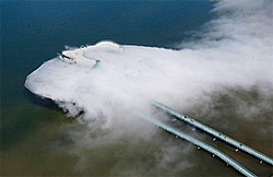
            The Blur Building was designed and built in 2002 for the Swiss expo; thus it can essentially be considered as more of a temporary pavilion than an actual building. As this was the nature of the project this means that the project had basically no program but it is still an interesting work that functions somewhere along the line between installation, art, and architecture. The Blur was conceptually a building with no form; it consisted of two long ramps that took occupants out across the water towards a platform shrouded by a fabricated cloud. I think that this design challenged the idea of architectural form by creating a structure that has close to no form. However, though the project lacked a definitive form Diller Scofidio + Renfro absolutely used architecture to create an experience and sculpt the space. Similar to the Moses bridge, the experience of the project was largely defined by the procession that the architects defined. To reach this enigmatic floating cloud one would have had to walk out over the water until they arrive at a space and are enclosed by the “blur” and a wall of white noise. I would think that this work embodies a similar idea to the Moses Bridge in that while the visitors walk across the ramp they increasingly become immersed in the landscape until they reach the cloud which shrouds and isolates them while simultaneously unifying them with the nature of the site.
            After considering how these two projects function as architectural works while simultaneously challenging my conception about the function of architectural form I think I would like to amend the assertion that I referenced at the beginning of this post. I would now state that in my opinion the primary nature of the job of the architect is to shape space in order to create a significant experience. Usually this is most successfully done through an architectural form, but as the Blur building and the Moses bridge show it can be done equally as well by cloaking, getting rid of, or generally minimizing the use of form in order to maximize the impact of the landscape or site.

Moses Bridge

View of Moses Bridge from
 farther away

Blur Building


9/15/12

Architectural Form and the Garden


 by Arif Javed

            One of the first misconceptions about the nature of architecture that was shattered when I began my architectural education was that architects primarily shape buildings. Over the course of studying architecture it has become apparent to me that what architects really deal with is space. Space is both the material an architect sculpts with as well as what he creates. By the same token, architects also primarily deal with form; the form an architect imagines is what defines the spaces that are created.  It is easy to think about the architectural form of a building and how that form shapes the spaces in and around the building. However, a perhaps less obvious yet just as important and fascinating use of architectural forms is when they are used to shape urban garden spaces. Gabriel Gueverkian’s cubist garden at Villa Noailles in France and Bernard Tsuchmi’s Parc La Villette are both excellent case studies for the use of architectural forms in landscape.
            Gabriel Gueverkian was the designer of three “Cubist” gardens, which were highly modern gardens designed in the Art Deco style, taking influences from Cubist paintings. One park was a hortus conclusus style private garden designed for a French family that was living in Villa Noailles. This park is triangular in plan and is enclosed on two sides by walls that recede in perspective to the tip of the triangle. The architectural nature of the design of the garden comes across with great clarity due to the way Gueverkian used strongly defined geometric forms to divide the space. It seems clear that the architect viewed the design as a composition of forms within space. Gueverkian’s careful placement of greenery, selection of geometry, and changes of elevation all contribute to the way the garden is experienced.
              Another highly modern garden that embodies the way that architecture can be used to shape space is Bernard Tschumi’s Parc la Villette in Paris, which came about 50 years after Gueverkian’s work. Tschumi’s Parc was done as an experiment in deconstructivism. I think Tschumi’s essential thesis for this project was an examination of using architectural form to shape an urban green space and in turn shaping the experience of the occupants of the park as they move along. He wanted to challenge the way parks conventionally function: as places for ordered, static relaxation. To do this he imposed a grid system of 35 structures called follies on the park that provide points of reference to people walking through the massive 100+ acre green space. This ordered grid of structures is the counterpoint to a free and unsystematic collection of paths that manipulate the circulation through the space. The follies are architectural forms that evenly divide the space and thus form visual landmarks for someone moving through the vast park, but the lines of the path almost force the occupants to get lost trying to find their way to those landmarks. This achieves Tschumi’s goal of turning the park into something that promotes activity, interaction, and movement.
            While these two projects are clearly completely different in terms of design and overall experience of the space they are interesting to examine in conjunction because they both in a way show the range of methods by which architects have used theories of form and space to shape experiences in an open public area rather than something that is more traditionally considered architecture.  Thus, they are a true testament to the ideal that architects are both figuratively and literally sculptors of space. 

Cubist garden
Parc la Villette design diagrams

Parc la Villette

9/4/12

Comparing and Contrasting German Interpretations of the Classical


By Arif Javed            

            Every form of art has a period within its history that can be considered its Classical period. The classical works of architecture, and perhaps of all art, oftentimes serve as a source of inspiration, as a point of departure, or occasionally as a set of ideals to completely reject. It is particularly interesting to me when the rigid principles of the classical orders are re-interpreted and re-presented in a strikingly new way. Additionally, it is also fascinating that though the definition of the classical styles will never change, the language of these orders can be deployed in vastly different ways depending on the time period, the goal of the architect, or any number of variables. In our last lecture on Contemporary European Architecture, I noticed two uses of the classical that produced completely different end results: Schinkel’s Neoclassical Altes Museum and Albert Speer’s Zeppelinfield and other Nazi works.
              Karl Friedrich Schinkel was a Prussian architect whose genius lay in his ability to work in every architectural style of his time and those that came before while managing to avoid the danger of creating poorly blended pastiches. Schinkel was tied with the royal family of Prussia which in a way gave him charge of the task of throttling Germany into an architectural competition of the early 19th century against England and France. He did this by  working in the prevalent styles of those countries of the era: the Neoclassical and the Picturesque. Schinkel’s greatest work is usually thought to be the Altes Museum, an art museum in the monumental heart of Berlin. To me, Schinkel’s use of the Neoclassical language in the Altes Museum is completely unique and expressive, which I think is an impressive feat for a work so heavily derived from the precedent of the classics. The front of Schinkel’s Museum is a clear use of the Ionic order, though Doric pilasters anchor the façade on each side. Interestingly, any use of the Classical orders ends after that, the sides and back of the Altes look, to me, like stripped down versions of the Neoclassical. Trachtenberg mentions how in the Berlin National Theater that Schinkel designed he reinterpreted Renaissance-like pilaster orders through the functionalist lens of a 19th Century architect. I think this is also the way Schinkel treated the sides of the Altes museum, he kept the sides functionalist and simple to lend gravitas to the Ionic façade. However, the most impressive part of Schinkel’s use of the Classical language was his considerations of the scale of the building. The building is set in the heart of Berlin, and could have easily fallen to the mold of the monumentality of the Berlin Cathedral or the Royal Palace. However, Schinkel created the building at what can be described as a human scale, as opposed to a monumental one. Using the classical at such a scale avoids using the rigidity of classical order and proportion to a psychologically imposing degree. By moving away from the grandeur of monumentality to the gravitas of the familiar and human scale, I think Schinkel’s museum achieves its goal of becoming a calming and dignified space for the appreciation of majestic works of art.
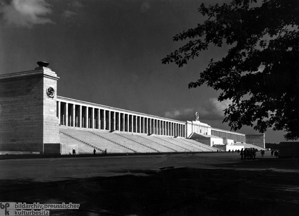
            Schinkel’s use of the classical language to create a compelling and original composition was augmented by his close attention to scale and proportion. Interestingly, these same attributes of the classical style, particularly scale, are what Hitler’s chief architect, Albert Speer, used as the principal drivers behind the structures that he erected to be the stages and platforms of the Nazi party. The goal of this Nazi architecture was to use the buildings as a form of propaganda; thus the architecture had to both embody the ideals of the Nazi party as well as impose these ideals upon the public. To do this, Speer looked towards Greco-Roman influences; Greek temples are a clear synthesis of the cultural, political, and psychological ideas of a nation into an architectural order. I think Speer and Hitler thought that by bending this language to their own ends they could use it to shape the ideas of the nation they wanted to create. Thus, Speer took the classical and used it on a massive and grandiosely monumental scale. He stripped away the ornamentation, generally leaving only the starkly clad masses arranged in classical dependencies. An example of Speer’s work is the Zeppelinfeld, a massive building that is part of the Nazi Rallying Grounds complex. The Zeppelinfeld is absolutely done in a classical style, but it is free of any ornament. Elements such as the cornice detail and the rhythmic colonnade of the façade solidify this classical language. The Zeppelinfeld is certainly not done at a human scale; in contrast to the Altes Museum the works of Speer are scaled to be suited for large military processions, rallies, etc. While the pleasant, human scale of the Altes allows the occupants to be in a calm communion with the space, the massive scale of the Zeppelinfeld keeps the occupants in awe of the space at all times. The stark, functionalist masses are meant to be always oppressive on the psyche of the viewer, always forcing them to acknowledge the power of Hitler’s regime.
            Though the essential objective of Speer’s work was oppression, and though the motives of all Nazi architecture was obviously terrible, it is genuinely intriguing how he interpreted the language of the classical in such a profoundly imposing way. Both Speer and Schinkel clearly thought about the psychological and mental effects of using something as familiar as the classical style for their work. They both realized that by keeping or getting rid of ornament and by managing scale, order, and proportion they could use the classical to their own goals. However, despite these possible similarities they both channeled the same influences into completely different work, which to me truly shows the beauty of architecture as well as the power of the architect. 
Zeppelinfield, Speer

Altes Museum, Schinkel


Sources

Trachtenberg, Marvin. "Architecture: From Prehistory to Post-Modernism/The Western Tradition."  New York University. 1986. Print. 04 September 2012.