Showing posts with label Khris Kirk. Show all posts

11/17/12

Paving the Future with Temporary Architecture


By: Khris Kirk

“The temporary pavilion has become unmissable, a rare opportunity to view the work of the finest international architects at first hand. This is how architecture should be exhibited and remembered.” Financial Times

A new style of architecture has become very huge within the past century, temporary architecture. Temporary architecture is a great way for an architect to present his idea to the public to see and experience firsthand. By the design being temporary, it forces the architect to use light materials and prefabricated materials. Also, the project being presented has a limited time of being available; therefore, the architect has to advertise his idea to the public effectively so it may take effect. 

A good example of temporary architecture is the Serpentine Gallery Pavilion. Ever since 2000, there is a new pavilion in front of the Serpentine Gallery. Each year an architect is chosen to design and build a pavilion that presents his idea of temporary architecture or pavilionaire architecture. Some well designed pavilions are Serpentine Gallery Pavilion 2002
by Toyo Ito and Cecil Balmond with Arup, Serpentine Gallery Pavilion 2005
by Alvaro Siza and Eduardo Souto de Moura with Cecil Balmond – Arup, and Serpentine Gallery Pavilion 2008 by Frank Gehry.

Each of these pavilions was designed with a preconceived idea that the architects tried to represent in the architecture. For example, the 2002 pavilion by Toyo Ito and Cecil Balmond is derived from an algorithm of a cube that was expanded and rotated. This is evident in the many triangles and trapezoids seen on the skin of the pavilion. These triangles and trapezoids are the spaces created with the rotating and expanding cube. One does not see a cube on the outside of the building but the spaces created between the cubes. By the constant changing of material and shape, allows for the building to have a sense of motion.

Another example of these preconceived ideas being represented in the architecture is present by the 2005 pavilion by Alvaro Siza and Eduardo Souto de Moura. Siza designed the pavilion to work well with the permanent Neo-classical house that the pavilion sits in front of. These triangles and trapezoids are the spaces created with the rotating and expanding cube. One does not see a cube on the outside of the building but the spaces created between the cubes. By the constant changing of material and shape, allows for the building to have a sense of motion.

Another example of these preconceived ideas being represented in the architecture is presented by the 2005 pavilion by Alvaro Siza and Eduardo Souto de Moura. Siza designed the pavilion to work well with the permanent Neo-classical house that the pavilion sits in front of. Therefore he designed the pavilion in a rectangular grid like pattern, but distorted the rectangles to be individual when a person looks at them from below. The pavilion is moving with the landscape as if it was a part of the land instead of a focus point.

A third example of preconceived ideas is the 2008 pavilion by Frank Gehry. Gehry’s inspiration for this pavilion was from wooden catapults designed by Leonard da Vinci and striped walls of summer beach huts. This explains the random pattern of wooden and glass canopies that hang above the space and the structure above supporting the canopies.

Each architect has come up with an idea that they try to portray within their building. These are revolutionary ideas that have yet to be set to buildings in this way. These architects are paving was to abstract a building in such a way to present an idea of how the space should be felt and viewed. Also, by having these pavilions be temporary, it makes the architect explore a different approach on the type of material used in construction. Most architects have used prefabricated materials that are built off site and then assembled on site. For example, the 2005 pavilion is comprised of wooden panels in a grid pattern. All the builders had to do was piece the pavilion together like a puzzle, just like Gehry’s and Ito’s pavilions in 2002 and 2008.

If buildings are designed like this more often, it will allow for buildings to be built faster on site and have more available homes and public spaces for the future families of the world.     

Links:


11/15/12

Social Living


By Khris Kirk


With the growing population of the world and the expanding cities, people need places to live. At the beginning of the 20th century, social housing arose as a means to house the large number of people moving to large cities from the countryside. Large apartment complexes, condominiums, and dorm rooms started to pop up everywhere. At the start of this architecture upbringing, the designs were plain and repetitive. However, after a while, the buildings started to reflect a more individual appearance. Another aspect that was a large influence of building these large apartment complexes was the cost of building them. Jean Nouvel’s Nemausus in Nimes, France, is a prime example of individual style of architecture and fairly cheap cost of building.  


Jean Nouvel was appointed to design a social living building by the mayor of Nimes. He started the project with the idea of giving the resident the maximum space to live in, and to make the apartment more functional in the way the resident actually uses the space. Before Nouvel designed his apartment complex, there was a method designing social housing that made the space not as comfortable for the resident. The bathrooms had no natural lighting; there were hallways, and tight spaces throughout the rooms. Nouvel thought these preconceived ideas of design were wrong and felt the need to design towards the liking of the resident. Therefore, he designed his social housing with the max amount of space and tons of natural lighting.

He went about making the max amount of space by designing the apartment without walls. The most common design throughout the apartment complex has one central shaft in the middle of the apartment that houses restrooms, water and heating, and storage space. Otherwise there is a continuity of space through the whole apartment. There is no defining line between public and private. Another way of making the space appear larger is having the north and south facades having walls of glass and movable, industrial doors. By having the minimalistic apartment, it allows for the tenants to create a space more personal to them.

Continuing on the minimalistic idea, Nouvel designed the whole building with concrete and prefabricated materials. The walls and structure of the building are made of concrete, which allows for the other elements of the building to be prefabricated materials like the fire station doors on the south façade. By having the walls and support be concrete, it allows for 30 percent more space within the apartments and saves money on the building costs.

Another aspect that was kept minimal was the decoration inside the apartments. There are none. All the walls within each apartment were left blank, showing the concrete. This makes the apartments appear unfinished, when they are complete. Nouvel wanted this idea to stay true through all the apartments that he made the tenants sign a contract that says they are not allowed to put anything on the walls or floors like wallpaper or carpet. However, the tenants rebelled and attacked the walls of their home with wallpaper and carpets. They felt the need to personalize their homes, and make the apartments feel less like a prison and more of an inhabitable space. Another down side to the apartment complete is that even though there was a lot of savings that went into building the Nemausus, the tenants have to pay 30 percent more for rent because they have 30 percent more living space.       

Overall, Nouvel has created a very well designed apartment complete by focusing on his minimalistic idea and making the apartment work best for the tenants.


Links:
Nemausus
Flexible Housing
Jean Nouvel-Nemausus 

10/25/12

Design vs. Fuctionality


By: Khris Kirk


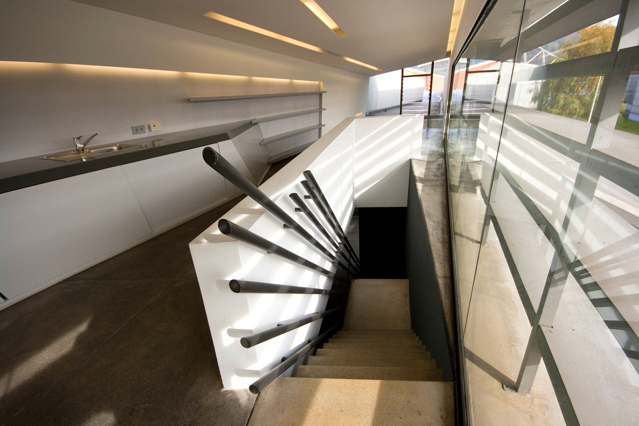
During the recent decades, architects have been trying to convey their ideas and concepts within the structures they are designing. Some architects take a subtle approach while others take a more drastic approach. When an architect take the more drastic approach, the next question to be answered is how functional is the structure. A prime example of an architect’s design not being very functional towards the program space is Zaha Hadid’s Vitra Fire Station.
            In 1981, there was a tragic fire that destroyed parts of the Vitra design campus in Weil am Rhein, Germany. The owners of the campus decide to redesign the campus and bring in well-known architects to design the different buildings across the campus. Among these buildings was the Vitra Fire Station. The company sought out an architect to build a fire station to prevent any reoccurrences of the devastating fire in 1981. This was Zaha Hadid’s first project to be built (ARCHdaily).
            Hadid approached this project in a very conceptual way. Hadid states that the “initial study of the Vitra factory site informed our designs for the Vitra Fire Station – a building conceived as the key element within a linear landscaped zone, the artificial extension of linear patterns in adjacent fields and vineyards – designed as a connecting unit rather than an isolated object; defining rather than occupying space.” This statement can be seen in her preliminary paintings.
            As she progressed in the buildings concept, she finalized upon the idea that the building is “movement frozen”. “A vivid, lucid expression of the tensions necessary to remain ‘alert’, to explode into action as required. Walls appear to slide one across the other, main sliding doors form a ‘moving’ wall” (Zaha Hadid Architect). Hadid took the concept of how firefighters live their lives and transformed it into a building, which still keeping true to her preliminary paintings.
            Hadid’s concept for the building is great. However, as a functional space, it is not so great. The layout of the fire station is a great representation of her complex concept of movement. The interior space is a series of walls that are bent, tilted and broken to accommodate the program space is inserted between the long, narrow planes sliding past each other. Then, the second floor is slightly off balance from the first floor, which creates a sense of spatial instability (ARCHdaily). By having the floor plans of the fire station conveyed this way it does stay true to the concept of ‘movement frozen’, but makes the whole space difficult for a firefighter to use effectively.
            A firefighter is suppose to be able to get his gear immediately and then proceed to the fire truck in the fastest way possible; so he can get to the fire and save lives. By making the fire station so engulfed in the concept, it makes the space for a fireman impractical to use effectively. In fact, eventually the firemen could not handle the living space and functionality of the building that they left the facilities. When the people of the program cannot use the space in the best functional way and end up leaving because of that reason, shows how poorly the building was designed. It is great for an architect to have a great concept that he wants to convey in the building. However, there is a point when functionality over-rules the concept, and Zaha Hadid’s Vitra Fire Station is the perfect example of how a concept was taken too far away from the functionality of the program space. Therefore, architects should try and create a concept to use for the foundation of their idea for a building, but should keep in mind how it will functional work for the program space they are designing.   


Links:
Zaha Hadid Architects, Fire Station
ARCHdaily, Vitra Fire Station
ARTchitectural, Zaha Hadid, Vitra Fire Station

10/22/12

Parasite?


By: Khris Kirk

When a person hears the word "parasite", they normally think about an organism that feeds off another organism, and normally causes serious health problems. A parasite is viewed in a very bad eye and must be immediately killed, that way a person or animal does not get sick. However, when an architect hears the word "parasite", they envision something completely different. An architect will view parasite in an architectural way, which is where parasite architecture fits in. Parasite architecture still exemplifies the term "parasite" by having a structure connect to a pre-existing building. Parasite architecture is a new modern style of architecture that builds onto a current building and takes a different style in comparison to the style of the original building.  


A great example of a parasitic building is Parasite Las Palmas by Kortekine and Stuhlmacher. This prefabricated house is an excellent example of how a parasitic building should be. The Las Palmas is an old industrial warehouse that is no longer used and is the host building for the Parasite house. The Parasite house latches onto a portion of the existing infrastructure and feeds off the life source of the host. In other terms, the parasite house uses the services of the host building; water supply, sewage, and the electrical insulations. The parasite structure can be seen for miles with its bright green painting against the gray surrounds. A person from far away can tell that the Parasite house is not a part of the original structure and can be viewed like biological term parasite, since it is growing off its host. 


The Parasite house was designed for an exhibition in Rotterdam. The building was built with prefabricated wood that was laminated for protection. The panels of wood were precut to size and delivered to the sight to be built. The construction of the Parasite house took three and a half days, which is extremely fast for building a house. The Parasite house was only suppose to remain on the site for a few months, but ended up standing from 2001-2005. During that time frame, it became a landmark in Rotterdam. When it was finally taken down, the Parasite house was taken into storage to be used again at a new location.

Kortekine and Stuhlmacher tagged the word “parasite” to mean prototypes for advanced ready-made amphibious small scale individual temporary ecological houses. They take the term parasite and give it completely new mean. The Parasite house still keeps true to the biological meaning while exemplifying the new meaning that Kortekine and Stuhlmacher have bestowed upon it.  Kortekine and Stuhlmacher are paving the way towards a new method of living. There is no reason to tear down structures that are already standing. One should just add onto the existing infrastructure. By having the prefabricated wood, the material of the parasite house is all recycled and sustainable to last through the years. Also, by having the living space smaller, it allows for more space for other parasite houses to be built. Parasite houses may start popping up everywhere as a new means of cost-effective living, reusing current structures, and ground breaking architecture.   

Links:


9/26/12

Venice Biennale


By Khris Kirk

To all my devoted Bloggers, 

   We just went to Venice and got to experience the Biennale for architecture. The Biennale is a gathering of architecture from many different countries. The theme this year is Common Ground, directed by David Chipperfield, who explains that "The emphasis of the 2012 Biennale is on what we have in common. Above all, the ambition of Common Ground is to reassert the existence of an architectural culture, made up not just of singular talents but a rich continuity of diverse ideas united in a common history, common ambitions, common predicaments and ideals. In architecture everything begins with the ground. It is our physical datum, where we make the first mark, digging the foundations that will support our shelter". (La Biennale di Venezia
         
         When I arrived at the Biennale, I had no idea what to expect. I have honestly never heard of it until my group did a presentation about Venice before we left for our trip. So I had I hopes for what I was about to see. Once I started walking through the exhibits, all I could do was look in awe. Everything around me was amazing. There were models everywhere! Each exhibit presented something new and different from the previous one. There were a few that I really liked in particular.


 One was the O’Donnell and Tuomey's wooden structure. When I first saw the wooden structure, I thought I looked like a giant chimney that you could walk through. After walking through the full scale model, I felt like it squeezed and then released as a space. I thought the woven pattern of the wood was fascinating by being able to see through little windows to the other side. Then I read about the project. O’Donnell and Tuomey built this structure as a response to Venice and its history. The timber work and brick work is evident within the architecture of Venice. Bricks were casted by wood and then a person had to break the brick away from the wood after it dried. The use of wood pilling up horizontally and parallel to the bricks in the Arsenale is their way of representing Venetian history. (O'Donnell and Tuomey) After reading this, I was amazed at how they were able to represent this piece of history contained by a wooden structure that looks like a chimney. 
        Another project that I really enjoyed was the Russian Pavilion in the Giardini. In the Giardini, there are pavilions representing each country, whereas in the Arsenale there were projects spread around representing specific architecture firms. The Russian Pavilion is a grid of QR codes throughout the inside of the building. As you walk in, a person hands you an Ipad and you scan the QR codes. Then information is revealed about the Skolkovo. At the bottom level of the Pavilion there is a room with little holes that show images of the past that lead up to the Strolkovo project. (Russian Pavilion) I liked how the pavilion integrated technology with their building so a person can see how the Strolkovo was constructed. It was very futuristic and the inside was an experience that put a person in awe. Even today, I’m still in shock of how amazing the Russian Pavilion was.


            Overall, the Biennale was an experience I will never forget. There were so many projects to see. If I could do it again, I would devote two days to explore the Biennale. One day to see the Arsenale and the other for the Giardini. I wonder what will be at the next Biennale in 2014. 


Links
La Biennale di Venezia 
O'Donnell and Tuomey
The Russian Pavilion


One with Nature


By: Khris Kirk

"All architecture is shelter, all great architecture is the design of space that contains, cuddles, exalts, or stimulates the persons in that space."- Philip Johnson

Architects design spaces that invoke a feeling for a person. They want people to feel a certain way when they are within their space. One method that some architects have been doing lately is bringing a person within nature and letting them experience the space from a different viewpoint. Being one with nature. Two examples would be Diller and Scofidio with Blur and RO & AD architects with the Moses Bridge.


The RO & AD architects designed the Moses Bridge to bring a person within the moat to Fort de Roovere. Moats were used as a defense against enemies that were attacking a fortress. The only way to get across a moat was with a draw bridge. Since the area around the fortress is used for hiking, running, and biking, people needed a way to get across the moat. The RO & AD architects decided to put the bridge within the moat, making it nearly invisible to the eye. The bridge is like a section cut within the land. By allowing a person to be within this section, they get to experience being within nature. The RO & AD architects could have designed a regular bridge that stretches across the moat, but instead, they took the effort to change a person's view from above to within. This unique experience will live on with people who visit the site. RO & AD architects have successfully engaged people to feel one with nature with the use of their designed space.


Diller and Scofidio took a similar direction with bringing someone into nature; however, they took a different approach. They designed a structure called the Blur. The idea behind this is to bring a person on top of a cloud. Many people dream of being on a cloud as a child, and Diller and Scofidio have made it possible. As a person approaches the Blur, it starts as a bridge towards a huge cloud. A person cannot see the structure unless they are far away. Once on the Blur, there is a viewing point where a person stands above the cloud and can see out onto the lake. Diller and Scofidio have created a space that gives the feeling that a person is in the air and standing on a cloud. The name Blur even gives the impression that as you are within the cloud and upon the structure, a person can’t see clearly in front of himself. The people beyond them are blurred. This is another sensation that the space has created for a person. Taken as a whole, Diller and Scofidio create a man-made structure that provides the sensation of being within a cloud and on top of a cloud, bringing a person within nature.


 Overall, both RO & AD architects and Diller and Scofidio have successfully created spaces for people to experience the nature around them. They did not just create a structure that is used to as shelter or a means to get somewhere, but they went further. They used their skills to bring a person into a space and feel what they wanted people to feel; and that would be to be one with nature. 

Links

9/8/12

Future Landscapes


By: Khris Kirk


The population of today's world is over 7 billion people and growing (World Population Clock). The amount of births in the world far exceeds the amount of deaths, which is the reason why the population is growing very rapidly. In 2045, the world population is predicted to reach 9 billion people. As the population grows so do the cities that these people live in. Over the centuries, the people of the world have slowly been moving towards more urban areas rather than the rural areas. A statistic done in 2010 shows that 50.5% of the world is urban population (World Demographic Profile). With the consistent growth of the world, eventually most of the world will be urban areas. By having an urbanized world, that means there are few gardens, parks, or green spaces. This is a major problem. The world depends on having forests, gardens, and vegetation. The world needs to have plant life because it helps regulate the air, provides food, houses homes for wild life, and provides soft spaces in comparison to the hard spaces of buildings.
            With the constant growth of cities, there are only a few options to having gardens, parks, or plant life. One option is for the cities to set aside land specific for botanical gardens like Catherine Mosbach’s jardin botanique in Bordeaux. Mosbach’s botanical garden is in an industrial area, which is probably how many future gardens will be placed. It also houses the original vegetation from around France. Therefore, the garden has become a museum, promenade, and a soft space among the industrial background. More of these types of gardens will start rising up over the years, as a means to preserve the plant life of countries.
            Another type of garden that will arise will be hortus conclusus. Hortus conclusus comes from the term used for gardens of monks. They are personal, meant for meditation, and transform a small space into a garden. As cities grow, there are small spaces available for garden areas. They would either be in squares between buildings, alleyways, or on roofs of buildings. One example of a roof garden is Ken Smith’s Moma Garden in New York. Although this garden is using completely artificial and recycled materials, it is still a garden. This garden provides texture to the top of the inaccessible roof of the Taniguchi building (ASLA Awards). The Moma Garden creates a visual appeal against the harsh landscape of the skyscrapers of New York. Eventually many roofs will become gardens and provide that soft space within the urbanized world. They will become people’s personal oasis.
            Overall, constant growth of the world’s population is causing people to rethink how their surroundings will be. As the cities get bigger and more urbanized, the rural areas start to get smaller. Landscape architects have to be more creative with the amount of space available, materials to use, and feel they want to implement for a person within the space they are creating. In the future, these spaces will become very popular and much needed to bring nature back into the forest of buildings. The future awaits these new gardens.    


Links:

World Population Clock
World Demographics Profile 2012
Ken Smith, Moma Garden, New York


8/30/12

Embracing History


By: Khris Kirk


Berlin is a center of many different styles of architecture. It has a vast range of historical architecture within one city, and the history is what defines the architecture. There are several examples of how the history is the defining feature of the structure and they are Peter Eiseman's Holocaust Memorial, David Chipperfield's Neues Museum, and Daniel Libeskind's Jewish Museum. Each building or structure enhance historical feel in their own way.

Peter Eiseman's Holocaust Memorial embraces the history of how people were treated during the Holocaust, but does it in a minimalistic way. The memorial itself is placed upon around several locations that "housed the office of Nazi propagandist Joseph Goebbels, and nearby was Hitler’s Chancellery and the infamous bunker where he ended his life" (Quigley). By placing the memorial in this specific spot, creates the feeling of a person being right at the center of where all the tragedy happened. The memorial is comprised of concrete pillars that are very thick and have a wide range of heights. They are also linked together in a tight grid. A person walking through the memorial would get a feeling of how the Jews felt during the war. There is nothing in the memorial to tell you how to feel, but one must feel it on your own. Therefore, the minimalistic architecture of the memorial represents the history during the Holocaust without having to tell people what they feel, but feel it on their own.

David Chipperfield’s Neues Museum approaches this concept differently. The Neues Museum is a combination of the existing architecture and a more modern style of architecture. Chipperfield took the restoration of the Neues Museum in the direction that he wanted to add onto the current building while “respecting the historical structure in its different states of preservation” (David ChipperfieldArchitects). Within the museum, the renovated parts of the structure do not distract from the original elements. For example, the new exhibition rooms are made of white concrete. The white concrete is bland in order to put the focus onto the existing structure. Also, the façade of the building has two sides. Where the existing structure is, there is ornaments on the façade; however, the new wing that was added on is stripped of all ornaments and only matches the structure symmetrically. Overall, Chipperfield embraces the historical aspects of the architecture and designed the new structural aspects to not take away from the existing one.


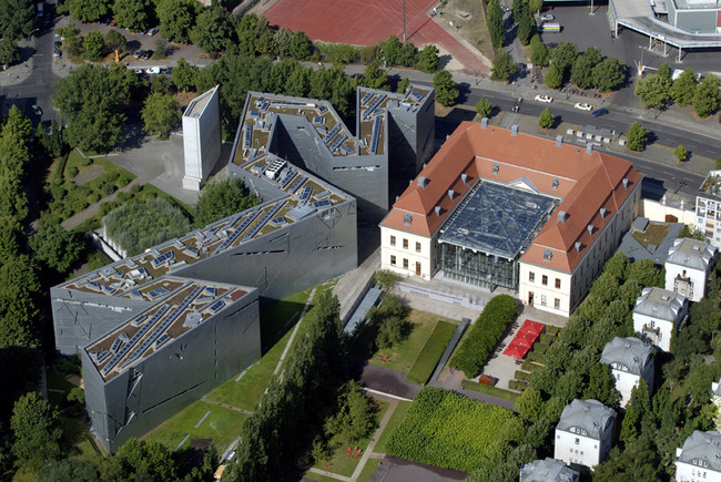
Daniel Libeskind’s Jewish Museum takes the historical approach in a more drastic direction in comparison with the other two structures. The Jewish Museum’s entrance is through the Baroque Kollegienhaus, and then a person must travel underground to reach the museum. The Jewish Museum takes you through an existing structure, then through certain paths that bring you to important aspects about the Holocaust. One takes you through the museum and presents historical documents from the Holocaust. Another takes you to a garden that has several pieces that represent those who suffered during the war. And finally there is one that leads you to the dead end of a Void. This void represents the unknown, those who are lost, and the absence that has come from the Holocaust. Overall, the Jewish Museum takes many approaches towards embracing history. It connects with physical aspects of history, which are the historical documents and the Baroque Kollegienhaus, and it has an abstract representation of the Holocaust with the void.

These three structures connect with the historical aspects of Berlin and embrace them. They all were shaped and molded to produce the structures that are standing today.    


Links