Showing posts with label Seth Oliver. Show all posts

11/20/12

Fading Spaces


Seth Oliver

“To be brief is almost a condition of being inspired”- George Santayana. I believe this statement is also true when applying to architecture. A temporary structure can be just as powerful and amazing as a permanent one. One architect that tends to do wonders with the temporary pavilions is none other than the famous Zaha Hadid. Her work has captured the attention of the world for the unique curves and generally other worldly forms. Her pavilions are no different. My favorite ones are the Serpentine Pavilion in Hyde Park, London for 2007 and then the Burnham Pavilion of Chicago in 2009.


                 The building of the Serpentine Pavilion generally marks when an architect has made it to the big leagues.  Zaha Hadid has had the pleasure of being invited more than one time. I was really taken with the second iteration. This one is really just three identical structures that are centered arount one point. Clean, simple and elegant. The great part is that it works really well for creating spaces. Several events were held in and around this structure including the world renowned fundraiser, The Summer Party. All because three cloth covered aluminum mushroom-like pieces were in a park. This is amazing to me. It is such a simple solution to a general problem. The new space under the structures is what I would imagine it would be like to be an insect under a plant. This is one perfect example of something that made a very big impact for just a short period of time.
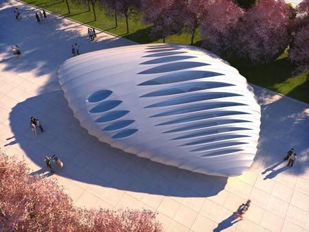

                Another less well known pavilion by Zaha Hadid is the Burnham Pavilion in Chicago. This one really looks like it is an alien structure in a park. I am rather taken with the form and think it is perfect for the momentary function of streaming a video of the history of the city plan of Chicago. The structure is also made of cloth and aluminum, but this one is injected with LEDs that change the feel of the space at different point during the day. The colors range from red to blue to green to orange. So it is never the same for the participating audience or the passers-by. The structure looks very pod like with organic forms from head to toe. The openings are on two separate points to create a movement through the pavilion.  


                Pavilions are probable something that are overlooked by the general populous. I am of the mind-set that they are actually one of the things that can help any architects reputation. To design a space successfully with such limited materials and time span says a good deal about somebody. Zaha Hadid may not be the best at making actual buildings work, but nothing bad can be said about her temporary structures. It might just be the case that certain people should only to the short term things. But a short termed things can often be the thing that makes the most impact. 

Something For Everyone


Seth Oliver

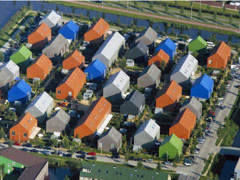
                “Without continual growth and progress, words like improvement, achievement and success, have no meaning.” – Benjamin Franklin. Building houses for just one person is stressful, but try building for a few hundred or even a few thousand at one time. This seems very daunting to me but one firm in Europe has got the recipe down for just this situation. I was very interested to see how the MVRDV firm handles such large scale housing in different places. I was taken with 2 projects that shine above the rest. The first is the Ypenburg Master plan of the Netherlands and the second it the additions to the Wozoco project in Amsterdam.  


                 The Ypenburg project is simply astonishing. A whole community focused on unity between little islands of residential space. My favorite part of this cluster is the vibrantly colored houses. Each of the houses seems to have the same general shape. Just the typical house. But the exceptional part is how each house extends to different lengths as well as unique in materials and color. It is one of the strangest versions of “Suburbia” I have ever seen. This not only fosters a common ground in the people that live there but also gives them something to stand out as well. Social housing generally has a negative connotation for which most people would not really want to discuss it. But I, for one, would be happy to talk all day about these houses. The level of thought that went into designing this complex not only is good for the environment and economy of the town, it is good for the people. The community is the thread that makes the town and without the common pieces everything would unravel and the town would crumble to ashes. Having spaces and places that bring back the since of pride to a neighborhood is a commendable act for anybody. This approach to social housing projects is exactly why I like MVDRV.


                Continuing on with another great social housing project, Wozoco is exactly the kind of structure needed in bigger cities. The firm literally just attached what looked like glass boxes to the side of a building. They seem to defy gravity an float above the heads of passers-by. Of course they are cantilevered and definitely structurally sound, but the illusion is on that will get you everytime. The new spaces created from these boxes have added so much more room for the residence of this building. As in the last project, this community is one people can be proud to say they are a part of. It currently functions as an elderly community, but it is no less impressive. The interiors are clean and cut. I love this about the buildings of today. This style of new architecture really is for everyone. This is one of the best parts of social housing in genral for me and the MVDRV firm. Nobody is excluded and there is a niche for every type of person. 

MVDRV is quickly becoming one of my favorite firms. I admire their contribution to the world and think we all should strive to be their equals. 

11/15/12

Fashion by Design


Seth Oliver

                “Enough of sweetness, women need to get out there and fight again.”- Muccio Prada. The company of Prada is known worldwide for its innovative fashions and shocking styles. So why should their stores be any less of a phenomenon? Well they are not. The Prada Company takes great pride in all of their stores. They are considered to make themselves better and really showcase the artwork that is Prada fashion. Two of my favorite stores designed for Prada are on the opposite sides of the world from one another; the location in Tokyo, Prada Aoyama, by Herzog and de Muron and then the famous Prada Flagship Store in New York City designed by Rem Koolhaas (OMA).


                I would personally love to go to New York City. The design influence is all around in abundance. The fashion is impeccable and always the avant-garde style of the world. This being the case, the showrooms to display these pieces are equally as on top in the design realm. Rem Koolhaas (OMA) designed a very technologically advanced store in 2001. I think it is one the most interesting indoor space designs and really ties together the two floors. The half pipe takes up a good bit of the retail space along with a very large circular elevator in the front of the store. But to really showcase the design of Prada, something had to be different. The “big wave” ,or the wooden half pipe, is designed to be steps for clothing and also mannequins but then the space can be transformed with the push of a button to change the setting completely.  I think this is a neat idea, but too much might have been focused on the wow factor rather than the possibility of actually selling clothing. The space looks minimal in the floor plan, and having watched several Prada fashion shows through the years, I know they need more space than just what the wave can give them. But there are other features that make this pace notable as well and keep shoppers and tourists alike coming back for more. The dressing rooms look into the open space from above through a window that functions as a wall. This window had glass that turns opaque when an electric current runs though it to make it function more as a two way mirror rather than a window. The wall along the side of the store has graphics that could change every season to keep up with the fashion. This might have been the intention but it has not yet been realized. So I think this is a wonderful concept and should be studied by any interior designer. The object was to make the floors function as one space and it was completed. But the bottom line of a store is to sell the products. When the space is crammed and rather small, the clothing almost gets neglected. So as a design, I love it, but as a functional space, it might as well have been designed by Zaha Haddid.


                Tokyo is a whole different world than that of New York City. Still a huge city but on the edge of style that is way more conceptual and eccentric than the western world. The second store designed for Prada that really struck a chord with me was the Prada Aoyama in Tokyo. This design was taken after the Flagship store as another approach to have a fashion forward architecture. It is a very tall building that had a skin of windows in the shape of diamond scales. The windows change sizes and textures to make it a real piece to look at when passing. The irregularity of the store is something you cannot miss walking down this famous street. My favorite details about this structure all revolve around this miraculous skin of windows. The door even fit into the shape of the diamond. They are glass and transparent but only denoted by the larger diamond than the rest. The entrance is not individual or outstanding from the general façade. It blends quite nicely between the plain and bubbling windows. From the inside looking out, the windows change the landscape of the city. The convex and concave nature of the windows distorts the outside world and gives the impression that Prada is the only thing that is reality. This is a part of the store that I hope was intentional. It would actually help the line sell more things if,  subconsciously, the shoppers found themselves identifying more with the clothes in the store rather than anything in the outside world.  I think this is really clever and that more stores and designers should think this way.


  Prada is one has been a favorite of mine ever since I could remember. The amount of effort put into the whole company that is Prada is something to be admired. I can honestly say that I appreciate the designs of the stores so much more when I know it has all been planned out for a specific reason to showcase the art that is fashion.  


10/24/12

Are parasites really that bad?


 Seth Oliver


“Only by learning to live in harmony with your contradictions can you keep it all aloft.” - Audre Lorde. This statement is true to almost everything in life. But the real kicker is where it can apply to our wondrous profession of architecture. The word “parasite” often has a negative connotation surrounding it like a fog of toxic fumes. However, in architecture, the building and design of a parasitic piece should only be to help and engage the original work. My favorite examples of this are of similar nature but executed in different ways. The first is called Legal Illegal by Manuel Herz Architects . The second is called the Didden Village in Rotterdam by MVRDV. Both are great works and make a difference in the way I think about the word parasite and how to use it when designing in existing conditions.


                Legal Illegal. The name even suggests a dichotomous relationship to make anybody take another look.  The very red and very obvious addition to this apartment resides in Cologne, Germany. It follows all the building codes but also breaks the normal convention of thought when putting an addition to a house. It added significant amount of space but also the extra “wow” factor that the architect was really aiming to achieve. Sitting between the existing walls makes it a real part of the building rather than just a plain addition. The floors it added are all concerned with natural light and openness between all the existing and new levels. It not only sits on top, it actually engages the core of the existing building. So it acts as a true “parasite” and attaches itself into the building to act as once cohesive unit. Yes the new part stands out with the different angles, shapes and then the bold primary red, but it works as a complimentary part of the overall neighborhood. It adds to the apartment rather than distracts from it. I believe this is an excellent look and something to aspire to in the future. Working with the history to celebrate it as well as the foreign piece it the mark of a well developed design.


                Different but yet the same thought, the Didden Village by MVRDV captures the attention of those everywhere in the city of Rotterdam. Rather than being an abstract form between existing walls like Legal illegal, the village is literally 2 “cottages” on top of an apartment building. They look as if they are just sitting there to match the blue walls to the blue sky. The three houses are actually bedrooms for a family; a master suite and two children’s rooms. They fit like a village with door opening to the roof to convene for meal times and such, but also connect to the apartment below. The stairs are what impress me the most from this project. The children’s staircases function as a double spiraled stair that ends up being a center piece in the living-room below. The stairs are covered and come down through the ceiling but never actually touch the floor. I feel it is a way of respecting the existing architecture. I can appreciate for trying to fit into the apartment but also standing out to rest of the world. It uses the same function of color as the last project, but it becomes a separate piece. Instead of judging the work as a whole, the houses on top lend themselves to be the spectacle. I still love this work and it makes me consider how to address a different way of parasitic architecture.


                So in I have figured out that I am a fan of parasites. The point of them it to engage what was existing and make them better. The styles may be different but I think that is the true art of architecture.  

9/30/12

Great Experience at the Venice Biennale 2012


By Seth Oliver
"Great architecture is the design of space that contains, cuddles, exalts, or stimulates the perosns in that space." - Philip Johnson. I thoroughly enjoyed the 2012 Biennale in Venice! The theme was Common Ground and focused mainly on the architectural response to it. I felt as if it was set up just for our trip as architecture students to benefit from. I learned so much from this experience. It furthered my love for a few architects and spiked my interest in others. I will still have to say that the 2 exhibits I enjoyed the most were from Zaha Haddid and Norman Foster + Partners. Both are very different but inspire me to think outside of the normal realm.  Each of them deals with the idea of a movement in a space but the approaches are very different.


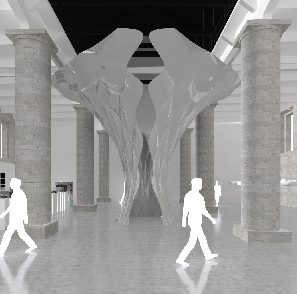
                The Hadid exhibition was all about the visual and the contrast of light and shadows. The main structure was a oversized platted metal piece. It looked similar to a lily before the petals have fully blossomed. There was an opening at the base, just large enough for a person to fit through and leading into a shaft with a small diameter that expanded as the metal grew taller. A single slit in the entrance separated the walls from coming full circle. The metal was cut and then bent in several different directions to fit this shape, but also to catch light at almost any angle. From the outside, the structure is elegant but commanding the attention of the room. Everyone is staring at it. However, inside the grand, silver petals, sound is close to being a loud silence. The inner circle fosters solitude and the feeling of being the only person in the room. I absolutely loved this piece of art. The power of a metal shield in a busy space is unreal. The level of detail is very precise and needs to be studied closely to really find the meticulousness of the work. It proves that no detail is too small to go unnoticed 


                The Norman Foster+ Partners exhibit was almost the opposite of the Hadid Exhibit. The space was dark except for the continuous moving projection of words in different directions on the floor and the constant quick slide shows and sounds. The Slide shows were all around the room and never had an image upon the wall for more than a few seconds. The images assaulted your eyes with the difference in colors from dark to bright at a quick pace. The content of the images varied. At one point there would be pictures of buildings and scenery with people laughing and getting along, and then there would be pictures of war, fire, crime and riots. The sounds were deafening and flipped from the fire of a guns to peaceful ocean waves and several others that came as quickly as they went. All of this put together made me feel as if I was meant to just stand and stare. Walking on the projected words was disorienting and there was nowhere else to go. The theme of common ground was extremely prevalent in this space. All people can experience joy and triumph, but also feel the hurt and pain of a struggle too.  I felt as if this was the first time I actually realized and comprehended that every other person in the world can feel exactly as I do. We are all human, but I just need reminding sometimes and this was the space that did it for me.


                I would definitely go back to this exhibition. I think there are a lot more things to observe and understand that I might have missed before. I know that my class was meant to see it as architecture students. We may have picked up on things that others did not, but it is in our hands to use the knowledge and experiences we gathered in Venice to apply it to our work in the future. 

9/26/12

Ties that bind

by Seth Oliver


“Your problem is to bridge the gap which exists between where you are now and the goal you intend to reach.” – Earl Nightingale. The point of a bridge is to get from one point to another. Plain and simple. But the best bridges are those that make the journey a destination as well. A mental stimulus is what can set these structures apart. The majority of people just cross a path without noticing much of anything. This is partly due to them being wrapped up in their own lives, but also due to the unchanging footpath patterns they tread on. Giving people something to experience is a goal that more architects should try to reach. Bridges are the perfect examples. My two favorite pieces we have studied thus far have been the Pedestrian Bridge by Tobias Rehberger and Schlaich Bergermann & Partner in Oberhausen, Germany, and the Moses Bridge Ro&ad Architecten in the Netherlands.
                The Pedestrian Bridge in Germany has been lovingly called the “Slinky Bridge.” The coils and colors that make up the structure are reminiscent of the toy that we all used to play with when we were younger.  Seeing this is a point of nostalgia for the older crowds traipsing across the bridge, but the massive scale of these coils are enough to grab the younger generation too. It almost seems to be a huge play-scape rather than just a bridge. To reinforce the idea of the playground above water, the artist behind the design also included specific colors on the path. The colors change depending on where you are at the moment. On a curve that is inclining, the colors are closer together in ribbons, much like a barcode. The path across the river is fairly smooth, so the color changes are more gradual. To top it all off, the spiraling metal that goes around the footpath lights up at night. This makes it a spectacle no matter what time of day and gives a playful illusion to the city. I think that more bridges should be designed in a fun way. It would make people want to cross the bridge or just stop to stare at it. We are all children in our hearts after all, so why not use that to draw people in? I would love to see my home town do something similar to this.


                The other bridge that exceeds expectations in experience is the Moses Bridge in the Netherlands. It is almost part of the landscape. I cut, or ravine if you will, shoots through the hill and divides the water. The edge conditions are especially noteworthy, in that they stop just at the point of the water on the sides to be brought up to the average person’s waist. The feeling of being in the water is one that most bridges try to avoid. This unique structure makes the walls come towards the pedristian so the the water looks as if it could flow into the path at any second. Something as simple as a bridge to hold out the water rather than going over it is a stroke of genius. This is not a sight such as the Slinky Bridge, but more of a hidden treasure for the adventurer. The mental stimulus from this masterpiece is very much worth the trip. Calmness abounds in the still water, and people can glide through it without disturbing scene.


Bridges are some of my favorite structures to study. The importance of the connections can always be highlighted in a way to enhance the experience. I cannot wait to see what other designs can be built in the future. 

9/10/12

Gardens of the Age

By Seth Oliver


                “What is a weed? A plant whose virtues have never been discovered.”- Ralph Waldo Emerson. Gardens have transformed over the centuries into more pieces of art for public use rather than private. These landscaped features can be compilations of many materials to form miniature, condensed and sculptural pieces in themselves. Gardens can have architectural elements surrounding them but also have the plants be the architecture. The dichotomy of this ideology has come about in different ways. A few in particular that follow the notion of structure around the focal pieces are the Tanner Spring Park and Park Westergasfabriek. A few that counter this and have the focal pieces be the gardens are represented in the Serpentine Pavilion and the Lincoln Center Roof Garden.
                Architecture to contain the wild is a path to showcase the natural environment in a way that is controlled with the illusion of frivolity. Tanner Spring Park makes a miniature of an ecological process of the cleansing water. From the rough hills to the edge of the pond, the plants and landscape dominate the scene. The paths are placed on top of the show off the piece of the natural elements. It is almost as if floating above it is to admire the process at work below the bridges. The Culture Park of Westergasfabriek also fosters the idea of paths added to nature, but isolates most of the nature to preserve them from Human interaction. A visual stimulus rather than a physical one. This park also displays the cleansing of the water, but from a distance. The other difference would be the large pool at the very end of the park that engages the public. Tanner Spring Park engages people from the trails and the earth but the Culture Park of Westergasfabriek engages people from the water. Many other gardens have followed these ideas of displaying nature, but these two are of the ends of the spectrum and very unique.
                On the contrary, more modern gardens have popped up as pieces of architecture as well as natural wonders. The Serpentine Pavilion in London by Peter Zumthor and Piet Oudolf was literally a box. The dark corridors of the ambulatory surrounding the garden were completely articulated. Not only the structure, but also the pants were specifically cultivated for the height and color. Giving the illusion of wild and natural but in reality it is all planned and carefully calculated. The plants became a part of the architecture. They were integral in filling a void of the inner rectangle and shaped the experience within. The Lincoln Center Roof Garden uses plants as a building material as well. The sections of the field, pond and forest all became three separate “buildings.” The roof of the first is a vast slope of grass. The pond is a reflective rectangle flush with the ground. And the forest is a composition of the grid lined trees to shape a box building outline. All three are individual pieces of the same sculpture, but all add a different aspect of the personality of the space. This idea incorporates the city into the garden rather than the garden into the city. Blending the spaces into a modern take on the “garden” and to push the limit of what materials can be used to create architecture and landscape.
                The designing of garden spaces still centers on the public experience. This has not changed for centuries. The new gardens try to blend the materials of the featured pieces and the structures that frame them. The realization of materiality and how to use it is key to successfully composing a landscape for the modern world. Whether the flora is the main attraction, or just a thread in the fabric, gardens are pushing the boundaries of the norm further than ever before.  

9/3/12

A Style Forgotten

by Seth Oliver

“Being unwanted, unloved, uncared for, forgotten by everybody, I think that is a much greater hunger, a much greater poverty than the person who has nothing to eat”- Mother Teresa. A bit antiquated, but fits the situation of Berlin, Germany adequately. Nazi Germany produced a style of architecture that was a blend of modern and neoclassical. This style embodied the great power of the nation at the time. The colossal structures that make the people feel so minute, presents the face of Germany as one that has power and control.
The structures like the Zeppelin Field, Grossenplatz, the Gross Halle, and the Neue Reich Chancellery give a structured order to the city that had been unprecedented thus far. The style was basically coined by Hitlers single and favorite architect, Albert Speer. Bringing the blend to the city changed it in the time the Nazis ruled and was never the same. The second war prevented the more grandiose projects, but it was still enough time to shape history forever. The terrible, bloody acts of ill-compassionate soldiers with the swastika had a lasting impression on the city but also the world.
Once the war was over and the Nazis no longer had any control, the people of the age drew back from anything that was associated with the crimson stain on Germany’s history. The buildings forgotten and the style shunned. The ruins left were partially destroyed to create something new and better suited than order and uniform. The sides of East and West Berlin had very different opinions. The eastern side of Berlin was controlled by England, France and the USA. This part had tried to rebuild everything in the 1960’s and 1970’s in the style of the age. It worked for a while but was soon looked upon as old and dilapidated. The Western side of Berlin was under the influence of the Soviet Union. The buildings were all in a block style and took on the very modern notion of the clean and straight edges. The parks are very wide and the avenues are well kept. The Western side actually defines somewhat of a new style that references what used to be in Nazi Germany. It is the fabric of the city that stands out as uniquely Berlin. That is something every city should strive to achieve.
I understand the negative stigma that comes with the style of the Nazi Germany. But the style was actually something to consider as a feat. They style was uniform but also makes a statement the people under the government. It did what Hitler intended in a way that has a stylized feature to it as well as a practical functionality. The monuments and pieces commanded attention from all viewers. Nothing in the city had been able to do that. Even though the general emotion ended with fear, the emotion was stronger than any other building in the city. In no way would I ever attempt to justify the teachings or the following of the Nazi life, but I will advocate the notion of control. Albert Speer had mastered the control of the people of Berlin if only he had been giving the time to fully extend his plan to the whole city.
This style of thinking is heinous to the modern world. The brain is a powerful tool to use. But the architecture of the age can be just as powerful to control others as well. The style of the modern and neoclassical by Albert Speer has been let go and forgotten for a reason. Not because of the style, but because of the negative memories that come with the style.