Showing posts with label Jennifer Lenn. Show all posts

12/5/12

Preserving the "Country Cottage"

Wohlfart-Laymann House 
Arch.: Meixner Schluter Wendt
(Jennifer Lenn)

       During a time when the idea of a post-modern style poisons the idea of beauty in architecture design, it is easy for many of the older buildings to simply fade into the backgrounds of history. Buildings that, at one point stood out in innovation and design serving as a crucial living place, now seem to get lost in the predecessors of today's architecture. I grew up in a small house, in a small town, the southeast region of the United States. In this small town, architecture was not an elaborate demonstration of the world's latest innovation and technologies, but it made is presence known by providing the necessary means to serve its function. A common theme seemed to exist among many of the houses which dressed this town and, in turn, began to mold my ideas of a "home". A simple square floor plan consisted of a kitchen with only enough excess space to accommodate a small table to hold a family meal, a small living room area and only enough bedrooms to provide for a "typical" size family (which means that some rooms were shared by siblings). 
       These simple floor plans  were typically constructed on top of a 3 foot crawl space defined by an exposed wall of cement blocks. The "architecture" itself contained little or no ornamentation but the overall construction dressed the centralized space with a wrap around porch which allowed for a very personalized adornment by its inhabitants. Today, architectural innovations have challenged and evolved the idea of a "home" and these simple structures have come to seem somewhat primitive. As I have moved away from my small town and exposed myself to many other ideas, places, people, art, design, and structure through my studies in architecture, I see more and more how people view these older homes as being tasteless and/or disdainful. However hideous these homes seem to my fellow peers, I have and will always maintain a certain admiration for this style of home. 
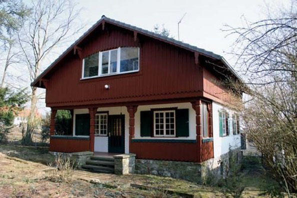
       While many architects today do everything they can to navigate away from styles of the past, there are few that embrace it. This is why I am particularly enthused to see the work of Meixner Wendt on the Laymann House in his efforts to preserve a simple house of the 1930's. Aside from its location in Frankfurt, Germany, the overall structure of the house is very similar to that of the vernacular "home" I became accustomed to in my small town. The house exists in the Taunus hills area which is right outside of Frankfurt. Initially, the goal was to enlarge this space by replacing the existing house with a bigger one, however, Wendt had a better idea. He decided to preserve this "traditional, simple country cottage" by expanding on it with a protective "shell". The shell he proposed implemented elements of post-modern architecture to complement the remains of the 1930's which it would encase. You can see, by looking at the plan, how the outer shell interacts with the original house plan based on predetermined functions of the original house. The walls of the original house were also painted a soft off white to complement the shell. The openings of the original house are broken open to allow for light to come through the shell and provide proper lighting inside. Encasing an original structure with a new shell puts an intriguing play on the relationships between indoor and outdoor spaces. What used to be an outdoor patio is now an indoor porch with a completely different atmosphere. 
       I really appreciate Meixner's efforts to preserve such a quaint and picturesque space while really embracing the architecture of the 1930's. He was able to do all this while still implementing his own design and complementing old architecture with new architecture while embracing and enhancing the overall atmosphere of the space. 


11/20/12

Harmony in Juxtaposition


PHILIPS PAVILION
(Le Corbusier)
JENNIFER LENN

        Architecture is viewed as a monumental and sometimes a permanent work of art dedicated to the fabric of its surrounding city. But not every building we see is classified as "architecture". If only some buildings are classified as "architecture" because they are considered works of art, and some exist as only "buildings", then how is it decided what is or is not "architecture"? In an era when the term "art" is used so subjectively, it is important to recall that "beauty is in the eye of the beholder". What one may see as "architecture" may be nothing more than a simple structure serving a function and vice-versa. As an architecture student, I have began to do my own analysis of what classifies as "architecture";  deciding for myself what is or is not art and examining why I see it that way. In doing so, it is important that I keep an open mind and that I am able to appreciate architecture even if it does not pertain to my own view of "architecture". Analyzing the Philip Pavilion has encouraged me to look past y first impression of a building and appreciate it for what exists beyond my own first impressions. 

        Over the past four years of education in architecture, I have developed my own list of characteristics which I look for to define a successful project. I tend to classify successful architecture as the following: 
~ It responds to its surroundings appropriately without boasting
~ It takes advantage of present day technologies to be more economical
~ it is practical
~ It creates a symbiotic relationship between all of it's elements
~ It is sustainable
~ It gives back to it's community

        These are the six minimal characteristics that differentiate a simple building from architecture. Le Corbusier, however, far exceeded these characteristics with his Philips Pavilion in 1958 with his partner, Iannis Xenakis who contributed  to the building design while also writing music for the finished space. Philips Industries commissioned Corbusier for this pavilion to showcase their technology at the World's Fair. Corbusier worked side by side with Xenakis to create a pavilion that perfectly juxtaposed two different experiences within spaces. 

       Not only does the team succeed in clearly defining a threshold between inside and outside experiences but they also do so in using mathematical hyperbolic paraboloid forms and innovations in technology. The ending product, Philips Pavilion, is an artistic result of perfect harmony existing between mathematical design and construction innovations to create a form that follows function. The walls of the structure are made of rough slabs and cast in place by a moveable scaffolding. They are supported by a double network of cables that are suspended along the parabolic forms which are made of reinforced concrete. The interior is just as complex as the exterior in an effort to emphasize the acoustics of the music and also showcase the technologies of Philips Industries. An installation of 350 speakers complement the assortment of lighting methods along with film projectors, sculptures and more. The intense form and acoustical settings of the interior provide a clearly defined and remarkable experience of the space. 

        Although this piece, overall, stands out quite dramatically from its surroundings it is doing so in an incredibly successful way. Corbusier made efficient use in technologies and collaborated very well with his Xenakis. The harmony which exists between the two architects is, no doubt, reflected in their final project. At first glance, Philips Pavilion is not a structure that I would particularly declare as impressive architecture because it stands out so boldly from its peers. However, I was able to look deeper into the structure and design of the project to see the reasoning behind the moves made in the Pavilion, which really allowed me to appreciate it much more than I would have initially. The fact that such a distinct juxtaposition between interior and exterior spaces based on the mathematical forms is quite artistic and impressive. The use of the hyperbolic paraboloid forms to enhance the acoustics even further justifies the need for such a complex structure. The piece, all together, is a perfect product of the synchronization of harmony and juxtaposition in architecture and those who create it. 


SOURCES: 


11/18/12

Perfection of the Five Points


NEMAUSUS I & II
(Jennifer Lenn)


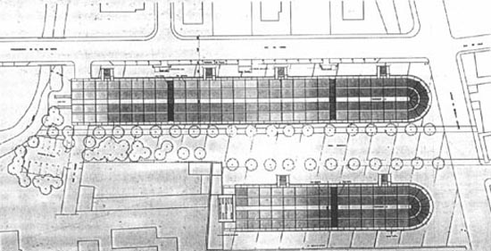
      Le Corbusier introduced his five points of architecture in 1926 with the intention of designing a common thought for perfect habitation. It was not until 60 years later that his five points were perfected by Jean Novel with Nemausus I and II in Nimes, France. In addition to his five points, Corbusier defined the home as something that should operate as a machine, he particularly showed this in his Villa Savoye but Jean Nouvel presented the home as a machine on a much larger scale. The Nemausus project is a 10,300 square meter,  multi-family housing complex, constructed with steel, aluminum, and concertina garage doors. All together, the two seven story buildings contain 114 apartments and is classified as modern architecture. Nouvel uses the qualities of modern architecture to meet the demands of the project, rather than using the radical qualities of the modern movement in order to create a lavish master piece. This is what makes Nouvel's work so successful.

       Nemausus I and II exist side by side with a broad lucious canopy of trees between them. Nemausus II is shorter than I in order to fit the confines of the site and both are rounded at the east ends. With a limited budget, Nouvel constructed both buildings with low cost, long lasting materials that could function on the interior as well as the exterior. Using innovative materials and advancement in technology, Nouvel fused modern building qualities and Corbusier's five points of architecture. Logically, it may seem that no one could represent Corbusier's five points better than Mr. Corbusier himself, however, Nouvel executes this design project with perfect use of the infamous five points. Unlike Corbusier's homes as machines, Nemausus does not exasterbate radical modern forms for the sake of looking radical in a modern era. Instead, Nemausus uses radical forms in a way that seem to work with its surroundings and qualities that are crucial to fitting within the guidelines of the program. Nouvel used qualities of the modern architecture era because they were necessary for his project, not to fit in with a certain style or to boldly define a new one. This is why his Nemausus buildings fit so appropriately with their surroundings and their time. They do not attempt to flaunt any unnecessary means of construction for the sake of a flamboyant look, but merely appeal to the exact program using the most economical and inventive tools of the time. 

       Nouvel used the concrete from the exterior to also finish the interior walls to reduce cost of materials and emphasize a simple interior along with its open floor plans. Some of the apartments differ based on size, but for the most part Nouvel tired to leave an open floor plan as listed on Corbusier's five points. This also allowed for the building to be more flexible in the long term. With a more open floor plan there are more opportunities for the space to be used differently over time. This use of concrete reduced costs in order to meet the budget but also added to the life of the building by allowing for change. A canopy of trees between the two buildings reach the same height as the buildings making a large enough space for a luxurious garden. Perforated metal balustrades of the cantilevered balconies echo the repetitive rhythm of the interior units and also frame the ribbon windows on the facades. Nouvel also takes into account Corbusier's established importance of pilotis. The rounded eastern ends of the buildings are raised on pilotis allowing for a slightly recessed area for covered parking. This concept is very similar to Corbusier's method of pilotis in the Villa Savoye. 

        Corbusier does, in fact, carry out his own five points of architecture through his work but in a harsh and crude fashion. His work serves as somewhat of a diagram or "paint by numbers" to explain his concept of five points. While this is informative to others in illustrating his points, it does create a harsh architecture that struggles to find a balance between radical and comfortable architecture. Nouvel perfected Corbusier's five points by using the basic concepts rather than aiming to create a literal, visual translation of them.


SOURCES:


Travels Through Rome


Report on Class Trip

*Jennifer Lenn*


Dear Blog, 


        In midst of my reminiscing of my recent adventures through Rome, I have decided to tell you of my most significant discovery. It has now been six days since I was in Rome but the memory still asserts itself in my mind with its vivid sounds, smells and overwhelming architecture. Of all the architectural wonders that exist in Rome, I'm sure you may expect to read of my experience in the Coliseum or the Pantheon or the Forum, however, I feel that the most significant experience I can share with you is one from the Isola in the Tiber River. You see, many people can tell you of their journey's to the Coliseum and to the Pantheon and I am sure that all of the stories would be very similar. I am quite sure that hardly anyone journeys to Rome in order to see Isola, or for that matter, even makes nan effort to see this place during their stay in Rome. This past trip that I took to Rome was my fourth time being in Rome so, naturally, it was easier for me to deviate from the typical tourist trail through the city. 
Our first day in rome, as a class, was full of site visits to monumental places that many people only get to read about in books or see in pictures. But while the class proceeded to these world known sites, I decided to discover something new, that I had never seen before.

        I opened my map and was overwhelmed by how many sites were recommended on this paper tourist map. After looking over it for a few minutes, I spotted this small island in the middle of the Tiber River. I was quite interested to see how in the world a small island could fit in a river much less be able to provide proper ground for building. So i set on my way to find this small island. I departed from the Piazza in front of the Pantheon and made my way, first to the Piazza Navona by way of Via di Sant Agostino. The small narrow road finally let out into this great Piazza full of people and street vendors. The space between the buildings and the Piazza was buffered by shaded table and chairs in front of restaurants. This was clearly a place which once held so much more meaning than what it showed now. Now it is only a place to serve tourists. While the space was very open and welcoming, I still had not felt that I really discovered something new. So I continued along its narrow oval axis and left on another busy narrow street. 
        As I continued walking towards the river on Via Arenula, the crowds thinned out and the vendors seemed to reduce in number only slightly, the space slowly turned into one not geared towards tourists but the roads by which locals used in daily life. I finally reached the river and the massive trees that lined the sidewalk had begun to change colors providing the most beautiful foreground to the view of the Isola. My pace had slowed down significantly as I tried my best to take in every part of this view. Halfway across the bridge I paused and could only stand still trying to take in everything that was around 
me.
         I looked on one side of the Ponte Fabricio and saw another much larger bridge with a beautiful elaborate structure. A large concrete slab surrounded the border of Isola, and from above I watched two older men walk together in deep conversation as they slowly made their way around the island. Ponte Fabricio itself hosted only a few street vendors which told me that tourists were somewhat expected here and immediately I could see why, I just didn't  understand why I had never heard or been told of this place before. This place was absolutely stunning. I could see the other end of the island as soon as I reached the other end of the bridge. For such a small piece of land, I was shocked to see how many buildings existed here. There was a small hospital and a modest sized church which housed the relics of St. Barthalemeu. It is a shame that Isola falls in the shadows of its neighboring sites such as the Coliseum and the Pantheon, it is because of these major monuments that Isola does not exist on the tourist trail through rome, but maybe it is a good thing. 

        Aside from its impeccable location, it is the lack of commotion in this place that makes this island so beautiful. This is one of the greatest and most memorable experiences I have had in Rome. It is a place that I got to discover without any direction, which makes it even more rewarding for me. I wish that more people could find time to find this humble spot in Rome but, at the same time, it is the lack of tourists and the serenity of the island that makes Isola so beautiful. 
        I hope that one day you will get to see this place! 
 - Jennifer 

10/22/12

Preserving the "Country Cottage"


Wohlfart-Laymann House 
Arch.: Meixner Schluter Wendt
(Jennifer Lenn)

       During a time when the idea of a post-modern style poisons the idea of beauty in architecture design, it is easy for many of the older buildings to simply fade into the backgrounds of history. Buildings that, at one point stood out in innovation and design serving as a crucial living place, now seem to get lost in the predecessors of today's architecture. I grew up in a small house, in a small town, the southeast region of the United States. In this small town, architecture was not an elaborate demonstration of the world's latest innovation and technologies, but it made is presence known by providing the necessary means to serve its function. A common theme seemed to exist among many of the houses which dressed this town and, in turn, began to mold my ideas of a "home". A simple square floor plan consisted of a kitchen with only enough excess space to accommodate a small table to hold a family meal, a small living room area and only enough bedrooms to provide for a "typical" size family (which means that some rooms were shared by siblings). 

       These simple floor plans  were typically constructed on top of a 3 foot crawl space defined by an exposed wall of cement blocks. The "architecture" itself contained little or no ornamentation but the overall construction dressed the centralized space with a wrap around porch which allowed for a very personalized adornment by its inhabitants. Today, architectural innovations have challenged and evolved the idea of a "home" and these simple structures have come to seem somewhat primitive. As I have moved away from my small town and exposed myself to many other ideas, places, people, art, design, and structure 

through my studies in architecture, I see more and more how people view these older homes as being tasteless and/or disdainful. However hideous these homes seem to my fellow peers, I have and will always maintain a certain admiration for this style of home. 

       While many architects today do everything they can to navigate away from styles of the past, there are few that embrace it. This is why I am particularly enthused to see the work of Meixner Wendt on the Laymann House in his efforts to preserve a simple house of the 1930's. Aside from its location in Frankfurt, Germany, the overall structure of the house is very similar to that of the vernacular "home" I became accustomed to in my small town. The house exists in the Taunus hills area which is right outside of Frankfurt. Initially, the goal was to enlarge this space by replacing the existing house with a bigger one, however, Wendt had a better idea. He decided to preserve this "traditional, simple country cottage" by expanding on it with a protective "shell". 

       The shell he proposed implemented elements of post-modern architecture to complement the remains of the 1930's which it would encase. You can see, by looking at the plan, how the outer shell interacts with the original house plan based on predetermined functions of the original house. The walls of the original house were also painted a soft off white to complement the shell. The openings of the original house are broken open to allow for light to come through the shell and provide proper lighting inside. Encasing an original structure with a new shell puts an intriguing play on the relationships between indoor and outdoor spaces. What used to be an outdoor patio is now an indoor porch with a                  completely different atmosphere. 

       I really appreciate Meixner's efforts to preserve such a quaint and picturesque space while really embracing the architecture of the 1930's. He was able to do all this while still implementing his own design and complementing old architecture with new architecture while embracing and enhancing the overall atmosphere of the space. 


REFERENCES: 


10/8/12

Russian Pavilion and Paul McCarthy


THE BIENNALE
Written by Jennifer Lenn

Dear Blog,
       Words cannot even begin to describe how overwhelming the Biennale in Venice was. Hopefully through some of my text and photographs I will be able to give you a small glimpse of the talent and thought that went into this incredible exhibit. Let me first give you some sort of perspective by telling you that this exhibition did not exist simply within one building, in fact, it included multiple buildings within itself. We walked through a very large building that seemed never-ending but it was difficult to notice just how long I had been walking because my mind was so preoccupied by the art work. Honestly, it is difficult to remember exactly the sequence in which I saw everything because the places have run together in my head. Certain places do stand out, however.  The pavilions in particular were very interesting to me and each stood out in its own way. The Russian pavilion was of particular interest to me because of the inside. 

       The inside of the Russian pavilion had walls that were completely covered in barcodes which you were supposed to scan with an iPad that was handed to you as you walked in. Each bar code represented a different project or architect. Once you scanned it with your iPad it brought up a summary that you could read about that certain project or architect. This stood out to me not only because of the innovative way to view projects but also because it just so happened to exist in the Russian pavilion. When I saw the use of the iPad i was immediately reminded of my little brother because I knew it was something that he would have enjoyed. Given that my brother was adopted from Russia, I thought that this was really interesting. 


        One thing that I found somewhat contradictory in this pavilion was a sign that was meant to direct the viewer by labeling two different rooms. One was labeled  "architecture" and one was labeled "function". I found this questionable because in my mind the two should be one, not separate.  


       Aside from particular buildings that intrigued me, the art work grabbed my attention the most. Particularly that of Paul McCarthy. Most would say that his work is grotesque, provocative and even perverted but this is what stood out to me. A lot of art work, both sculptural and two dimensional convey messages through "beautiful" picturesque scenes. Artists try to grab the attention of the viewer using incredibly rich colors or images that cause the viewer to stop, turn their head and drool in amazement. Paul McCarthy uses a very different approach to get his message across through his art work. He juxtaposes characters and commonly known figures of different worlds, classes, and societies to provoke an analysis of fundamental beliefs and American myths. For example he may mix the character of a political figure with that of a fantasy character as a satirical way to analyze a cultural norm. In some pieces he often gives very innocent and pure characters pieces or elements that are incredibly provocative or daunting. 

       At first his work was very grotesque to me and there was a certain invisible form of tension that existed between myself and the other people to walked so timidly through his exhibit. There were even several times when I simply left his exhibit to avoid the awkward tension of the other viewers. As soon as I would leave, however, I had a sudden desire to return to his exhibit to learn more about what exactly was going through this guys head. Once I returned the first time I was again forced away by my own discomfort amongst his work. Again, I returned. Finally I stopped to read the brochure about his works and I was fascinated by his method. Suddenly I felt comfortable and at ease as I browsed and photographed his heinous sculptures. Once I was informed about his work I felt more comfortable viewing it because I was actually reading something rather than seeing it for face value. Paul McCarthy's way of grabbing my attention fascinated me. Not many artists nor architects or buildings themselves, for that matter, can make me return three times in a row to truly discover the meaning that lies beneath it. 

       So many artists (this includes architects) try so hard to impress people by creating the "most beautiful" or the "largest" of its kind, so many mistake "grandeur" for "perfection". This misconception leads to a plethora of work that is merely a compilation of "big, beautiful" things and all that is evoked within the viewer is a mundane gasp with a jaw dropping "Wow, how beautiful". So how successful does it make a piece of art when every reaction from a viewer is the same as their last reaction to the previous painting? Perhaps it depends on what message the artist is trying to convey but, personally, I would venture to say that Paul McCarthy is quite the successful artist because he is able to evoke emotion and cause action among his viewers. This, to me, is success.   

9/30/12

BIG RED


Parc de la Villette

Bernard Tschumi
(written by: Jennifer Lenn)

        Like any work of art, architecture is a tangible statement communicating an artist's message or idea. The work, in turn, develops its own character defined by its architectural elements. In many instances projects are heavily or completely influenced by its location, people, circulation and, most importantly, the context. In my last blog i wrote about Axel Schultes'  response to the new German government on the Spree river. He used Spreebogenpark as a way to forever inscribe Germany's new identity on the banks of the Spree river. One thousand kilometers away in Paris, France, Bernard Tschumi breaks away from the tradition of referencing context and makes a bold red statement with his design for Parc de la Villette. Tschumi's goal for this park is clearly defined by its deep red structure and its obtrusively enormous scale. The 135 acre park sits on an abandoned plot of land previously used for the French national wholesale meat market and slaughterhouse on  the Canal de l' Ourcq. Rather than recognizing the history of the site or the landscape of the site, Tschumi proposed a park that is completely man made and controlled lacking any organic elements or forms and with a complete disregard for the history of the site.

      Tschumi's design was driven by a competition calling for a design that would respond to Paris' urban redevelopment of the 1980's. The brief for this competition called for an urban park for the 21st century. The contest was a result of the efforts made by President Mitterand to make Paris a more tourist influenced city. Out of more than 470 proposals, Tschumi's Parc de la Villette was most reminiscent in contemporary issues as well as the future while refusing to reference the history of the site. Tschumi developed an open yet direct path throughout the park. There are several open areas in which a more direct path will direct the viewer. From these spaces there are several ways by which a person may proceed through the site. Although the circulation alone may get slightly ambiguous, direction and orientation are always confirmed by the bright red coloring of the structure itself. Such circulation allows for "constant reconfiguration and discovery" throughout the park. Not only does the scale and coloring of the structure orient and define a place of discovery for the visitors but it also serves as a point of reference for the local tourists of the city.


        While aiming to stand out with his big red mess of metal, Tschumi explained the reason to his madness as a result of three principles of organization; points, lines, and surfaces. 
 POINTS Thirty five points make up a grid that defines the spread of the 135 acre site, which Tschumi referenced as "follies". These follies are each different than the next and unique in their own place but given their repetitive nature, they are meant to give the visitors within the park a point of reference so not to get lost in the space.  

 LINES  The lines within the park are just as random and various as the park itself. They are not governed by any means of organization or grid but rather are only directed by specified places of "interest" within the park. 

 SURFACES The surfaces of the park refer to the 85 acres of green space that scattered throughout the site. These surfaces are the part of the park given to the interaction of visitors with the park. The green spaces are dedicated to play, relaxation, socializing and typically to large open gatherings. 


     Parc de la Villette is a piece that stands out with its obnoxiously bright coloring, and excessive size. With complete disregard for the history of the site, Tschumi designed a park whose sole purpose is to orient tourists, being the bright red beacon of reference that it is. This is greatest bond it has to its location. Its size and material boasts the innovations of the 21st century and possibilities of what is to come in the future. As of now this park stands out as something abnormal and out of place but because it has put so much emphasis on the design of the future, it is only the future itself that will ever be able to define the normalcy of this work. Only time will tell the truth regarding the abnormality/normalcy of this project. 


REFERENCES: 


9/12/12

Connecting Past and Present Germany; Spreebogenpark


SPREEBOGEN PARK 


*Axel Schultes*
Jennifer Lenn

After the second World War much was done to restore Germany, and even more so after the fall of the Berlin wall in 1989. Not only was the country's infrastructure destroyed but the government had been substantially set back as well. Crucial ties between East and West Germany had been broken during the war and the government had severely crippled the trust of its citizens, therefore calling for a massive restoration and renovation of an entire nation and its government. It had been agreed upon, with little or no rebuttal, that the center for the most important parliamentary and government buildings should lie in Spreebogen, Berlin on the Spree River.  Master planning for the new Federal Government began in 1991 with a two-part international competition that was announced the following year. The first part would select a master spatial plan while the second called for the architectural designs. By 1996 another competition was announced for the design of a park which would exist in front of the German Chancellery building and the Paul-Lobe-Haus on the southern banks of the Spree River. The significance and symbolism of the location is, emphatically, just as important as the winning design itself by Axel Schultes. 
Coinciding with the German Government's goal, Schultes submitted a design unifying the major government buildings, improving circulation around the river, providing leisurely space for the public and ultimately he designed a perfect display of the Nation's new identity. The layout of the park symbolizes the connection between East and West Germany that had just recently been restored. This is clearly defined by the central concept in their plan; the "Band des Bundes". The "Band des Bundes" is a board of government buildings that extends from the north part of Friedrich Wilhelm-Stadt to Moabit and crosses the Spree river two times. On the North end of the park are the legislative buildings of parliament and on the other are their executive counterpart, the chancellery. Connecting the two major sectors is the "citizen's forum", or the park itself which is rich in open green spaces dedicated to the people.

The open spaces in the inner parts of Spreebogen park were left as open as possible because Schultes felt it was important to leave plenty of spaces to the people of Germany. Not only does the park make a bold statement to the public but is also full of symbolism in order to remember German history. There are two major meadows which slope to follow the radius of the Spree river. The western meadow is made up of condensed boxwood beds (or Buxus Sempervirens) in the front yards of Grunderzeit Alsenviertels. The symbolism of this meadow acknowledges the agreement upon one location for the site of all diplomatic missions and the replacement of the wet meadows that had previously existed in Spreebogenpark. The east meadow of Spreebogenpark is full of tall, rich, and colorful grasses and plants which become visually contradictory to the western garden and in doing so also commemorates the division of Germany. The wall area of the meadow signifies the Berlin wall but the harmony in which the two meadows exist links the east and west gardens. This is only one of the many ways by which Spreebogenpark attempts to reveal the Government's new identity. 
The newly found unity of the German Government and its people was celebrated from the early stages of this project beginning with the master planning of the site. Before master planning even began a common location was agreed upon for the central government structure. The Spree river united the plan all together in providing a perfect site for a new government and plenty of space to provide for the public. Once the main buildings were set in place and the architecture of the site had been developed, Schultes tied it all together with his landscape plan which has become known today as Spreebogenpark. His plan is developed around two major axis which link all of the major places of the city of Berlin. The axis are delineated by the healthy flow of circulation around the Spree River and by the self defining meadows throughout the park. The symbiotic relationship between the circulation, the government buildings and the luscious meadows form a strong and bold statement which defines the new identity of the German Government.