Showing posts with label Tyler Silvers. Show all posts

11/17/12

Prada: Search for Corporate Identity

By Tyler Silvers


Whether a small department store or a new headquarters, the design of a corporate structure speaks volumes about the company that is housed within – the target audience, core values and corporate intentions are displayed alongside the products in the window. Through the particular design of its temporary headquarters, Prada has utilized architectural design to develop a corporate identity based on an innate predisposition toward innovation and experimentation.

Through the design of its stores around the world, Prada effectively displays its corporate embrace of experimentation. None of the headquarters around the world that Prada has had designed look the same – each were specifically tailored to the particular culture, geography, or situation presented at the time of design. Renzo Piano’s design for Prada’s temporary headquarters in Valencia, Spain constitutes a situational flare that helps Prada, as a sponsor of the Luna Rossa Challenge (an Italian sailboat race), relate to its audience. Piano recycles the high-tech sails no longer able to be used by the boats as a facing for the building, offering both a cost-effective and highly relatable build. The use of the sails offers the obvious connection with the sailboat racers and serves as both a promotion of the race and a symbol of the company’s attempt to reach out to the racers and fans as a client base. As well, the façade shows Prada’s transparency – their openness to innovation. During the day, the facing acts as a brise soleil; diffusing the light on the inside of the building. By night, the sails allow light to cast out from the structure, acting as a beacon, perhaps symbolizing a lighthouse, tying back into the sailing roots of the structure; perhaps alluding to the fact that Prada is willing to do what is necessary to take care of its clients.

In stark contrast, Prada’s Marfa store in Texas is not a store at all, but rather exists as a symbol of Prada reaching out to potential clients. The small, fake store exists along a long, otherwise vacant road in the Texan desert and existed only as a temporary structure – a sort of pseudo-billboard through which Prada could advertise its products. Although the idea may seem silly to people who drive by, most take a few minutes to stop and get a glimpse of the small structure before continuing along the lonely desert road. Perhaps this is Prada’s way of encouraging others to slow down, to forget the conventional and wholly binding social expectations that we encounter on a daily basis, and to realize that, to an extent, the outliers are far more interesting and eye-catching than the moderate.

I respect Prada for taking the necessary initiative in the design of their corporate structures to call in big-name architects. The company displays its pride and confidence in its products; considering the high monetary burden associated with such large firms and the stylistic gap between some of the structures, such designs serve to highlight the overall strength of the company. Also says that they are completely willing to adapt to the cultural, geographical, and situational changes that comes with each new site; thus none of the headquarters look the same.

Low-Cost Housing with a Long Run Focus

By Tyler Silvers
 
The design of mass social housing calls for the use of “low-tech” aspects and certainly a low-cost budget. This simplified style of design forces architects to reach for a new way of thinking (far separated from the stereotypical grandeur often associated with the profession), and challenges designers to incorporate low-cost construction techniques and materials into spaces that provide a maximum quality of occupancy. FOA accepts these challenges in their Carabanchel Housing project for the city of Madrid, Spain, in which the firm synchronizes aspects of the existing site with a focus on low-tech mechanics; all on a low budget.

FOA’s goal throughout the development of this social housing project was to “provide the maximum amount of space, flexibility and quality to the residences,” and designed the complex around the principles of space and light. Throughout the design of the project, FOA is able to integrate the building onto the site in an incredible way; to an astonishing extent. It seems that often, projects that are based on a low-budget fix too closely to what money can buy, focusing on saving money in the short run. Projects that operate on this basis seem to forego aspects that the site itself has to offer (such as sun and wind patterns and building orientation) that can significantly help to lower the cost of operating the maintaining the building in the long run.


With their Madrid social housing project, however, FOA integrates the building into the site through the sectional considerations for the design as well as the incorporation of natural exterior materials on the façade. The site leads to the development of a rectangular form oriented along the major axis to the north/south line. To the west of the structure is an existing green space, while the housing complex is surrounded by existing buildings to the north, south, and east. The architects design each apartment unit to include openings on each façade that the unit opens up to (in most cases this is to the east and west). This allows a cross breeze to flow through the units, reducing cooling costs in the summer months, and sunlight to enter the units, notably during the morning and evening hours. To diffuse the harsh, direct sunlight, the architects have designed the housing complex with a double skin with the outermost consisting of bamboo panels. Due to the manner in which bamboo grows, the panels allow sunlight to pass through in an irregular manner and create a natural, diffuse shadow pattern inside each apartment. To help with the facilitation of the cross breeze (as well as with the occupant-specific customization of the spaces), the panels outside each apartment complex are fully operable. The bamboo panels stretch over the façade of the building without interruption (except in the case that some of the panels are open), and give the impression that the structure itself has grown out of the earth. The architect’s use of bamboo as the principle element on the façade of the building situates the building into the context of the site (particularly the existing green space to the west) particularly well.
 

Experimental is Professional is Experimental

By Tyler Silvers

There exists a tenuous distinction between “experimental architecture” and “professional architecture.” The industry and profession of architecture can be said to be based on a refinement of an individual’s architectural ideas and theories over the life of a career. The only manner by which to understand more fully the personal and cultural implications of one’s designs is to begin with some form of study, some form of experimentation; whether that be through the use of temporary structure (which provide a more suitable environment for architectural experimentation) or more permanent ones in built form (which constitute a more costly form of experimentation). Using this logic, “experimental architecture” will eventually refine itself down to becoming a more professional form, and “professional architecture” is always experimental; thus a distinction between experimental and professional architecture is difficult to identify in the big picture.

Professional architecture is experimental. To a certain extent, any and all people who put into practice the processes of architectural design spend their life defining and refining their interpretation of “architecture” and “design.” For example, Le Corbusier, who had great influence on the development of modern architecture began to develop an architectural theory based on five simple driving concepts (pilotis, free floor plan, free façade, ribbon windows and rooftop garden) early in his career and continually worked to refine his theory with each new project that he confronted. His experimentation with the five points led his designs from the traditional Dutch style of his 1905 Villa Fallet (which most people would never link to the architect due to its severe divergence from his commonly understood theories) to the fully modern culmination of his architectural theory: the 1928 Villa Savoye. The architecture of Le Corbusier, arguably one of history’s most influential architects, can easily be considered “experimental architecture;” but his career was one of the best examples of “professional architecture” in history. Thus his architecture was fully “experimental architecture” and, simultaneously, constituted a “professional architecture.”
                                                          Villa Fallet                                       Villa Savoye

Temporary architecture is experimental and experimental architecture will become professional. The construction of a temporary structure assists architects in the definition and refinement of their architectural theories, which, as previously discussed, are based on experimentation. Like a life-sized model, architects can study differing effects that they are trying to achieve with no long-term pressure present in the construction of permanent structures. For example, Mies van der Rohe’s 1929 German Pavilion exists as his first “essay” of sorts about elements of architecture. The architect focuses on blurring the distinction between interior and exterior, the relationship between floor and slab and a multiplicity of movements based on a simple gridded plan. From his studies at the Barcelona exhibition, van der Rohe refined his architectural theories to lead him to the designs of the 1956 Crown Hall for IIT and 1968 Neue National Gallery in Berlin. Van der Rohe’s construction of the temporary German Pavilion gave the architect a unique opportunity to experiment with architecture and essentially acted as the starting point for his career. Based on this idea, the experimental qualities of architecture led only to a more and more “professional architecture” – one with solid ideas and refined theories. In this way, “experimental architecture,” over time, becomes or leads to “professional architecture.”
German Pavilion                                                       Neue National Gallery

Although the analysis of these big name architects can easily apply to the concepts that have been put forth, the same ideals exist for architects everywhere. From the time that we begin our modern day architectural education, students work toward developing their own architectural theories. Perhaps based on an influential career of history, perhaps based on their own design aesthetics; perhaps developed and followed early in life, perhaps developed as a result of experimentation over time. Nevertheless, everyone who puts into practice the processes of architectural design work to develop these architectural theories over a lifetime. The distinction between “experimental architecture” and “professional architecture” may exist, but if it does, it will not last for long, as one cannot exist without the other.

11/15/12

An Invisible Parasite

By Tyler Silvers


The owners of the structure sought invisibility – a structure that would not disturb the existing qualities of the residential courtyard situated among a group of Parisian apartment complexes. A group of radical architects, headed by Francois Roche (partner in the R&SIE firm), found the answer. R&SIE architects conceived a simply structured home masked on the site with a new form of greenery – a technologically oriented blanket of plants that surrounds the structure and fuses the new house with the existing site and, in effect, creating the invisible inhabitance appropriately called, “I’m Lost in Paris.”


The skin of plants that surrounds the simple structure of “I’m Lost in Paris” represents a clash between technology and nature. R&SIE architects created a simple steel mesh structure that indirectly connects to the raw concrete structure of the inhabitance with a grid of steel rods that protrude from the concrete surface. The hydroponic ferns (which were chosen because they do not need soil to grow) attain the necessary minerals from a small tube running back to the roof of the structure, where rainwater and bacteria are collected to form the mineral bath. Intermittent within the fern skin, the architects have implemented groups of glass-blown forms resembling wild berries, which serve to direct and diffuse natural light through the outermost skin into the living areas of the home.


The house exists as a full scale experiment with natural elements that supports cynical undertones. The clash of technology and nature creates an almost robotic plant form – the ferns are supported totally through man-made innovations rather than the natural processes that would typically sustain the plant life. The pseudo-robotic plant forms suggest that man has conquered nature; almost as if we no longer need the natural processes that we can now artificially simulate (at least on a certain scale) and control completely based on our perceptions and knowledge of both the technological systems in place and the natural capabilities of the plant life of our choosing. This example represents fully the modern domestication of natural processes – to the extent that some of the processes are completely supplemented with human innovation. I do not take the stance that this extent of technology in nature is a bad thing, nor necessarily a good thing. I simply think that the juxtaposition of the two are quite interesting, especially to the extent reached in this particular project.

 “I’m Lost in Paris” acts as an interesting play on the idea of parasitic architecture. In this case, is nature a parasite that has grown to overtake the house, or is the house a parasite on the residential courtyard that has yet to reveal itself? Seen from the perspective of the house itself, it seems that nature is the parasitic element of the two. This form of nature (which happens to be technology based) seems to have effectively attached itself to the house with a grid of steel rods and a system of tubes attached to the roof of the structure. The plants get their source of life from the system of tubes that have, at this point, completely surrounded the house. Seen from the perspective of the site, however, the structure seems to retain the more parasitic element. The house is comprised of two stories of livable space above ground and a basement floor (housing various mechanical systems) below the grade of the site. Looking at a transverse section through the structure, the house appears to be rising from within the earth like a tectonic plate yet to break the surface; forcing the soil and plants of the site upwards to form a boil within the residential courtyard. In this case, we know that elements of parasitic architecture are present, but the distinction, just like the inhabitance, is invisible.

9/28/12

Wall House Exhibition: 2012 Venice Biennale

By Tyler Silvers

At this year’s Biennale, Anupama Kundoo’s representation of her “Wall House” struck me as one of the most interesting exhibitions as this was the only exhibition that represented the original structure so fully, keeping true to the intended design concepts, materials, and construction methods. The architect’s decision to represent her Wall House with such accuracy in each of these fields allowed her to fully encompass the theme of this year’s Biennale – that of creating a common ground in architecture. From the original design intents to the construction and design of the exhibition space, Kundoo found a common ground between the occupants, the workers, and the environment.
Kundoo’s original design of the Wall House finds a common ground between man and his surrounding environment. The initial design works around the natural benefits of the site to enhance the capabilities of the home; taking into account sensitivity to sun patterns, wind orientations and seasonal variations as well as incorporating several of the existing trees into the plan. Furthermore, the structure itself can be modified to most effectively capture the natural aspects through the manipulation of shutters, specifying cross ventilation and sun exposure patterns based on the particular season. In addition to these passive techniques, the home finds use in active solar technologies such as photovoltaic cells (providing electricity) and a solar water heater that integrate natural elements, the structure, and the occupants.

In the construction of her exhibition, Kundoo and her team find a common ground between vastly different cultures. Kundoo chooses to mirror the construction of the original Wall House by utilizing traditional Indian construction methods that rely heavily on natural and recycled materials (such as locally produced baked clay bricks and terra cotta tubes or pots) that are installed by highly skilled local craftsmen. The architect has the original materials duplicated in India and shipped to Venice to ensure an accurate portrayal of her Wall House. As well, Kundoo brings with her several of the highly skilled Indian craftsmen to construct the exhibition, ensuring that the construction methods are also accurate with the local traditions. A team of students from the University of Australia (where Kundoo teaches) and Italian builders also lent a hand to the craftsmen for the creation of the exhibition. The diverse construction team found a common ground with the completion of the project, which represents a synthesis of what Kundoo calls, “imported techniques and [Italian construction] traditions.”

Through her design concepts for the exhibition space, Kundoo found a common ground between the design of the original project and the architecture of the Italian Arsenale. Stepping into her exhibition is like entering another world. Kundoo represents only a carefully selected portion of the Wall House at a 1:1 scale within the small confines of the exhibition space. Visitors catch a glimpse of traditional Indian construction techniques (through exposure of structural wood elements out of the brick façade and use of terra cotta tubes to create a barrel vault) and material pallette (through building materials and floor treatments). The design also gives visitors a sense of the original site within the walls of the exhibition by utilizing the existing brick column structure of the Arsenale. Kundoo integrates the columns in a similar manner to that of the trees at the original site. 

Kundoo’s exhibition space of the Wall House effectively finds a common ground with everyone involved in the project from start to finish – from the influence of the craftsmen of the original structure to the visitors of this year’s Biennale.

Bibliography:

-Vinnitskaya , Irina . "Venice Biennale 2012: Wall house / Anupama Kundoo, University of Queensland" 30 Jul 2012. ArchDaily. Accessed 28 Sep 2012. <http://www.archdaily.com/258087>

-Images courtesy of www.designboom.com


9/26/12

How the Sunken Bridge Works

By Tyler Silvers

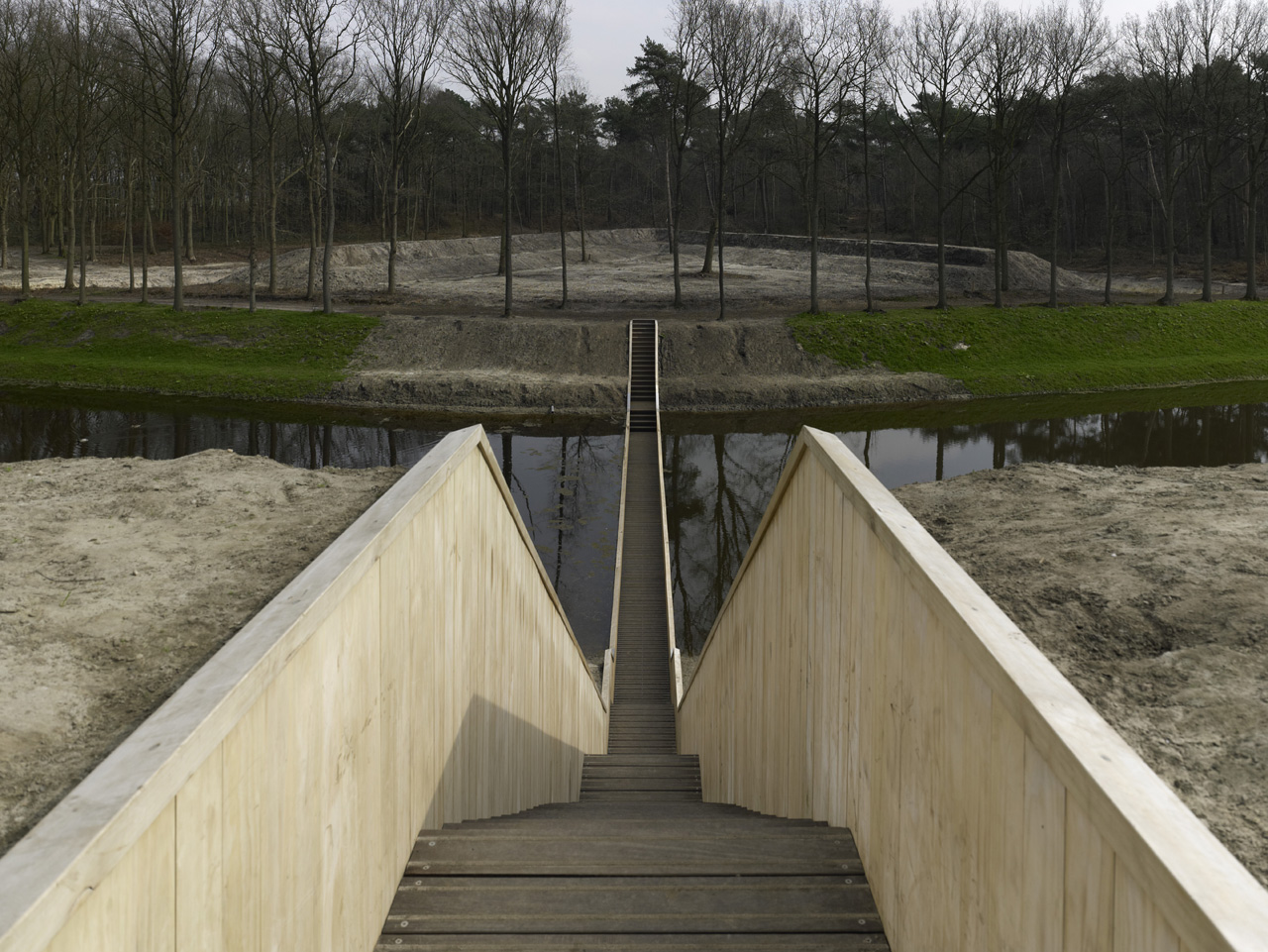
When charged with the task of bridging the gap to Fort de Roovere, now a recreational space located in Halsteren, The Netherlands, RO&AD Architects pursued the idea of invisibility. The result was the picturesque Moses Bridge – a promenade that is sunken into the West Brabant Water Line that, from a distance, achieves virtual invisiblity. The beautifully designed structure, however, raises a few questions that I would like to solve; namely:
:Why a sunken bridge?
:How does the design account for rising water levels and rainfall?
:How does the structure fare during the harsh winters of the Netherlands?


Through my research, I have found that the history of the site played a large role in the development of the “sunken bridge.” The structure crosses the West Brabant Water Line, a moat-like area that was used by Fort de Roovere as a defensive line during the 17th century while the fort was in use. This fort, and several others like it, suffered damage during the 19th century, but has recently been zoned for recreational usage. When charged with the task of bridging the gap to the fort, RO&AD Architects found that constructing a bridge across a defensive moat to be “highly improper…especially on the side of the fortress the enemy was expected to appear on. That’s why we designed an invisible bridge.” The design of the bridge features a wooden pathway that is sunken into the existing landscape. From a distance, the bridge becomes virtually invisible as only a small sliver of the accoya wood material (a rot resistant wood that is waterproofed with EPDM foil below the water) peeks through the surface.

With the question of aesthetics solved, I turn to functionality. Initially, the idea of a sunken bridge seemed absurd. If water levels rise, the bridge would be of no use. RO&AD Architects, however, seamlessly incorporated functionalities such as this into their design of this remarkable bridge. The design of the bridge is complimented by a set of dams (one on each side of the bridge) that help to control the water levels around the sunken structure. The heights of the dams are specifically calculated to direct water away from the bridge element in the event that water levels rise, as pictured in the diagram.


We now know that water cannot flow over the top of the bridge element, but what about water from above? The designers have taken into account the inevitable rainfall in the area with a practical design solution. Each of the floor planks has an intentional gap between them which allow rain water to permeate the walking surface (and also helps to account for the shrinking and swelling of the material). Once the rainwater finds its way to the space below the wooden surface, a sump pump expels the water into the moat and the dam system takes hold to ensure that the bridge element remains passable.
The harsh winters of the Netherlands take quite a toll on the bridge. Heavy snowfall and temperatures well below freezing often push the bridge past its limits and cause the bridge to flood and become impassable during these months. The recreational area of the fort, however, has little to no use during this time, so the bridge need not be crossed. Come spring, the land thaws and the bridge once again becomes operational thanks to accoya wood’s resistance to rot and the EPDM waterproofing enabling the structure to handle the mass exposure to water.


Bibliography:
Jett , Megan . "Moses Bridge / RO&AD Architecten" 17 Nov 2011. ArchDaily. Accessed 26 Sep 2012. <http://www.archdaily.com/184921>

Joo Kim, Sun, ed. "RO&AD Architects: How the Moses Bridge Works." Smart Planet. SmartPlanet, 29, Jan 2012. Web. 26 Sep 2012. <http://www.smartplanet.com/blog/design-architecture/ro-ad-architects-how-the-moses-bridge-works/3838>

:Pictures courtesy of RO&AD Architects and http://www.naturalhomes.com

9/11/12

Modern Domestication of Nature


By Tyler Silvers
As cities become more and more dense with man-made constructions, the demand for creative allocation green spaces has risen substantially. Landscape architects are challenged to form space that speaks toward both the natural beauty of the site and cater to the human need for order and structure. In the process, however, modern urban landscapes seem to have lost much of what makes nature in itself a space that overflows with an unmatched splendor through the slow but steady domestication of nature in form.
Although beautiful, modern urban landscapes, such as Gabriel Guevrekian’s cubist garden at Villa Noailles, tend to cater more to the human need for structure rather than turning their focus on the natural forms and processes particular to the site before human occupation. With his cubist garden, Guevrekian seeks to form an elegant oasis for the occupants – with much success in this aspect. His use of formed concrete and subtle terraces lead the eye toward a central node while the triangular shape of the space plays on the perspective of the eye.  The design of the garden allows occupants to enjoy the elegance of the architect’s interpretation of the landscaped area. The garden focuses the viewer attention on just that – a highly domesticated space. Rather than enjoying the natural, native beauty in itself, occupants are enthralled with a diluted, stylized version of the architect’s vision for the site. On a grander scale, the effect designing more and more controlled environments creates an inaccurate representation of how “nature” truly defines itself; the interdependent ecosystems making up nature are lost in the folds of modern urban garden design.

Image Courtesy of stylepark.com
In order to reform the correct representation of nature in the minds of the general populace, designers have begun to look back to a time before the rise of urbanization. Alan Sonfist’s Time Landscape, for example, offers a new form of urban landscape that takes root deep in the history of the particular site – Manhattan, New York. Sonfist’s green space is designed around the idea of bringing back the landscape that was once prominent in the area before the arrival of Dutch settlers in the 17th century. As noted by the New York Government Park Services, Sonfist conducted “extensive research” on the “botany, geology, and history” of the community and utilized native trees, shrubs, rocks, soil, and flowers to create a living memorial to the natural landscape that once dominated the area. The simple idea of the Time Landscape seems to have been well received in the surrounding community as people gathered to assist in the construction of and subsequent maintenance for the park. With his seemingly simple design, Sonfist provides an effective manner by which to reintroduce nature (in its true sense) into the context of the modern city.
Time Landscape: Past, Present, and Future
Painting by Paul Rodgers

As urbanization continues to rise and cities continue to advance, nature, in its true form, will continue to be diluted of purity. Perhaps one of the most effective manners by which to truly preserve natural form is to realize the loads of history below our feet.

8/29/12

Berlin's Struggle Toward Cultural Identity


By Tyler Silvers

 
During the reign of Nazism in Germany, dating back to the 1930's, the leaders of the political party set out to radically change the culture of the European continent and, if possible, the world. Under Hitler’s direction, Albert Speer became the chief architect of the new style of Nazi Architecture. Buildings designed with the new style quickly sprang up across the Nazi regime, and in effect grew to provide a new cultural identity for the people of the time period. Nazi Architecture seems to have been based largely on the party’s idea of creating an Aryan race – an ideal that essentially seeks to create a population of perfect people, all of whom possess an identical culture. This idea was expressed in architecture through the monumental scale of the buildings constructed at the time. If we take the opportunity to zoom out and look at the structures from afar while thousands of people are gathered in and around the building, everyone, in effect, becomes the same - we don't see individuals, we just see people, thousands and thousands of seemingly identical people; almost like looking at an anthill. The speed in which the Nazi leaders were able to establish the new cultural identity of the population is simply astonishing. In less than 10 years, they were able to undo the previous way of life and reestablish a new life (albeit one of oppression) supported thoroughly with the architectural works of the time.

 
The collapse of the Nazi regime, and its architectural style, came with the end of World War 2 and left the masses void of any significant cultural or architectural identity, a void most notable in the capital of Nazi Germany – the city of Berlin. As a result of being heavily bombed at the end of WWII and the sequential Allied takeover, the city was purged of any and all remnants of the so-called Nazi Architecture, giving the city a clean slate on which to redesign its cultural identity. Without an absolute direction (like that offered by the Nazi party, which allowed an identity to be forged quickly), the city would enter a period of cultural uncertainty. The monumental task at hand was to undo the culture based on an all-powerful political party and to reestablish a culture that focused on the value of the individual as present in the modern world. The movement toward the modern world, while largely avoided in Soviet controlled East Berlin, was encouraged in the western half of the city. Architects from around the world, such as Hans Scharoun and Mies van der Rohe, flooded West Berlin in efforts to redefine the culture of the city through works of design. The culmination of design led to the development of the Kulturforum, a new cultural center based on the arts (and, thus, the individual rather than the party). Each building was designed to be free standing, however, and no clear relationship existed between the structures. Despite the cultural complex bringing a touch of modern architecture into the city, representing their willingness to move on from the once prevalent Nazi Architecture, Berlin had yet to address the one group whom it had shoved furthest into the corner – those of the Jewish faith. It wasn’t until Berlin united as a city that the cultural transformation would culminate in a new identity for everyone in the city. Architects such as Daniel Libeskind and Peter Eisenman were commissioned to implement Jewish memorials to lament the occurrences of the past. At this point, the city could declare its new cultural identity complete – one which focused on every individual without discrimination based on race or religion.

 I find it interesting that over 50 years go by before the city fully regains an culrural identity through the use of architecture equal to that established by the Nazi regime in only a few years. The city's new identity, however, offers more centrally focused ideals that incorporate rather than oppress the masses. After over half a century of turmoil, the city finally finds peace cultural peace with the assistance of architectural design.