Showing posts with label Biennale. Show all posts

10/8/12

Russian Pavilion and Paul McCarthy


THE BIENNALE
Written by Jennifer Lenn

Dear Blog,
       Words cannot even begin to describe how overwhelming the Biennale in Venice was. Hopefully through some of my text and photographs I will be able to give you a small glimpse of the talent and thought that went into this incredible exhibit. Let me first give you some sort of perspective by telling you that this exhibition did not exist simply within one building, in fact, it included multiple buildings within itself. We walked through a very large building that seemed never-ending but it was difficult to notice just how long I had been walking because my mind was so preoccupied by the art work. Honestly, it is difficult to remember exactly the sequence in which I saw everything because the places have run together in my head. Certain places do stand out, however.  The pavilions in particular were very interesting to me and each stood out in its own way. The Russian pavilion was of particular interest to me because of the inside. 

       The inside of the Russian pavilion had walls that were completely covered in barcodes which you were supposed to scan with an iPad that was handed to you as you walked in. Each bar code represented a different project or architect. Once you scanned it with your iPad it brought up a summary that you could read about that certain project or architect. This stood out to me not only because of the innovative way to view projects but also because it just so happened to exist in the Russian pavilion. When I saw the use of the iPad i was immediately reminded of my little brother because I knew it was something that he would have enjoyed. Given that my brother was adopted from Russia, I thought that this was really interesting. 


        One thing that I found somewhat contradictory in this pavilion was a sign that was meant to direct the viewer by labeling two different rooms. One was labeled  "architecture" and one was labeled "function". I found this questionable because in my mind the two should be one, not separate.  


       Aside from particular buildings that intrigued me, the art work grabbed my attention the most. Particularly that of Paul McCarthy. Most would say that his work is grotesque, provocative and even perverted but this is what stood out to me. A lot of art work, both sculptural and two dimensional convey messages through "beautiful" picturesque scenes. Artists try to grab the attention of the viewer using incredibly rich colors or images that cause the viewer to stop, turn their head and drool in amazement. Paul McCarthy uses a very different approach to get his message across through his art work. He juxtaposes characters and commonly known figures of different worlds, classes, and societies to provoke an analysis of fundamental beliefs and American myths. For example he may mix the character of a political figure with that of a fantasy character as a satirical way to analyze a cultural norm. In some pieces he often gives very innocent and pure characters pieces or elements that are incredibly provocative or daunting. 

       At first his work was very grotesque to me and there was a certain invisible form of tension that existed between myself and the other people to walked so timidly through his exhibit. There were even several times when I simply left his exhibit to avoid the awkward tension of the other viewers. As soon as I would leave, however, I had a sudden desire to return to his exhibit to learn more about what exactly was going through this guys head. Once I returned the first time I was again forced away by my own discomfort amongst his work. Again, I returned. Finally I stopped to read the brochure about his works and I was fascinated by his method. Suddenly I felt comfortable and at ease as I browsed and photographed his heinous sculptures. Once I was informed about his work I felt more comfortable viewing it because I was actually reading something rather than seeing it for face value. Paul McCarthy's way of grabbing my attention fascinated me. Not many artists nor architects or buildings themselves, for that matter, can make me return three times in a row to truly discover the meaning that lies beneath it. 

       So many artists (this includes architects) try so hard to impress people by creating the "most beautiful" or the "largest" of its kind, so many mistake "grandeur" for "perfection". This misconception leads to a plethora of work that is merely a compilation of "big, beautiful" things and all that is evoked within the viewer is a mundane gasp with a jaw dropping "Wow, how beautiful". So how successful does it make a piece of art when every reaction from a viewer is the same as their last reaction to the previous painting? Perhaps it depends on what message the artist is trying to convey but, personally, I would venture to say that Paul McCarthy is quite the successful artist because he is able to evoke emotion and cause action among his viewers. This, to me, is success.   

9/30/12

Great Experience at the Venice Biennale 2012


By Seth Oliver
"Great architecture is the design of space that contains, cuddles, exalts, or stimulates the perosns in that space." - Philip Johnson. I thoroughly enjoyed the 2012 Biennale in Venice! The theme was Common Ground and focused mainly on the architectural response to it. I felt as if it was set up just for our trip as architecture students to benefit from. I learned so much from this experience. It furthered my love for a few architects and spiked my interest in others. I will still have to say that the 2 exhibits I enjoyed the most were from Zaha Haddid and Norman Foster + Partners. Both are very different but inspire me to think outside of the normal realm.  Each of them deals with the idea of a movement in a space but the approaches are very different.


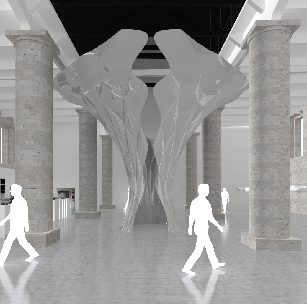
                The Hadid exhibition was all about the visual and the contrast of light and shadows. The main structure was a oversized platted metal piece. It looked similar to a lily before the petals have fully blossomed. There was an opening at the base, just large enough for a person to fit through and leading into a shaft with a small diameter that expanded as the metal grew taller. A single slit in the entrance separated the walls from coming full circle. The metal was cut and then bent in several different directions to fit this shape, but also to catch light at almost any angle. From the outside, the structure is elegant but commanding the attention of the room. Everyone is staring at it. However, inside the grand, silver petals, sound is close to being a loud silence. The inner circle fosters solitude and the feeling of being the only person in the room. I absolutely loved this piece of art. The power of a metal shield in a busy space is unreal. The level of detail is very precise and needs to be studied closely to really find the meticulousness of the work. It proves that no detail is too small to go unnoticed 


                The Norman Foster+ Partners exhibit was almost the opposite of the Hadid Exhibit. The space was dark except for the continuous moving projection of words in different directions on the floor and the constant quick slide shows and sounds. The Slide shows were all around the room and never had an image upon the wall for more than a few seconds. The images assaulted your eyes with the difference in colors from dark to bright at a quick pace. The content of the images varied. At one point there would be pictures of buildings and scenery with people laughing and getting along, and then there would be pictures of war, fire, crime and riots. The sounds were deafening and flipped from the fire of a guns to peaceful ocean waves and several others that came as quickly as they went. All of this put together made me feel as if I was meant to just stand and stare. Walking on the projected words was disorienting and there was nowhere else to go. The theme of common ground was extremely prevalent in this space. All people can experience joy and triumph, but also feel the hurt and pain of a struggle too.  I felt as if this was the first time I actually realized and comprehended that every other person in the world can feel exactly as I do. We are all human, but I just need reminding sometimes and this was the space that did it for me.


                I would definitely go back to this exhibition. I think there are a lot more things to observe and understand that I might have missed before. I know that my class was meant to see it as architecture students. We may have picked up on things that others did not, but it is in our hands to use the knowledge and experiences we gathered in Venice to apply it to our work in the future. 

Biennale: A Different Perspective

By: Denver Sells

The Venice Biennale is one of those once in a lifetime experiences that for the privileged, can actually happen multiple times in a lifetime.  It is a must for any architecture student or professional if for nothing else other than the sheer degree of effort into the architectural exhibits, especially in the main exhibit space.  This year the one exhibit in the main space that really struck me was the Gort Scott, Robert McKillop and Renzo Piano Building Workshop exhibit titled “London Streets and Skies.”
In this exhibit, Gort Scott and Robert McKillop critiqued Renzo Piano’s Shard building in London.  Gort and Scott focused on its relationship to the urban setting via drawings of London along a path with the Shard being experienced within that, vs Robert and McKillop created a video that showed the Shard from several different locations and perspectives around the city.  On the surface, this seems like a very simple project that just analyzes the relationship visually of Piano’s building to London, but as you spend more time there, really diving into what is being said and talked about in the exhibit, you realize that is almost a mockery of the building, at least that is how it seemed to me.  To me, both firms saw the Shard as almost this sore on the face of London, instead of something beautiful that is supposed to be there or fits in.  For instance, Gort and Scott’s drawings are focusing so much on the small little town blocks, that when you see the Shard, it seems out of place.  It is much the same story with Robert and McKillop, where their perspectival photos are beautiful, until you notice the big Piano project ruining the almost “perfect” ambiance and atmosphere that is created in the foreground of the photos.
This just really interested me and I feel it applicable to my future architectural projects because its not just the immediate area that is effected by our buildings, it the surrounding areas, especially if it is a skyscraper.  I’m not saying that Renzo Piano’s Shard is ugly, but I feel after this exhibit I have a much different opinion about it and skyscrapers in any setting.  I think too often we get caught up just trying to maximize the space in our site, and forget the greater cultural and physical impact of our building.  This is something that I want to try to keep in mind as much as possible as I go through school and my career, because I think considering that sort of thing is what separates a good architect from a great one, because you have to be conscious of so many other things about your building, other than just if it looks cool or is environmentally friendly.  Maybe Frank Lloyd Wright did have something with his prairie style – low impact on the environment physically and visually.  I think this is admirable, and I also think putting that thought should almost be obligatory, not something that is accidentally noticed.


9/29/12

Architectural Biennale: Finding Common Ground in a Diverse Field


By: Chris Melton

During our group's visit to Venice, we were able to attend the architecture Biennale, an event that is held for architecture every other year where different firms, architects, and countries come together to share ideas and work. We were fortunate enough to be able to visit both sections of the Biennale in one day; and my first impression of the convention as a whole was just how impressive of a variety of which different architects, firms, and countries chose to present their works. Exhibits ranged from large, inhabitable models, to fully crafted master plans, drawings, renderings, and everything else that lies in between. The only way to describe the sheer amount of information at this event was excessive. The most interesting aspect about this convention for me, was not just how different the presentation styles and projects between the two pavilions was, but how vastly varied each exhibit was inside of each pavilion. Both pavilions were fantastic in their own right, and singling out just a few presentations from each one does neither justice, so I would like to take some time to talk about what I found the most interesting at the first pavilion.

One of the best features of the first pavilion was the way in which it introduced the theme of the Biennale at the beginning of the exhibit. This set the bar for the rest of the presentations, most of which were crafted with this theme in mind. When you first walked in, the words "Common Ground," which of course was the theme, were boldly placed on the wall in front of you, and all around the room were posters (shown above) that further elaborated on the meaning of this theme. Upon reflection, one of the things that I found the most interesting was just how much in-progress work the architects chose to present in order to show process and narrative in the absence of an oral presentation. As I got to inspect everything from napkin sketches, to parti's, to different in-progress models (shown below), all of this process work showed something that the final model or project never could; how the architect thought and problem-solved to create the final project. This was a very interesting aspect for me, almost like a small glimpse into that firms' office, and it was probably why I enjoyed the first pavilion so much.


The second thing that I found the most interesting about this pavilion was the wide variety in how the architects showcased their work. Some presented very basic, clean models and master plans, while on the contrary some others compiled together with other firms and architects to create one master work. These works often came together using different methods and ideas that then created a model or master plan that was a hodgepodge of different ideas and styles that was actually quite interesting. I still feel strongly about how awesome of a feeling it was to walk from room to room and continually be just as interested in every new room. One of the presentations that excelled in this regard was the second room, the room that was directed by Norman Foster. From the instant you enter the room's threshold, the lack of lighting and music set the scene for a different experience for when you turn the corner. Shown below, Foster had thousands of words and pixels being projected across the walls, floors, and people as they walked about, as well as two video along the walls that presented his thoughts and ideas on the theme of Common Ground. This experience was entirely subjective, the more the viewer stayed and studied, the more they could understand and get out of it, but its boldness is why I enjoyed it so much. Overall, the Biennale was a fantastic sight to see, and I felt that its' theme for this year's convention was perfect. The fact that there are so many different ways to view, create, and present any architectural project is in fact the Common Ground that all architects stand on, and being able to explore this through the Biennale was definitely the best part of our Venice experience.

9/28/12

Wall House Exhibition: 2012 Venice Biennale

By Tyler Silvers

At this year’s Biennale, Anupama Kundoo’s representation of her “Wall House” struck me as one of the most interesting exhibitions as this was the only exhibition that represented the original structure so fully, keeping true to the intended design concepts, materials, and construction methods. The architect’s decision to represent her Wall House with such accuracy in each of these fields allowed her to fully encompass the theme of this year’s Biennale – that of creating a common ground in architecture. From the original design intents to the construction and design of the exhibition space, Kundoo found a common ground between the occupants, the workers, and the environment.
Kundoo’s original design of the Wall House finds a common ground between man and his surrounding environment. The initial design works around the natural benefits of the site to enhance the capabilities of the home; taking into account sensitivity to sun patterns, wind orientations and seasonal variations as well as incorporating several of the existing trees into the plan. Furthermore, the structure itself can be modified to most effectively capture the natural aspects through the manipulation of shutters, specifying cross ventilation and sun exposure patterns based on the particular season. In addition to these passive techniques, the home finds use in active solar technologies such as photovoltaic cells (providing electricity) and a solar water heater that integrate natural elements, the structure, and the occupants.

In the construction of her exhibition, Kundoo and her team find a common ground between vastly different cultures. Kundoo chooses to mirror the construction of the original Wall House by utilizing traditional Indian construction methods that rely heavily on natural and recycled materials (such as locally produced baked clay bricks and terra cotta tubes or pots) that are installed by highly skilled local craftsmen. The architect has the original materials duplicated in India and shipped to Venice to ensure an accurate portrayal of her Wall House. As well, Kundoo brings with her several of the highly skilled Indian craftsmen to construct the exhibition, ensuring that the construction methods are also accurate with the local traditions. A team of students from the University of Australia (where Kundoo teaches) and Italian builders also lent a hand to the craftsmen for the creation of the exhibition. The diverse construction team found a common ground with the completion of the project, which represents a synthesis of what Kundoo calls, “imported techniques and [Italian construction] traditions.”

Through her design concepts for the exhibition space, Kundoo found a common ground between the design of the original project and the architecture of the Italian Arsenale. Stepping into her exhibition is like entering another world. Kundoo represents only a carefully selected portion of the Wall House at a 1:1 scale within the small confines of the exhibition space. Visitors catch a glimpse of traditional Indian construction techniques (through exposure of structural wood elements out of the brick façade and use of terra cotta tubes to create a barrel vault) and material pallette (through building materials and floor treatments). The design also gives visitors a sense of the original site within the walls of the exhibition by utilizing the existing brick column structure of the Arsenale. Kundoo integrates the columns in a similar manner to that of the trees at the original site. 

Kundoo’s exhibition space of the Wall House effectively finds a common ground with everyone involved in the project from start to finish – from the influence of the craftsmen of the original structure to the visitors of this year’s Biennale.

Bibliography:

-Vinnitskaya , Irina . "Venice Biennale 2012: Wall house / Anupama Kundoo, University of Queensland" 30 Jul 2012. ArchDaily. Accessed 28 Sep 2012. <http://www.archdaily.com/258087>

-Images courtesy of www.designboom.com


9/26/12

Venice Biennale


By Khris Kirk

To all my devoted Bloggers, 

   We just went to Venice and got to experience the Biennale for architecture. The Biennale is a gathering of architecture from many different countries. The theme this year is Common Ground, directed by David Chipperfield, who explains that "The emphasis of the 2012 Biennale is on what we have in common. Above all, the ambition of Common Ground is to reassert the existence of an architectural culture, made up not just of singular talents but a rich continuity of diverse ideas united in a common history, common ambitions, common predicaments and ideals. In architecture everything begins with the ground. It is our physical datum, where we make the first mark, digging the foundations that will support our shelter". (La Biennale di Venezia
         
         When I arrived at the Biennale, I had no idea what to expect. I have honestly never heard of it until my group did a presentation about Venice before we left for our trip. So I had I hopes for what I was about to see. Once I started walking through the exhibits, all I could do was look in awe. Everything around me was amazing. There were models everywhere! Each exhibit presented something new and different from the previous one. There were a few that I really liked in particular.


 One was the O’Donnell and Tuomey's wooden structure. When I first saw the wooden structure, I thought I looked like a giant chimney that you could walk through. After walking through the full scale model, I felt like it squeezed and then released as a space. I thought the woven pattern of the wood was fascinating by being able to see through little windows to the other side. Then I read about the project. O’Donnell and Tuomey built this structure as a response to Venice and its history. The timber work and brick work is evident within the architecture of Venice. Bricks were casted by wood and then a person had to break the brick away from the wood after it dried. The use of wood pilling up horizontally and parallel to the bricks in the Arsenale is their way of representing Venetian history. (O'Donnell and Tuomey) After reading this, I was amazed at how they were able to represent this piece of history contained by a wooden structure that looks like a chimney. 
        Another project that I really enjoyed was the Russian Pavilion in the Giardini. In the Giardini, there are pavilions representing each country, whereas in the Arsenale there were projects spread around representing specific architecture firms. The Russian Pavilion is a grid of QR codes throughout the inside of the building. As you walk in, a person hands you an Ipad and you scan the QR codes. Then information is revealed about the Skolkovo. At the bottom level of the Pavilion there is a room with little holes that show images of the past that lead up to the Strolkovo project. (Russian Pavilion) I liked how the pavilion integrated technology with their building so a person can see how the Strolkovo was constructed. It was very futuristic and the inside was an experience that put a person in awe. Even today, I’m still in shock of how amazing the Russian Pavilion was.


            Overall, the Biennale was an experience I will never forget. There were so many projects to see. If I could do it again, I would devote two days to explore the Biennale. One day to see the Arsenale and the other for the Giardini. I wonder what will be at the next Biennale in 2014. 


Links
La Biennale di Venezia 
O'Donnell and Tuomey
The Russian Pavilion


Context or No Context?

Context or No Context?

by Sarah Wilson

Unexpected and perhaps unintended symbolism in Biennale exhibits


       Our visit to David Chipperfield’s ‘Common Ground’ architecture exhibition at La Biennale di Venezia was educating in a number of ways. We saw countless models, photos, displays, and constructions, all exploring and probing at the edges of what defines architecture. There was an enormous range of materiality, form, method, function, use of lighting, and use of display; all of these meshed in each exhibit to create different experiences for the individual visitor, whether it was bending down to examine a tiny model on a stand or climbing through a full-scale structure. While I expected to see incredible things, I was surprised at almost every turn, but these surprises could be chalked up to more than just initial appearances. The most memorable thing about the Biennale, for me, was the apparent symbolism I encountered in the presentation and materiality of several of the exhibits, however intentional or unintentional.


I will make a note here early on that I have a terrible memory for titles and names, and must rely on my own photos and what other recollections I do have. The fact remains that the impressions these exhibits stirred make for the best memories, and so it is these that I will write on. One of the earlier impressions I recall comes from this large-scale quartered neoclassical building which, in retrospect, bears a remarkable resemblance to Palladio’s Villa Rotunda. The model seems to be study of symmetry how the interior may reflect the exterior; in fact, the exterior quarter on the right appears to have been formed from a mold cut into the interior quarter on the left. This exacting construction may allude to the importance of the inside of a piece having connection to the outside, and that one cannot exist without the other. This symbolism of the molding process lends itself to an interesting expression of the construction process.


Browsing through my photos, I came across this other lightweight but memorable piece. If memory serves me correctly, these dark strands that both hang downwards and grow upwards were shaped and welded from pieces of metal. I remember this one well because of the stark contrast between the organic appearance of these strands and the very non-organic material they were created from. I would have loved to see this exhibit placed in a field of grass; it seems to be asking the question of how modern construction materials can be used to aid construction in blending in with the natural environment. It’s an interesting query, certainly, especially represented in this manner. It’s almost as if this shell of a house was made from the shadows of vines and grasses, an evanescent construction that fades impalpably into the land. Needless to say, this was one of my favorites.


Again, I wish I could remember the names and creators of these pieces, especially this one. It likely represented something entirely different than the impression I recall getting from it, but then again, taking a second look at a model without knowing its original purpose can be helpful in its own way; in this manner, the second and new impression can divulge a different bit of knowledge that may not have been accessible when one is lead in the direction the creator originally intended you to follow. For example, these carved blocks of translucent material, injected with different colors placed amidst smaller white blocks that literally pale in comparison, may have simply represented an architect’s city plan for new installations amongst old ones. My impression, on the other hand, is less direct (as usual). This exhibit leads me to ponder the juxtaposition of color and fluidity amongst stark regularity. I wonder if it could symbolize the greatest desire of most artists: to break free of the norm and laugh in the face of monotony. For an architect, it could be the wish to ignore the confines of context, and instead create something wild and unfitting, for its own sake.
                
 Sometimes it’s more appropriate to keep in mind the context which the creator gives you in order to better shape your impressions and thoughts into the ones the creator was hoping to inspire. Other times, it’s not so bad to ignore the plaque next to the model and formulate your own conclusions. Even unintended symbolism should occasionally be given importance, for not every citizen immediately recognizes a building’s architect, its style, its purpose. One must keep in mind those other minds that are uninformed, for they can see something very different than one intends, but that something can be just as beautiful.