Showing posts with label Sarah Wilson. Show all posts

11/18/12

A Serpentine Approach to Light

By Sarah Wilson

An examination of light manipulation in the Serpentine Gallery Pavilions at Hyde Park

The usage, denial, and manipulation of light is always an interesting investigation in regards to architecture. Since the year 2000, Hyde Park of London has hosted a yearly pavilion installation for the Serpentine Gallery. Each pavilion was temporary, meant to only last six months, but the attention paid to details of structure and form was not diminished in comparison to permanent installations. Due to their relationship with the outdoor park, every pavilion displays consideration towards the effect of natural light, but this consideration is perhaps best displayed in the pavilions designed by Toyo Ito in 2002, Sejima and Nishizawa in 2009, and Jean Nouvel in 2010.

Toyo Ito’s approach to the Serpentine Gallery Pavilion was mathematical in origin. Utilizing a steel structural frame, Ito worked with an algorithm developed by co-designer Cecil Balmond. This algorithm described a cube that expanded as it rotated. After performing this algorithm for six cycles, Balmond and Ito extended the resulting lines to create a complex pattern of intersections. Some of these intersections served as primary load bearers while others were secondary bracers, but altogether, the lines created a coherent semi-enclosed structure. The manipulation of light came into play when working with the shapes left behind by the intersecting lines. Many of these triangles and trapezoids were made solid using concrete, but a nearly equal amount of shapes were given glass panels. The end result was a box-like structure punctuated by multiple openings at every side, creating a pattern of light amongst the visitors inside. This kaleidoscope of geometric light patterns gave the complex expression of chaos and order as commanded by light and shadow.

SANAA architects Sejima and Nishizawa took a less geometric approach to their design for the 2009 Serpentine Gallery Pavilion. They brainstormed several inspirations for form, including a forest, a new horizon, mountain trees, clouds of smoke, umbrellas, and sprouts. The ending design combined a few of these inspirations, resulting in an organic shape that flows and winds about the park. This shape, elevated above the ground on multiple thin metal columns, was made of a thin layer of polished aluminum.  Acting like a mirror, this aluminum form reflects light almost perfectly, reproducing what the viewer sees depending on his or her angle. This manipulation of light fashions the new horizon Sejima and Nishizawa sought to create, and simultaneously provides a sheltered area for passing, for pausing, and for seeing the park at a different perspective.
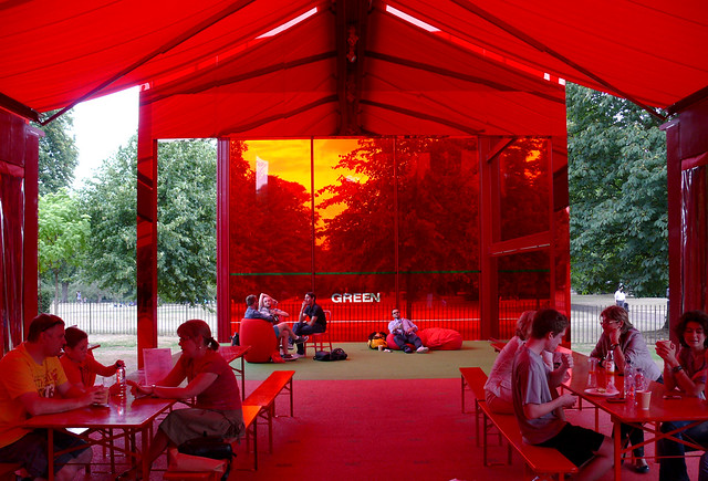
Jean Nouvel likewise took a light-focused approach to his Serpentine Gallery Pavilion in 2010 and, like Ito and Balmond, utilized a lightweight metal structure to provide his skeleton. Its defining characteristic, however, is not the use of natural light alone, but the resulting effect cast within the structure after the light passes through: everything inside appears to be red.  The thin fabric stretched and draped around the metal structure is dyed red, and the result is red-tinted light cast on everything and everyone within the pavilion. The purpose of saturating his pavilion in such bright red was to create a stark contrast with the bright saturated green of the surrounding park. Nouvel even goes so far as to print the word “GREEN” in one of the glass walls facing the exterior. The contrast between the red and green puts greater focus on both, emphasizing the pavilion while not diminishing its habitat. Like Ito and Sejima and Nishizawa’s Serpentine Gallery Pavilions, Nouvel’s installation was similar in that it utilized his materials to manipulate light towards his specific purpose. Whether it was transparent glass, impermeable concrete, shining aluminum, or tinted fabric, each of these three pavilions manipulated light to provide a different perspective on the natural site in which it was placed, reminding visitors of the habitat in which all architecture was once placed.

Enter the Metro

By Sarah Wilson

A small study of underground train entrances in Vienna and Paris


        Travelling around metropolitan Europe usually means a lot of time spent underground, for both locals and visitors. For such an important part of Europe’s infrastructure, it’s a shame to see so many entrances to the metro lines muted and pushed to the side. In cities like Vienna and Paris, however this is not always the case. These cities’ planners recognized the impact of underground railways on everyday European life, and sought to celebrate them via their street entrances. With the designing help of architects Otto Wagner in Vienna and Hector Guimard in Paris, this endeavor was made possible, even elevating some entrances to infamy.
         In terms of basic form, Wagner’s Karlsplatz Stadtbahn station entrance, Guimard’s entrance at Porte Dauphine, and this third Parisian entrance not by Guimard (commonly dubbed the ‘Whimsical’ entrance) are all similar. Each is constructed in terms of an arched covering on vertical walls or stilts positioned directly over a set of stairs leading underground to the train station. All clearly visible above the ground, these entrances are located alongside roads lined with pedestrian sidewalks, making them easily accessible, as is necessary for public transportation. Each also marks the point of change of movement from horizontal movement to descending movement.  The effect of these entrances is open and inviting, encouraging entry via the arcs overhead that in some way reach forward, extending over the sidewalk like an inviting embrace.
         What makes the Parisian entrances unique to the Karlsplatz entrance is largely the appearance of their respective weights. As a group, Guimard’s entrances –of which I saw three—are lightweight constructions that loop, arc, and float over the pavement, using varying amounts of green-painted ironwork and glass glazing. In particular, the entrance at Porte Dauphine appears as series of wings resting atop a glass and iron frame. One of these wings fans over the entrance with feathers of misted glass. Other than the dark green painted ironwork, there is little color to this entrance, but minimal color use for this entrance is more appropriate for its tree-dotted site.


 The ‘Whimsical’ entrance is much more colorful than the other two, appearing like a collection of large colored beads strung onto an arcing wired frame. Though this entrance does not have an element that physically reaches out, it retains that welcoming gesture with its extensive use of bright colored glass that can refract sunlight and cast splotches of colored light onto its surroundings. The lightweight metal frame loops up, down, and around like the path of a bouncing ball. Even the metal fence that frames the back and sides of the staircase is composed of thousands of small hollow circles, resembling a shiny foam of bubbles floating above the surface, only adding to the light and fanciful character of this entrance.
        

Wagner’s Karlsplatz Stadtbahn entrance’s greatest difference to these Parisian entrances is its materiality and, therefore, its appearance of weight. Though it does not seem particularly heavy on its own, its concrete walls add more mass to it than the Porte Dauphine’s thin ironwork. It does, however, benefit from the large window below the center of its arced roofline. Interestingly enough, most of the ornamentation of form occurs on the side facing away from the opening to the staircase, facing instead towards its sister building and creating a small plaza in between. Throughout the entire entrance building, however, there is a great deal of metal and painted ornamentation, largely in the form of golden leaves and flowers. It also reflects the thin green metal work seen in the Porte Dauphine entrance, as well as the arc that reaches out over pavement. Despite its greater volume, the Karlsplatz Stadtbahn entrance shares with the Parisian entrances the welcoming character and even some of the cheerful and whimsical character.

11/1/12

Dichotomy of Private and Public

Dichotomy of Private and Public

A comparison of the spacial character within the VitraHaus and the whole of the Vitra Campus 


     As a piece of architecture on a campus that has virtually become an architecture museum, the VitraHaus fits in with its surroundings. The question to ask, however, is what makes this possible. The Vitra Campus today features works from very well-known architects including Gehry, Hadid, and Ando, and Herzog & de Meuron’s 2006 addition to this campus may at first seem a confused heap of prisms, but the derivative of its form may come from the campus itself. The VitraHuas, a combination of the archetypal house theme and the stacking theme, reconciles the public space with the private space as the Vitra Campus does in a comparable manner, and this method creates an effect on visitors that is at once steering and welcoming.


     The purpose of the VitraHaus was to have interior space with which Vitra could display its newly launched Home Collection. As one might conclude by the collection’s title, Vitra required space that summoned that feeling of welcome and comfort that a private house can provide, while also acting as a public space to provide circulation amongst the product displays. To satisfy these requirements, architects Herzog and de Meuron harnessed two themes: the archetypal house, hence the pentagonal prisms, and the theme of stacked volumes, hence this prisms sitting atop and poking through each other. Herzog and de Meuron studied a variety of typical house sections, arranging and connecting theme to create spaces that could at once feel homey and still be navigable between each space.  The result is a somewhat informal plan constructed using informal themes.
     This informality contrasts with the formal plan and architecture used for the entire Vitra Campus, but the reconciliation of public and private spaces is similar. Both the VitraHaus and the Vitra Campus must make a separation between public space meant for circulation and movement and private space meant for pausing and habitation, however long-term or momentary. Both this building and the campus are essentially defined as public places, but both contain moments of privacy. On the other hand, using the archetypal house and the action of stacking is more informal than the regulated pathways and structural locations that render the plan of the campus more formal.
     This difference in formality creates a dissimilar effect on the character of the spaces. While a visitor to the campus will feel the open freedom of the outdoor paths between buildings, they will feel a palpable change in this as they come upon a crossroads and must allow themselves to be directed to a location, or as they enter inside a building and become confined within it. A visitor to the VitraHaus will feel a less palpable change in traversing between public and private spaces within because of the informal planning and form to both; the lack of formality lends itself to greater ease of habitation and of circulation. Naturally, comfort of potential customers amongst their Home Collection products would have been important to Vitra; the success of Herzog and de Meuron’s blending of public circulation space with private habituation space within the VitraHouse meant the optimization of visitor comfort and display circulation, and it may have been the informal character to these spaces that was the deciding factor in their achievement of this purpose.


Source:
Basulto, David. "VitraHaus/Herzog & de Meuron." ArchDaily. . http://www.archdaily.com/50533/vitrahaus-herzog-de-meuron/ (accessed October 26, 2012).