3/24/13

The Maxxi Museum


Zaha Hadid’s Maxxi Museum is located in Rome, and was completed in 1998.  It is certainly a unique building that stands out among its surroundings.  When we visited Rome as a studio, I was expecting to see many ancient structures such as the Coliseum, but I did not expect to come across a modern piece of architecture such as the Maxxi.  It was nice to experience some modern architecture in the midst of all of the old structures.  When we first arrived at the Maxxi, I really loved it.  The concrete walls and use of glass made the building feel clean and superior to the ones that surrounded it.   However, once I went inside the museum, it seemed as if Hadid paid more attention to the outside than she did to the interior.  It was simply a confusing space.  The whole time I was in the museum, I felt like I was going around in circles in the same spaces.  I was never led to a new exhibit by the building itself, instead I had to find my way by walking around and looking for something new.  I believe that a well-designed museum should lead the visitors around to the different spaces.  In fact, there was a whole side of the museum that I missed during our visit because it was a confusing space.  

In most aspects, the interior of the building did not live up to the appeal of the exterior.  However, my favorite part about the Maxxi, would have to be the ceilings.  I found myself looking up almost the whole time I was in the museum watching the way the ceiling became almost like a wave.  Hadid used the ceiling to allow natural light to enter the spaces because there are almost no windows in the entire exhibit space.  I think that the ceilings were a very successful part of this building.  If she had not designed the ceilings the way she did, the spaces would have felt incredibly cold and dark.  


I chose to focus my analysis of the Maxxi on the ceilings, because in my opinion they were the one element of the structure that made me truly enjoy the interior space.  I thought it was really interesting how normal windows were not the source of natural light in this building, and instead the ceiling was.  The concrete elements that were used to break up the glass are very successful in creating an interesting rhythm.  They give an organic feel to a very cold structure, and I think that is key to making this an enjoyable space.  In my cutting and drawings I wanted to portray this organic feel among the rigidity.
ceiling sketch

ceiling sketch

ceiling sketch


Terminal Hoenheim


Zaha Hadid’s 2001 Terminal Hoenheim is located in the suburbs of east France in the city of Strasbourg. Hadid’s idea behind the design was to encourage people to leave their cars outside of the city to help alleviate the congestion and pollution within the city.  The design included a train station and a car parking area for 700 cars. She wanted to create an energetic space that defined its function and purpose to the users while maintaining open circulation that optimizes natural light.  Part of Hadid’s design was to give the space an ever changing identity and to do this she created a contrast between black tarmac and white lines. This was to give the illusion of an  “imaginary shadow” which would link the train station to the parking lot.

 Hadid wanted to create a three dimensional space that was enhanced by its playful use of light. She uses lines that overlap one another to show the continuous movement. Whether they are painted on lines or light lines that come together to create an attractive space that defines the programs spaces of waiting, storage, toilets, shops and parking.

To create the ever-changing space Hadid divided the parking lot into two parts known as magnetic fields. The magnetic fields are the white lines that define the spaces where cars are constantly coming and going.  She placed a light post on the line of each parking space that was opposite of the color of the ground and line in order to give the “imaginary shadow.

The model shown shows the over hang structure and how when light is casted through the openings it reflect the lines of the parking spaces. I think Hadid was successful in showing three-dimensional movement through this approach but the approach she used outside is not as strong. It is hard to understand the concept she wanted to achieve in daylight. Instead it looks like a bunch of stationary light posts that do not reflect the constant movement of cars and light.

The cutout shows how the lines in the roof create the lines of the parking spaces on the plain concrete ground. I think this a great way to show how light changes a space at different times of the day.   

Hoenheim Terminal, Strasbourg

201 Hoenheim Terminal, Strasbourg
Architect: Zaha Hadid

I chose to focus this week on the Hoenheim Terminal because I felt the project did not successfully unite the structure with the surrounding landscape.  The design of the terminal is an abstracted "S" shape with sharp edges.  The gesture was extended into the surrounding space through the use of white paint.  I think this was the least inspired way to continue the gesture and to unite the structure with the surrounding parking lot. 

The white stripe is only appeal and only reveals the true gesture when seen in plan.  The gesture does not have any positive impact from the pedestrian viewpoint.  To improve the pedestrian's experience on the site Hadid should have investigated the use of a different kind of paving.  Why not use a lighter permeable paver that would at least increase the permeability of the site than to paint a literal white stripe on the concrete.  The site is a giant cement pit, from the structure to the surrounding parking.  Another option would have been to integrate plant material to extend the gesture. 

It is important to design with the environment in mind.  The use of a giant slab of pavement is uninspired, but also is not an enjoyable human experience.  Both people and cars tend to migrate toward plants and large shade trees.  If trees were not an option responsible paving would have been a good alternative.  

The structure is interesting when standing alone. The attention to detail makes the space seem very unified.  The angle of the benches, lights, and even poles stabilizing the overhead concrete ceilings all use the same language.  The folding of the ceilings creates beautiful lines but more important protects the people from sun, rain, and wind.  Furthermore, the shapes of these elements create a unique language when light and shadows are introduced.  If the same consideration had been used for the surrounding parking lot this site would be a knockout.  

model looking at the relationship between the columns and the offset line of the ceiling

flattened model looking at the relationship between the columns and the line of the ceiling

The Rolex Learning Center

Rolex Learning Center
Kazuyo Sejima and Ryue Nichizawa

I was interested in the Rolex Learning Center because of the way it mimics and gently folds in to the land.  The use of concrete to create a unique texture, similar to the texture created by the concrete blocks in the Memorial to the Murdered Jews, caught my attention right when I saw the project.  Rather than using concrete to create a planar structure the building is composed of 2 shells.  What is most interesting about the structure, however, is that while to two levels are directly identical, they are constructed in different ways.  The construction of the top shell used steel for stability, while the bottom  shell used wood to make sure the structure would be aesthetically pleasing from the underside of the structure.  Since the two shells are directly parallel certain areas on the ground plane look up at the underside of the bottom shell.  This relationship between the bottom of the building and the ground plane reminded me of a more organic version of the Caixa Forum.

To prevent interrupting the fluidity of the space there are no stairs and only one elevator to control circulation.  All other circulation is controlled by the gentle slopes of the building.  I enjoyed this feature  because the building is still very accessible and easy to navigate but the form of the structure did not have to radically change to suit the people.  By this I mean that the fluidity of the structure remains the same and was not interrupted by special moments to accommodate the circulation.

Another very unique aspect of the design is the lack of definition in interior space.  The spaces are divided only by the fourteen "bubble" structures, which also function as patio spaces.  Similar to the Italian piazza, the building has circulation that is subtly differentiated from the programmed space.  Rather than having rooms for the library, classrooms, and other programmatic elements all items use the space freely.  When walking around it is hard to distinguish the end and the beginning of various programs.   While this is a unique open floor plan, I think it is well-suited for the building.  The simple structure and materials would be ruined if the space was divided into pieces rather than flowing together.

cutting shows the relationship between the "bubbles" the the two planes of the space

plan view looking down on bubbles to the ground plane


3/22/13

Hotel Everland - Traveling Hotel

When I first saw Hotel Everland, designed by Lang and Baumann, I was intrigued by the idea of a traveling hotel.  While the concept of a moving hotel is definitely original, I was skeptical about its ability to function as a hotel, the circulation of the hotel room, as well as the practicality of moving it from place to place.


Hotel Everland is a one room hotel with a king bed, bathroom, and lounge area.  The concept was that the hotel could only be booked for one night.  However, the mini bar was fully stocked and included in the price, and breakfast was delivered to the door.


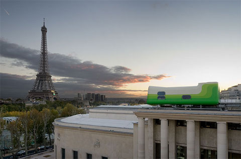
The hotel was constructed for the Swiss national exhibition in 2002.  It was built in Burgdorf and transported to Yverdon where it overlooked Lake Neuchatel for 4 months.  From June 2006 to September 2007, Hotel Everland sat on the roof of the Museum of Contemporary Art Leipzig in Germany.  Visitors could look at the hotel during the day, and after closing hours, it was reserved for the overnight guests.  The final destination of Hotel Everland was Paris where it sat on the roof of Palais de Tokyo from October 2007 until spring 2009, overlooking the Eiffel Tower.  After its stay in Paris, the hotel traveled back to Switzerland and has not run as a hotel since.  There are also no current plans for a future tour.

DSC_3822

I'm not surprised that Hotel Everland's operation as a hotel was very brief.  The practicality of a one-room hotel on top of a public building that can only be booked for one night is almost non-existent.  I have a feeling that of all of the hotel's guests, most were artists or architects who stayed in the hotel simply to study and appreciate the design.  But as a functioning hotel, there are many problems.  For one, you can only book one night which requires people to switch hotels if they are staying in the city for longer than one night.  Once travelers reach their destination, most do not want to pack up their bags and move again.  Also, the hotel was public to museum guests during the day during its stay in Germany which means that the guests only got to enjoy their room to themselves from 6PM until the next morning.

DSC_3823

Also, besides the amazing view, the hotel really doesn't have much to offer in the way of amenities.  There is no swimming pool, fitness center, or restaurant - additions that have become the norm in most 4 and 5 star accommodations, to which I'm sure Hotel Everland was comparable in price.  I would think that in order for Hotel Everland to be able to really serve as a functional hotel would be for it to be a parasite on top of an existing hotel and be able to use that hotel's services and amenities.

DSC_3824

Despite the flawed concept of a one-room traveling hotel, I think that the design of Hotel Everland is actually really wonderful.  There are windows on all sides, and the ends of the hotel are all glass, maximizing views with lovely picture windows.  Even though the room is rather small and compact, the amount of light allowed in by the windows makes it appear much larger on the inside.

DSC_3827

If it weren't designed to be a hotel room with no kitchen, this could actually function rather nicely as a studio apartment.  Perhaps the interior could be renovated to include a small kitchen nook.  I think that the other possibility for putting Hotel Everland back in use is to partner with a hotel chain and rent the room out through them, which would not only make it easier for guests to book and stay at, but allow guests to use hotel amenities and perhaps stay in a regular room if Hotel Everland were to remain available for only one-night stays.

DSC_3838

Otherwise, I think Hotel Everland will just remain a part of the collection of beautiful designs that just don't function.  Perhaps it will become a part of a design museum in Switzerland.  Despite its lack of success as a functioning hotel, Hotel Everland not only exemplified collaborative design, but challenged the concept of a hotel.

3/21/13

Centre Pompidou

Centre Pompidou

The Centre Pompidou is located in the Beaubourg neighborhood in Paris, France. The competition for Centre Pompidou in 1971 attracted 650 entries, and the winning project was designed by Renzo Piano, Richard Rogers, and Gianfranco Franchini. This building was unconventional because it took functional elements such as escalators, water pipes, and air conditioning to the outside of the building which allowed more free space on the interior of the building for displaying artwork. The elements are color coded by function: blue for air, green for water, red for elevators and safety devices, gray for corridors, and yellow for electricity. 

Centre Pompidou
There was a lot of opposition from people who did not like the idea of having a modern, colorful building in the middle of the centrally located historic district. Despite this opposition, when the building was open in 1977, it was an instant success. Today, the Centre Pompidou has had 25,000 visitors per day which makes it one of the most visited attractions in Paris.  It houses Europe's largest museum of modern art, a large public library, a center for music and acoustic research


In my models I wanted to show how the Centre Pompidou stands out from the surrounds. It is much larger in scale than the surrounding buildings, and it also stands out because of how modern and colorful the building is compared to the surrounding neighborhood. I like the modern new building mixed in the historic section, and it has become a very popular destination. The model on the right shows the color coding of the pipes and how they completely cover the sides of the buildings. I think it is interesting that the strategy of putting the structure and the mechanical systems on the outside not only helps the structure be understood, but it maximizes the interior space so there is plenty of room to show artwork. The facade facing the piazza appears mostly white with the main element being the circulation on the outside with the sides being filled with different colors of pipes with different functions.

3/20/13

Residence Wohlfahrt-Laymann - Meiner Schluter Wendt
Interstice - Space within Space


Image 1: After

Image 2: Before
 I think its important to preface this exploration with a explanation to the sub title: Interstice is defined as space between space, I like to think of it as the positive-negative or solid-void relationship architecture creates with its built footprint.

In this case by Architecture Firm Meixner Schluter Wendt, Residence Wohlfart-Laymann is a prime example of how "new architecture" creates a interstitial tension between both the new volume and the pre existing architecture on the site.

The concept of this architectural piece is very interesting to me because they decided to keep the already existing house on the site and affix/ envelope a new volume as if it were a apenditure growing off the building. The resulting form then became a modern "idea" of what was once their.

Image 3: Old facade made interior space
On the inside of the modern envelope one would fine the reminance of what once was. Once a red/white country cottage, you will notice they white washed the pre-existing residence and "extruded" through an extension of the second floor towards the front glazed facade, by doing this they created a bulhead "interior" volume adjacent to the new open foyer which is shown in both images 3 and 4.
Image 4: Extrusion creates enhanced interior space out of pre-existing front yard
Image 5: Section
In conclusion, as an interpretation of parisitic architecture this building is a complete success. While some may negatively critic the end result in form, the approach in concept is very strong and shows dynamic influence of architecture of the existing built environment. No this is not an attempt to redefine the approach to new construction, but instead a twist to methods. 


Serpentine Gallery Pavilion - 2012 Herzog and De Meuron

[arch]AEOLOGY: Designing from past footprints


EXTRACTION - Herzog and de Meuron's approach to the 2012 Serpentine Pavilion


At the Serpentine Gallery at the Kensington Gardens, London, UK there is a rotating pavilion exhibit held in the "front yard". Every year one of the best architects in the world is selected to present an example of their manifesto on the theory and practice of architecture. In 2012, Swiss architects Herzog & de Meuron and their Chinese collaborator Ai Weiwei were selected to do just that.

I chose to focus on this pavilion because the master plan was "manufactured" off the figurative excavation of all the previous years foundations, walls and details-superimposed together. At that point Herzog and De Meuron began to define their own spacial interests off of the three dimensional push and pull of the pre existing elements and lines.

In my opinion, this is a very strong stance on an architectural pavilion; to express a new architectural intent on a site as the excavation of historically significant foundations. Not only is the a strong concept for the serpentine pavilion but I think in the architectural profession as a whole and as layers and layers of new projects cover the globe, architects can begin to think of their given site/ project as a metaphysical relationship with "the past".  


FINAL FORM - With a suspended pool this pavilion redefines the capabilities of design and form


The Reichstag Dome – A Symbol of Unity


     In 1933, the original dome of the Reichstag Parliament Building of Germany was destroyed in a fire.  Further demolition of the building came with the bombings throughout World War II. In 1993, a competition for the re-design was won by Sir Norman Foster.

Interior View


     Foster’s idea for the new building included a large glass dome over the top of the parliament room. Inside the dome there was a conical structure bending down to the center point. This conical structure allowed light to enter both the dome and the parliament room below. It also allowed for visitors to the dome to see the parliament in action. Also inside the dome is a large screen that adjusts based on the position of the sun to provide just enough light to the space without it being too overbearing. The dome provides a panoramic view of Berlin and has attracted over 34 million visitors


Exterior View

   The transparency of the dome and the futurist structure of the dome symbolize the unification of the German people and a symbol of a more transparent, democratic government. The idea of visitors being in the dome and being able to oversee the actions of the parliament also symbolizes the idea that the people are above the government.


     In my model of the building, I wanted to explore the structure of the dome and understand the transparency of the structure as well as the shadows that occur. The cut section of the dome shows the exterior dome shape, the interior conical shape, and the visitor area in between the two.


Exterior

Interior


3/17/13

Modernity and Tradition


Modernity and Tradition


High-tech architecture, also known as Late Modernism or Structural Expressionism, is an architectural style that emerged in the 1970s, incorporating elements of high-tech industry and technology into building design. High-tech architecture appeared as a revamped modernism,  an extension of those previous ideas helped by even more technological advances. This category serves as a bridge between modernism and post-modernism, however there remain gray areas as to where one category ends and the other begins. In the 1980s, high-tech architecture became more difficult to distinguish from post-modern architecture. Many of its themes and ideas were absorbed into the language of the post-modern architectural schools.http://en.wikipedia.org/wiki/High-tech_architecture


Centre Pompidou is one of the most famous high-tech architecture designed by Renzo Piano.The first time I saw this construction,I feel deeply the contrast between the Pompidou and historical buildings around.Some people dislike high-tech architecture mainly because the construction materials are most steel and glass, which render the atmoshpere cold and uncomfortable. But when the Renzo Piano creates a  space specifically for local residents,this kind of feeling disappear at once.The large slightly sloped paved piazza in front of the building fulfills this role and introducing the building to it's traditional surroundings and Paris street life.


The main structure are moulded steel beam hangers.45m long girders rest on the beam hangers,which transmit stress though the posts and balanced by tie-beams .Those escalators exposed outsides and  carried by the structure coming out of the main steel beam serves as the main transportation system communicating each floor.The interior space has no columns and  the flow ability of the floor was enhanced .


I am extremely interested in the details of the beam and the spacial experience with cable,terrace glass and tunnel.So ,I drew some pictures there transport from my direct inner world to a visual world.Paris is an international ,culture-mix city, and the history it has make every Paris pound of .When I looked  cross the steel beam to the city at the top of Pompidou,I can feel the history of  Paris by looking at the city context ,building type and the movement of people downstairs.I suddently realise the most important thing that make centre Pompidou is not itself,it because Pompidous proves that modernity and tradition can interact and enhance historical cities.


3/16/13

The Rolex Learning Center


The Rolex Learning Center located in Lausanne Switzerland was designed by Japanese architects Kazuyo Sejima and Ryue Nishizawa. Construction on the center began in 2005 and was not completed until 2009. The massive center features a library, a center for language studies, offices, cafeteria, a restaurant and a lobby. Sejima and Nishizawa’s idea behind the unique design was to create a space that featured multiple different indoor/outdoor spaces within one structure. To do so they designed the roof and the floor to have a curving effect, which allowed for seven distinct interior courtyards. By giving the roof and floor an undulating shape it allows for the interior spaces to have an open and varying feel. In addition the Center receives more natural light and better circulation of the learning and office spaces. The design was inspired by pieces of sculpture and is often recognized more as a landscape than an actual building.  From above it is hard to see how the curves of the roof continue down to the ground, but it is very obvious when approaching the building. The Center is accessible on all four sides and was designed so that visitors have to walk under the actual building.

I found it very interesting how Sejima and Nishizawa took a basic square and created a space with continuous movement that engages its visitors from the interior and the exterior. I wanted to reflect the movement and the effect that the courtyards had on the building as a whole.  The model above shows the basic design of the roof and how when layered it creates a space of many levels. I also wanted to look at the light and how when direct sunlight shines through the courtyards it also flows through the entire building. While trying to create the same effect it showed me how each curve had to be particularly executed in order to create a structurally sound building.  I also wanted to show how the building does not sit directly on the ground. The sketches show how the building allows for people to access it by walking under the first floor of the Center. The second sketch shows how the curves of the building correlate to the elevation of the site.