Showing posts with label Zaha Hadid. Show all posts

10/29/12

Architecture Advertises

By Shawna Hammon
Lecture - "Strategy & Identity"


Our buildings have become billboards!  When did this happen?  Using architecture as a billboard is not a new phenomenon, but why does it seem like all of our buildings are suddenly advertisements for the latest and greatest technologies or product lines?  I thought we designed buildings so that form follows function; we are not supposed to create forms and hope that we can fit our functions into it – looking at you Gehry.

Using architecture to demonstrate the power of a company is definitely not a new idea, take, for example, the Chrysler Building by William Van Alen in 1930 and later the AT&T Building by Philip Johnson in 1984, these buildings, even to this day, still function as they were meant to, but are blatant advertisements for the men or companies that funded them; somehow this idea seems more romantic when the building still serves it purpose.

Chrysler Building           AT&T Building              Hearst Tower

A more recent example of this trend is the Hearst Tower by Norman Foster in 2006, called the “most muscular symbol of corporate self-confidence” by The New York Times; it was the first skyscraper to reach completion in New York City since 9/11.  Joesph Urban designed the Art Deco style base, which was meant to be capped with a soaring tower; Foster realized this tower 70 years later with the new and old “colliding with ferocious energy.”

Another example of architecture as a flex of the corporate muscles is the Vitra Campus, a furniture factory campus in Switzerland; it is akin to an architectural playground.  It identifies itself as an “experiment in powerfully communicative architecture,” but what, exactly, is this architecture saying?  The website proclaims that “Vitra stands for an architectural concept that unites buildings by some of the most influential architects in the world.”  The Vitra are “collectors” of architectural objects by the likes of Frank Gehry, Zaha Hadid, Alvaro Siza and the list goes on.  Why are they collecting these objects?  Simple, all of these objects are part of the shrine of power that Vitra has created.  Some of the pieces in this collection, but most especially Hadid’s Fire Station, have been accused of lacking a function entirely because the spaces are impossible to use or do not adequately serve the program they were built for.  The Fire Station has since been transformed into additional gallery space, but Vitra commissioned this work by star architects not entirely for functionality, but more for the status symbol the work brings to the furniture factory.  Perhaps Vitra is also attempting to elevate the status of the factory worker, similar to the AEG Factory by Peter Behrens and the Fagus Shoe Last Factory by Walter Gropius, with buildings that do not scream “factory.”

Vitra Factory Campus

A final example of this deliberate use of architecture as a means to advertise a product or brand can be seen in designer brand flagship stores such as Prada and Louis Voutton.  It is disgusting how much money these companies can dump into these stores.  This flagrant use of building as an advertisement for the product and power of the company is likely expected by its clientele.

Although as a profession Architects do not advertise in the traditional sense via TV or radio ads, our buildings do advertise our wares or those of the clients we have designed for.  Frank Gehry, among others, is a prime example of this.  How laughable would it be to see advertisements, like those of lawyers, on TV for architecture firms “Let Gehry design your next iconic structure.  No fees charged until you are completely satisfied!”

Just because we can doesn't mean we should.


Sources:

10/25/12

Design vs. Fuctionality


By: Khris Kirk


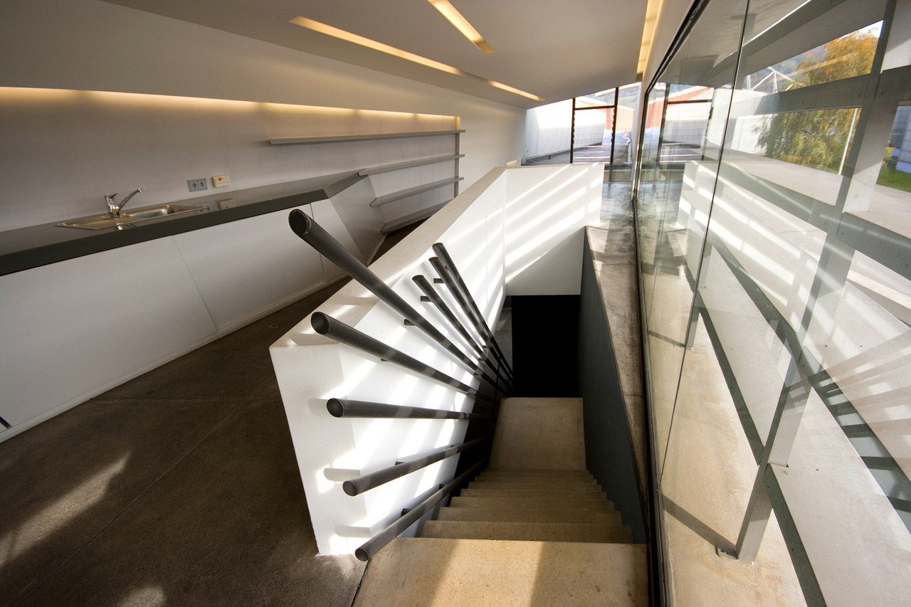
During the recent decades, architects have been trying to convey their ideas and concepts within the structures they are designing. Some architects take a subtle approach while others take a more drastic approach. When an architect take the more drastic approach, the next question to be answered is how functional is the structure. A prime example of an architect’s design not being very functional towards the program space is Zaha Hadid’s Vitra Fire Station.
            In 1981, there was a tragic fire that destroyed parts of the Vitra design campus in Weil am Rhein, Germany. The owners of the campus decide to redesign the campus and bring in well-known architects to design the different buildings across the campus. Among these buildings was the Vitra Fire Station. The company sought out an architect to build a fire station to prevent any reoccurrences of the devastating fire in 1981. This was Zaha Hadid’s first project to be built (ARCHdaily).
            Hadid approached this project in a very conceptual way. Hadid states that the “initial study of the Vitra factory site informed our designs for the Vitra Fire Station – a building conceived as the key element within a linear landscaped zone, the artificial extension of linear patterns in adjacent fields and vineyards – designed as a connecting unit rather than an isolated object; defining rather than occupying space.” This statement can be seen in her preliminary paintings.
            As she progressed in the buildings concept, she finalized upon the idea that the building is “movement frozen”. “A vivid, lucid expression of the tensions necessary to remain ‘alert’, to explode into action as required. Walls appear to slide one across the other, main sliding doors form a ‘moving’ wall” (Zaha Hadid Architect). Hadid took the concept of how firefighters live their lives and transformed it into a building, which still keeping true to her preliminary paintings.
            Hadid’s concept for the building is great. However, as a functional space, it is not so great. The layout of the fire station is a great representation of her complex concept of movement. The interior space is a series of walls that are bent, tilted and broken to accommodate the program space is inserted between the long, narrow planes sliding past each other. Then, the second floor is slightly off balance from the first floor, which creates a sense of spatial instability (ARCHdaily). By having the floor plans of the fire station conveyed this way it does stay true to the concept of ‘movement frozen’, but makes the whole space difficult for a firefighter to use effectively.
            A firefighter is suppose to be able to get his gear immediately and then proceed to the fire truck in the fastest way possible; so he can get to the fire and save lives. By making the fire station so engulfed in the concept, it makes the space for a fireman impractical to use effectively. In fact, eventually the firemen could not handle the living space and functionality of the building that they left the facilities. When the people of the program cannot use the space in the best functional way and end up leaving because of that reason, shows how poorly the building was designed. It is great for an architect to have a great concept that he wants to convey in the building. However, there is a point when functionality over-rules the concept, and Zaha Hadid’s Vitra Fire Station is the perfect example of how a concept was taken too far away from the functionality of the program space. Therefore, architects should try and create a concept to use for the foundation of their idea for a building, but should keep in mind how it will functional work for the program space they are designing.   


Links:
Zaha Hadid Architects, Fire Station
ARCHdaily, Vitra Fire Station
ARTchitectural, Zaha Hadid, Vitra Fire Station

9/30/12

Great Experience at the Venice Biennale 2012


By Seth Oliver
"Great architecture is the design of space that contains, cuddles, exalts, or stimulates the perosns in that space." - Philip Johnson. I thoroughly enjoyed the 2012 Biennale in Venice! The theme was Common Ground and focused mainly on the architectural response to it. I felt as if it was set up just for our trip as architecture students to benefit from. I learned so much from this experience. It furthered my love for a few architects and spiked my interest in others. I will still have to say that the 2 exhibits I enjoyed the most were from Zaha Haddid and Norman Foster + Partners. Both are very different but inspire me to think outside of the normal realm.  Each of them deals with the idea of a movement in a space but the approaches are very different.


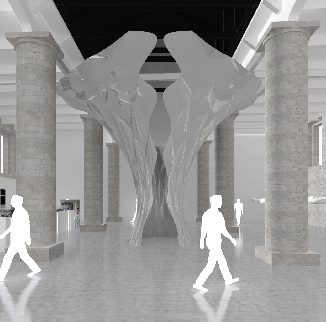
                The Hadid exhibition was all about the visual and the contrast of light and shadows. The main structure was a oversized platted metal piece. It looked similar to a lily before the petals have fully blossomed. There was an opening at the base, just large enough for a person to fit through and leading into a shaft with a small diameter that expanded as the metal grew taller. A single slit in the entrance separated the walls from coming full circle. The metal was cut and then bent in several different directions to fit this shape, but also to catch light at almost any angle. From the outside, the structure is elegant but commanding the attention of the room. Everyone is staring at it. However, inside the grand, silver petals, sound is close to being a loud silence. The inner circle fosters solitude and the feeling of being the only person in the room. I absolutely loved this piece of art. The power of a metal shield in a busy space is unreal. The level of detail is very precise and needs to be studied closely to really find the meticulousness of the work. It proves that no detail is too small to go unnoticed 


                The Norman Foster+ Partners exhibit was almost the opposite of the Hadid Exhibit. The space was dark except for the continuous moving projection of words in different directions on the floor and the constant quick slide shows and sounds. The Slide shows were all around the room and never had an image upon the wall for more than a few seconds. The images assaulted your eyes with the difference in colors from dark to bright at a quick pace. The content of the images varied. At one point there would be pictures of buildings and scenery with people laughing and getting along, and then there would be pictures of war, fire, crime and riots. The sounds were deafening and flipped from the fire of a guns to peaceful ocean waves and several others that came as quickly as they went. All of this put together made me feel as if I was meant to just stand and stare. Walking on the projected words was disorienting and there was nowhere else to go. The theme of common ground was extremely prevalent in this space. All people can experience joy and triumph, but also feel the hurt and pain of a struggle too.  I felt as if this was the first time I actually realized and comprehended that every other person in the world can feel exactly as I do. We are all human, but I just need reminding sometimes and this was the space that did it for me.


                I would definitely go back to this exhibition. I think there are a lot more things to observe and understand that I might have missed before. I know that my class was meant to see it as architecture students. We may have picked up on things that others did not, but it is in our hands to use the knowledge and experiences we gathered in Venice to apply it to our work in the future. 

9/29/12

Venice Biennale: The Material Side of Architecture


The Materials Side of Architecture
 By Rachel Gamble

During my travels this past week, I noticed a great variety of beautiful and interesting building materials. The red marble of Verona, the glass of Venice, and the rustic stones of Vicenza, among others, lent a rich historicism to much of the architecture that I saw. Yet other buildings, like the work of Carlo Scarpa and Tadao Ando, employed more high-tech and contemporary materials, giving their buildings a fresh and exciting sense of modernity. Through the choice and treatment of materials I saw during my travels, I was able to make comparisons between the various ways architects throughout history have employed different materials. At the Architecture Biennale in Venice, I was thus particularly interested in the exhibitions which focused on the importance of materials in architecture. As I toured the Biennale, I paid special attention to how the choice and treatment of materials shaped the exhibits and communicated the architects’ design goals.
In Anupama Kundoo’s “Feel the Ground: Wall House,” the Indian architect created a life-size scale model of her Wall House in South India. The exhibit used seemingly simple materials and traditional building techniques. However, in doing so, the Wall House demonstrated how valuable and relevant such construction methods remain, in spite of the high-tech world we live in. The house was constructed using handmade bricks, terra cotta tubes, and recycled materials – basic materials that exist in many different cultures and time periods. The materials themselves were made by Kundoo’s college students, Italian workers, and Indian craftsmen. These people were from several different counties but were brought together for the material construction of the exhibit. Kundoo’s exhibit demonstrated why traditional, low-tech materials and construction materials remain important in this high-tech era: through their ability to draw diverse people together to collaborate with one another in the creation of architecture.
Alternatively, Zaha Hadid’s “Arum Shell” represented high tech materials and construction techniques at the Biennale. The complex geometric sculpture was made up of lightweight folded aluminum in combination with a tensile structure. The project began with research and was then developed computationally based on a complex algorithm. By experimenting and testing the structural efficiency of the materials through technological means, the architect created an elegant and beautiful form. Through the cutting-edge materials and construction of this high-tech exhibit, I observed that architecture is constantly evolving and testing its boundaries. 
In the exhibits of the Biennale, many interesting materials from around the globe were featured, covering both the low tech and high tech ends of the spectrum. Exhibits such as Kundoo’s “Wall House” involved traditional building materials like brick, timber, and earth, showing how they are useful in bringing many different cultures together. In contrast, exhibits like Zaha Hadid’s “Arum Shell” were daring and visionary in material selection and technique. All the different materials and technological levels at the Biennale last week showed me how materials and construction techniques can be communicative. Together they tell the viewer much about the time period and culture of a design. In the words of Ludwig Mies van der Rohe, “Each material has its specific characteristics which we must understand if we want to use it. We must remember that everything depends on how we use a material, not on the material itself... Each material is only what we make of it.” Materials contribute uniquely to the architecture of which they are part. The Biennale showed me that architects should think beyond form and consider the impact that their material choices have on the built environment.
Wall House: Homemade Materials
Wall House: Photos of the Traditional Construction Techniques
Arum Shell: High Tech Tensile Structure
Sources
Mies Van Der Rohe, Ludwig. Illinois Institute of Technology. Armour Institute, Chicago, IL. November 1938. Inaugural Address.