9/30/12

Invisible Forms and How They Shape Space


by Arif Javed

          As I asserted in my previous blog post, the primary nature of an architect’s job is to shape space through the use of the architectural form. It doesn’t matter whether the space that is being shaped is a landscape or a building; the theory remains the same. However, in certain situations the most powerful experiential quality of an architectural work might not be the form but the lack thereof. It seems that oftentimes the way architects make a statement is through openly revealing how their design shapes space, but in my opinion an almost more powerful statement is made when the architect lets the form of the design be completely amalgamated into the landscape. Two such projects that use what I would term the invisible form are the Moses Bridge by RO&AD architects and the Blur building by Dilller Scofidio + Renfro.
            I always consider architectural bridge designs, especially pedestrian ones, to be fascinating because in these designs the experience is quite literally dominated by the path. I believe that a successful bridge design causes the destination to fade in importance as the journey becomes something to enjoy by itself. This quality is absolutely achieved by the Moses bridge, a pedestrian structure by RO&AD architects in the Netherlands that spans the moat of a Dutch fort that has been repurposed into a recreational structure. The form of the bridge is almost completely invisible; it is sunken, like a trench, into the water. This means that the water comes up almost to the edge of the bridge causing the bridge to completely fade into the landscape. The way I interpret this use of almost nonexistent form is that the architects wanted to take emphasis off of the fabricated structure while emphasizing the impact of the surrounding landscape. I think this work beautifully exhibits the importance of the architectural idea of shaping a procession through a space; due to the way the RO&AD minimized the form of their design they managed to not only emphasize the landscape but also add a new layer of harmony and communion with the natural elements by placing the occupants of the space within the moat.
            The Blur Building was designed and built in 2002 for the Swiss expo; thus it can essentially be considered as more of a temporary pavilion than an actual building. As this was the nature of the project this means that the project had basically no program but it is still an interesting work that functions somewhere along the line between installation, art, and architecture. The Blur was conceptually a building with no form; it consisted of two long ramps that took occupants out across the water towards a platform shrouded by a fabricated cloud. I think that this design challenged the idea of architectural form by creating a structure that has close to no form. However, though the project lacked a definitive form Diller Scofidio + Renfro absolutely used architecture to create an experience and sculpt the space. Similar to the Moses bridge, the experience of the project was largely defined by the procession that the architects defined. To reach this enigmatic floating cloud one would have had to walk out over the water until they arrive at a space and are enclosed by the “blur” and a wall of white noise. I would think that this work embodies a similar idea to the Moses Bridge in that while the visitors walk across the ramp they increasingly become immersed in the landscape until they reach the cloud which shrouds and isolates them while simultaneously unifying them with the nature of the site.
            After considering how these two projects function as architectural works while simultaneously challenging my conception about the function of architectural form I think I would like to amend the assertion that I referenced at the beginning of this post. I would now state that in my opinion the primary nature of the job of the architect is to shape space in order to create a significant experience. Usually this is most successfully done through an architectural form, but as the Blur building and the Moses bridge show it can be done equally as well by cloaking, getting rid of, or generally minimizing the use of form in order to maximize the impact of the landscape or site.

Moses Bridge

View of Moses Bridge from
 farther away
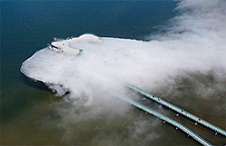
Blur Building


Biennale 2012: the Japanese Pavilion, "Home-for-All"


By Abbie Gentry

This phrase was painted on one of the walls in the Biennale Architecture 2012 exposition that we were fortunate enough to visit during our stay in Venice last week. This phrase stuck out to me because, despite its simplicity, it is a loaded and thought-provoking statement. What is architecture? What does it mean to be an architect? What are our responsibilities as an architect?

There was one exhibit that contained a section in which you could write on a whiteboard your definition of what it means to be an architect. You then took a picture holding the board and the pictures of the different people holding up their definitions combined to become a collage. One picture stood out to me because it read, “Sociological Spiderman: ‘With great power comes great responsibility.’” Though this phrase may have originated from a comic book, it makes the statement no less truthful. Though we may not work in a hospital with people’s lives literally in our hands, as architects, we are still responsible for the welfare of anyone who comes into contact with our designs. Architecture is more than simply insuring that a building will not collapse. We are charged with the task to design structurally sound, economical, sustainable buildings that will fulfill all of the needs of the clients and add beauty to the existing environment. Sometimes, our responsibility extends further. When disaster strikes, it is up to us to provide for the less fortunate and to lend our skills where they are needed. When Japan was struck by a tsunami in March of 2011, a group of architects undertook a project that would turn the suddenly homeless and poverty-stricken people’s lives back around. 

The Japanese Pavilion, “Architecture. Possible here? Home-for-All” allowed people to explore the design process that architects Kumiko Inui, Sou Fujimoto and Akihisa Hirata went through as they designed homes for those who suffered from the tsunami. Moreover, it set the perfect example for what architecture should be. The Commissioner, Toyo Ito, could not have said it better: “Since the modern period, architecture has been rated highest for its originality. As a result the most primal themes – why a building is made, and for whom – have been forgotten. A disaster zone where everything is lost offers the perfect opportunity for us to take a fresh look, from the ground up, at what architecture really is.” Architecture is not about building the tallest skyscraper or the fanciest house. Architecture sometimes needs to be concerned with the most basic of needs. 
As you walk through the pavilion, you can view the before and after pictures of the city of Rikuzentakata, the site of the project, which was struck heavily by the tsunami. It displayed the different iterations that the models had undergone until the architects had reached a decision on a final design. None of the designs were glamorous or particularly mind-blowing. However, it was the story that was so salient.

(some of the later models)


They began with a site visit and then began creating sketch models of their initial ideas. After much deliberation and many futile discussions with little advancement concerning a conclusive design strategy, they decided it was time for another site visit. Though the people had been emotionally devastated, physically displaced, and reduced to living in tents set up in temporary housing sites, they still managed to greet the architects with smiles and laughter. The sense of community amongst this burdened group inspired the architects, as did the story of Takata-Matsubara which told how the storm had scavenged the landscape until there was one lone tree left standing while the rest lay about the area, uprooted and useless. These very trees, however, became the starting point and synthesis for the project. Rather than importing materials for vertical structure elements, the cedar logs would more than suffice as columns. Moreover, they would create gathering spaces within the houses that would seem to be floating above the ground.


There is much to be learned from this example set by Toyo Ito and the accompanying architects. They designed specifically and intentionally for the clients by considering the sense of community and congregation that the people desired. By using local timber, the project was closely connected to its surroundings. Furthermore, the strategy was environmentally friendly since it reduced the amount of energy and resources necessary for transportation of building materials. 

Acuities in Landscape Architecture


Alessandro Giulio


INTRODUCTION
Located in the quiet seclusion of London's Hyde Park, lies the Diana Memorial Fountain designed by the architect Kathryn Gustafson. Since its opening in 2004, the Diana Memorial Fountain has attracted the masses in pursuit of both respects to the late Princess Diana and for personal contemplation. The fountain plants itself ambiguously within the spectrum between organic and engineered landscape architecture. The acuities between Space and the Senses are (in my opinion, of course) the hidden details that make the fountain an exceptional example of contemporary sensory landscape architecture.


ACUITIES between SPACE and the SENSES
When we construct walls around a given location, we create space; closed, clearly defined and often conditional space. But how does one design and ultimately provide for a sense of place without enclosing space? This is an issue landscape architecture continues to address. By consequence, landscape architecture projects range in their success of providing a sense of space. For this reason, sensory implementation allows for Kathryn Gustafson’s Diana Memorial Fountain to be a success project of landscape architecture. It should go without saying that the fountain holds a contemplative experience from approach to interaction. The following text is an experiential narration intended to portray the acuities between space and the senses.

You make your way into the grounds of Hyde Park. You wander through the tranquil landscape and suddenly you stumble upon the fountain in the distance. The fountain, an organic egg-shaped form, cuts across the Hyde Park landscape; a small collection of people are gathered at the form’s edge. You make your arrival to the fountain, where you would be greeted by a contrast in materiality and a sense of space. The architecture of the fountain, as you begin to examine, is slightly receding in the distance and provoking within you a sense of demarcation as the fountain gently carves out the ground in which you stand on. Standing on the outside perimeter of the fountain, you feel outside. You give a glance around the perimeter, where you quickly notice the footbridges that could bring you into the inside of the fountain. So you make your way around the fountain, closely admiring the changes in the waters speed and sound, briefly looking up to realize your place between the park and fountain. You reach a small footbridge that gently leads you into the fountain’s inside. The space you encounter is quiet and as welcoming as you would want it to be. You easily find yourself in a relaxed state of contemplation once inside the fountain; distanced from the perimeter of the fountain, yet within the fountain and its reaches of sound from the waters movement. At the fountain’s edge you see the collection of people from before, yet their voices are reduced to murmurs by the soft noise of water movement. A softscape path marks your return to the outside of the fountain, but you find yourself content with your position. Sitting on the lawn, on the inside of the fountain, you realize something. You are neither in or out of the any given space, but rather you are simply within the space sensorially.

BIG RED


Parc de la Villette

Bernard Tschumi
(written by: Jennifer Lenn)

        Like any work of art, architecture is a tangible statement communicating an artist's message or idea. The work, in turn, develops its own character defined by its architectural elements. In many instances projects are heavily or completely influenced by its location, people, circulation and, most importantly, the context. In my last blog i wrote about Axel Schultes'  response to the new German government on the Spree river. He used Spreebogenpark as a way to forever inscribe Germany's new identity on the banks of the Spree river. One thousand kilometers away in Paris, France, Bernard Tschumi breaks away from the tradition of referencing context and makes a bold red statement with his design for Parc de la Villette. Tschumi's goal for this park is clearly defined by its deep red structure and its obtrusively enormous scale. The 135 acre park sits on an abandoned plot of land previously used for the French national wholesale meat market and slaughterhouse on  the Canal de l' Ourcq. Rather than recognizing the history of the site or the landscape of the site, Tschumi proposed a park that is completely man made and controlled lacking any organic elements or forms and with a complete disregard for the history of the site.

      Tschumi's design was driven by a competition calling for a design that would respond to Paris' urban redevelopment of the 1980's. The brief for this competition called for an urban park for the 21st century. The contest was a result of the efforts made by President Mitterand to make Paris a more tourist influenced city. Out of more than 470 proposals, Tschumi's Parc de la Villette was most reminiscent in contemporary issues as well as the future while refusing to reference the history of the site. Tschumi developed an open yet direct path throughout the park. There are several open areas in which a more direct path will direct the viewer. From these spaces there are several ways by which a person may proceed through the site. Although the circulation alone may get slightly ambiguous, direction and orientation are always confirmed by the bright red coloring of the structure itself. Such circulation allows for "constant reconfiguration and discovery" throughout the park. Not only does the scale and coloring of the structure orient and define a place of discovery for the visitors but it also serves as a point of reference for the local tourists of the city.


        While aiming to stand out with his big red mess of metal, Tschumi explained the reason to his madness as a result of three principles of organization; points, lines, and surfaces. 
 POINTS Thirty five points make up a grid that defines the spread of the 135 acre site, which Tschumi referenced as "follies". These follies are each different than the next and unique in their own place but given their repetitive nature, they are meant to give the visitors within the park a point of reference so not to get lost in the space.  

 LINES  The lines within the park are just as random and various as the park itself. They are not governed by any means of organization or grid but rather are only directed by specified places of "interest" within the park. 

 SURFACES The surfaces of the park refer to the 85 acres of green space that scattered throughout the site. These surfaces are the part of the park given to the interaction of visitors with the park. The green spaces are dedicated to play, relaxation, socializing and typically to large open gatherings. 


     Parc de la Villette is a piece that stands out with its obnoxiously bright coloring, and excessive size. With complete disregard for the history of the site, Tschumi designed a park whose sole purpose is to orient tourists, being the bright red beacon of reference that it is. This is greatest bond it has to its location. Its size and material boasts the innovations of the 21st century and possibilities of what is to come in the future. As of now this park stands out as something abnormal and out of place but because it has put so much emphasis on the design of the future, it is only the future itself that will ever be able to define the normalcy of this work. Only time will tell the truth regarding the abnormality/normalcy of this project. 


REFERENCES: 


Great Experience at the Venice Biennale 2012


By Seth Oliver
"Great architecture is the design of space that contains, cuddles, exalts, or stimulates the perosns in that space." - Philip Johnson. I thoroughly enjoyed the 2012 Biennale in Venice! The theme was Common Ground and focused mainly on the architectural response to it. I felt as if it was set up just for our trip as architecture students to benefit from. I learned so much from this experience. It furthered my love for a few architects and spiked my interest in others. I will still have to say that the 2 exhibits I enjoyed the most were from Zaha Haddid and Norman Foster + Partners. Both are very different but inspire me to think outside of the normal realm.  Each of them deals with the idea of a movement in a space but the approaches are very different.


                The Hadid exhibition was all about the visual and the contrast of light and shadows. The main structure was a oversized platted metal piece. It looked similar to a lily before the petals have fully blossomed. There was an opening at the base, just large enough for a person to fit through and leading into a shaft with a small diameter that expanded as the metal grew taller. A single slit in the entrance separated the walls from coming full circle. The metal was cut and then bent in several different directions to fit this shape, but also to catch light at almost any angle. From the outside, the structure is elegant but commanding the attention of the room. Everyone is staring at it. However, inside the grand, silver petals, sound is close to being a loud silence. The inner circle fosters solitude and the feeling of being the only person in the room. I absolutely loved this piece of art. The power of a metal shield in a busy space is unreal. The level of detail is very precise and needs to be studied closely to really find the meticulousness of the work. It proves that no detail is too small to go unnoticed 


                The Norman Foster+ Partners exhibit was almost the opposite of the Hadid Exhibit. The space was dark except for the continuous moving projection of words in different directions on the floor and the constant quick slide shows and sounds. The Slide shows were all around the room and never had an image upon the wall for more than a few seconds. The images assaulted your eyes with the difference in colors from dark to bright at a quick pace. The content of the images varied. At one point there would be pictures of buildings and scenery with people laughing and getting along, and then there would be pictures of war, fire, crime and riots. The sounds were deafening and flipped from the fire of a guns to peaceful ocean waves and several others that came as quickly as they went. All of this put together made me feel as if I was meant to just stand and stare. Walking on the projected words was disorienting and there was nowhere else to go. The theme of common ground was extremely prevalent in this space. All people can experience joy and triumph, but also feel the hurt and pain of a struggle too.  I felt as if this was the first time I actually realized and comprehended that every other person in the world can feel exactly as I do. We are all human, but I just need reminding sometimes and this was the space that did it for me.


                I would definitely go back to this exhibition. I think there are a lot more things to observe and understand that I might have missed before. I know that my class was meant to see it as architecture students. We may have picked up on things that others did not, but it is in our hands to use the knowledge and experiences we gathered in Venice to apply it to our work in the future. 

Architecture According to the Landscape


 By: Francisco G. Zambrano

Fig.1: Personal quick sketch of the Moses Bridge.
     It's funny how things work out. Last week we talked about how architecture manipulates nature, and now this week we talk about how nature manipulates or rather influences architecture. The great part about this relationship is that the architecture is actually respectful of nature and tries to emphasize it. This is accomplished in many ways.

Fig.2: Beistegui Apartment view of Paris from rooftop.


Fig. 3: Hedge is down.
     We start with the Beistegui Apartments by Le Corbusier in Paris. In his task to try to hide some of the complications and impurities of the Parisian cityscape, he implements complicated machinery in order to filter and change the surrounding landscape. For example, on the roof garden, there are walls and hedges, which move electronically in order to hide or reveal parts of the surrounding cityscape (Fig.3). When one walks onto the roof top garden space, you are confused by the fact that there are furnishings that would normally be placed in a living room, yet are on the rooftop with a bright green grass floor. To top it off, you have the Triumphal Arch and the Eiffel Tower peaking up over the five foot white wall with the thin line of the surrounding mountain range along the top of the wall. The white wall manages to hide the complex cityscape yet keep in view the important monuments and the beautiful mountain range in sight. Then, when you are bored of the view or want to hide something, you simply move the architecture to do so.
    
Fig.4: The Moses Bridge in the Netherlands.
     It is interesting how one can emphasis nature. Le Corbusier did so by having architecture actually move in order to change the surrounding landscape. Now this is not always the case such as the Mosses Bridge in the Netherlands (Fig.4). This "bridge" literally hides itself in order to not interrupt the continuity of the moat or the simplicity of the site. When looking at the path from a certain distance, it literally is invisible, and as you approach it, the water and land slowly open up to reveal the a slit which is the bridge. What is amazing is that when seen from a distance, the bridge accomplishes to not interrupt the smooth current of the moat or the continuity of the land. This structure accomplishes to move you through a landscape that was only possible to do so in a story.
    
Fig.5: Blur as seen from afar.
     Another example of architecture, which tries to lessen the impact on its surroundings, is the Blur by the architects Elizabeth Diller and Ricardo Scofidio on Lake Neuchatel in Yverdon-les-Bains, Switzerland. Well, it is not that it wants to lessen its impact rather than the structure tries to blend in the landscape by mimicking a cloud of fog on the lake (Fig.5). From afar, that is what the structure looks like, a cloud of fog which rises and lowers depending on the temperature and either expands onto the lake or stays together in a stout cloud. The only way you can tell that it is a structure is by seeing the two bridges on which people walk on in order to enter the cloud. This structure allows people to experience what it is like to be in a cloud in the sky. Like the Moses Bridge, in a way, it allows people to be inside nature in a way that was only possible in stories.
    
     As seen in these projects, architects do not always want to shove architecture down natures’ throat, but try to blend the two together. I believe that in order for architecture to be more than great, it must take more than just queues from nature. It must respect and react with the surroundings’ like the Beistegui Apartments, the Moses Bridge and the Blur. These projects have done so and have even gone beyond by trying to blend with their surrounding.  

Biennale: A Different Perspective

By: Denver Sells

The Venice Biennale is one of those once in a lifetime experiences that for the privileged, can actually happen multiple times in a lifetime.  It is a must for any architecture student or professional if for nothing else other than the sheer degree of effort into the architectural exhibits, especially in the main exhibit space.  This year the one exhibit in the main space that really struck me was the Gort Scott, Robert McKillop and Renzo Piano Building Workshop exhibit titled “London Streets and Skies.”
In this exhibit, Gort Scott and Robert McKillop critiqued Renzo Piano’s Shard building in London.  Gort and Scott focused on its relationship to the urban setting via drawings of London along a path with the Shard being experienced within that, vs Robert and McKillop created a video that showed the Shard from several different locations and perspectives around the city.  On the surface, this seems like a very simple project that just analyzes the relationship visually of Piano’s building to London, but as you spend more time there, really diving into what is being said and talked about in the exhibit, you realize that is almost a mockery of the building, at least that is how it seemed to me.  To me, both firms saw the Shard as almost this sore on the face of London, instead of something beautiful that is supposed to be there or fits in.  For instance, Gort and Scott’s drawings are focusing so much on the small little town blocks, that when you see the Shard, it seems out of place.  It is much the same story with Robert and McKillop, where their perspectival photos are beautiful, until you notice the big Piano project ruining the almost “perfect” ambiance and atmosphere that is created in the foreground of the photos.
This just really interested me and I feel it applicable to my future architectural projects because its not just the immediate area that is effected by our buildings, it the surrounding areas, especially if it is a skyscraper.  I’m not saying that Renzo Piano’s Shard is ugly, but I feel after this exhibit I have a much different opinion about it and skyscrapers in any setting.  I think too often we get caught up just trying to maximize the space in our site, and forget the greater cultural and physical impact of our building.  This is something that I want to try to keep in mind as much as possible as I go through school and my career, because I think considering that sort of thing is what separates a good architect from a great one, because you have to be conscious of so many other things about your building, other than just if it looks cool or is environmentally friendly.  Maybe Frank Lloyd Wright did have something with his prairie style – low impact on the environment physically and visually.  I think this is admirable, and I also think putting that thought should almost be obligatory, not something that is accidentally noticed.


Does the Landscape Move, Or Do I?


By: Denver Sells

            It is hard to think of landscapes as a moving entity, but if you start to really analyze the space, you can usually find something that makes the landscape move.  For instance, even just the addition of people can change it into a moving landscape, because then the people become part of the space.  For instance, The High Line in New York City could be considered a moving landscape because of the addition of people moving through the space from one end to the other.  It starts as an elevated train track converted to a garden space with paths that don’t cut straight through, but meander their way through the space, from one end to the other, thus when people are added, whether they are moving upstream or down, they are still moving within the space.
Also, people can be influenced to move through the space by not just the paths, but also fencing.  Fencing can act as a movement item as well because it can block you and force you to change direction and thus move in a different way than expected, or it can run parallel to a path and help to guide or define a path, especially if it creates a corridor effect, which could signify rapid movement.  Additionally, a ramp can have somewhat of a similar effect in the space.  If you have a circular ramp, I know at least from personal experience, I am going to want to explore it, thus moving through the space.  This sort of hide and seek effect can be a powerful way to move people through a space and can sometimes provide a very strong reveal of a vista or lookout of the space or at least an opportunity to look back at where you just came from or are going.  This hide a reward is something that I have experienced in very well planned spaces.
            Another interesting aspect of a space that can make it a moving space, is something completely natural and can not be changed by humans: the seasons.  However, one can celebrate the season change or even the change in light during the day.  For instance, if you have a promenade, the light and shadows are going to change along the entire length of it, on a daily basis.  Then, when it gets to the opposite end of the year, in a different season, the shadows will be completely different just because of the natural change in position of the earth in relation to the sun.  This can create a remarkable effect, and something that gives the space that little something extra that really invites you in and makes you want to stay.
            Moving spaces to me are more interesting, and certainly more dynamic.  And I think it takes more effort to effectively make a moving landscape, thus why when you find one of these places, you want to spend a lot of time there, because it invites you to, it welcomes you, it puzzles you, and rewards you along the way.  Humans like a challenge, especially if it comes with a reward such as an amazing view or a cool shadow.


(http://www.freetoursbyfoot.com/new-york-tours/highline003.jpg)
(http://lawprofessors.typepad.com/.a/6a00d8341bfae553ef0154345667b1970c-800wi)
(http://waterandpower.org/Historical_DWP_Photo_Collection_LA_Public_Library/San_Fernando_Mission_92.jpg)

9/29/12

Morphing a Linear Cityscape


By Emma Lyne Pouch

            When I think of a landscape it is a view to vast, open spaces and scenery for miles and miles with varying greenery scattered throughout. Landscapes are spaces that are meant to be enjoyed at a slow place and inflict different emotions upon those who experience it. But what happens when you are surrounded in a city of millions of people where high rises are the view for miles. The idea of landscapes we originally formed in our heads has been transformed to something far different. Now we see architecture and find beauty in it instead of greenery. In these landscapes we lose the rebirth that comes with the changing of seasons and overtime the city areas’ quality diminishes. It is in these places that we have to step in and form new ideas and plans for a city.
            In New York City we find a division of spaces designated by the five boroughs all connected by bridges, tunnels and busy streets.  These elements form a moving landscape that take us through the city and allow us to see and experience the architecture at a different pace. In the late 1990s the Van Alen Prize in Public Architecture held a competition to redesign New York’s East River, taking it from overlooked to a highlight and vital space in the identity of New York City. The winner was Reiser and Umemoto whose “project proposed submerging parts of FDR Drive in order to create a continuous, linear park where the East River meets Manhattan.” This plan would bring together the diverse vehicular, pedestrian, commercial, and cultural infrastructures in a twisting manner that corresponds with the rise and fall of the FDR. The incorporation of public programming in the space breaks down space yet leaves it with the same continuing flow.
            It is this division that gives the area meaning and purpose. This theme has been studied and continues to be prevalent through design in architecture and landscape so it makes sense to see it occur when we study landscapes that are solely architecture based. In this proposal by Reiser and Umemoto we find the transition between the high speed of FDR and the low speed of the city grid. The two are interwoven in a way that the people occupying the space feel like they are part of something instead of a second thought to the traffic of the city. Those interacting with this stretch of the city can experience moments that are organized along the linear urban morphology whether they are walking along the street or merely passing by in the car.
            Reiser and Umemoto’s design revitalized a space that was once over looked and thought of as the grime of a city plan. Today the area of the East River Park allows for people to experience different views contrasting the powerful architectural designs to the traffic flow of the city and the water of the harbor along a single stretch. No longer is it a boring drive to work but a moving landscape that frames a view of a one of kind city.


http://www.vanalen.org/competition/recent/04_1998_EastRiver

The Design of the Natural: A Complexity in Designed Landscapes


The Design of the Natural: A Complexity in Designed Landscapes
By Joel Pominville


Homage to El Lissitzky - Lucien den Arend


            There is an incredible complexity in designing landscape that results in several solutions. All solutions maintain a manmade element, but some are able to overlook the manmade by attracting the eye with a form or design that is so seamlessly naturalistic looking. Some designs are manmade materialistically, but, in form, they push the eye into seeing a natural form. And others remain so unnatural that they begin to push away any human attraction at all.
            
A perfect example of the first solution is Lucien den Arend’s Homage to El Lissitzky. Lucien den Arend, a sculptor born in the Netherlands and raised in California, was asked to create a land sculpture outside of the test center of the national Road and Transport Department of the Netherlands. It would serve not only as a sculpture, a landmark, but it would serve as a sound barrier for the center. His solution was a mass of formed earth in a crescent shape across the road from the test center. This is a great example of the first solution as it is manmade, but seems as if some strange movement in the tectonic plates of earth could have created it in that very spot. I applaud den Arend for creating such a simple and elegant form that does not feel out of place as it serves the needs of the clientele as well.
            
Maritime Youth Center - Bjarke Ingels Group
One can look to Bjarke Ingels Group for evidence of the second solution. The Maritime Youth House in Copenhagen designed by BIG was a conceptually driven form that began to take shape as a landscape of its own. In order to cover up a bad area of ground on the site, they took a flat plane and created a sloping, morphing plane that broke away from the ground using push and pull diagramming. The slope took on materiality with many long planks of wood creating these sloping surfaces. Where the plane “rises” up, they allowed for air-conditioned space for the clientel. I find this project so astounding, not only architecturally, but naturalistically as well. Although they were not asked to design landscape, they designed an artificial landscape that addresses nature in a formatic way, not so much materialistically. 

Hualien Beach Resort - Bjarke Ingels Group

Another project by BIG worth mentioning is the Hualien Beach Resort project in the process of being completed and juried to be constructed. This project, seen next to the Maritime Youth House, has more of a naturalistic materiality. However, it is even more so natural in the way the designer has decided the form. Bravo to the Bjarke Ingels teams for designing in a way that did not hide the artificiality of the project, but respecting the nature in which we consume with designs.
            
Villa Garden - Gabriel Guevrekian

The last solution left to mention is a much less appealing, and less natural solution. It is a result of over control of the form and function of the landscape that, in a way, destroys any kind of feeling of nature. This ties directly into my blog post about the cubist gardens. I discovered through analysis that there seemed to be a very cold nature to the cubist gardens by Gabriel Guevrekian. It is a result of controlling the design solution to the extent that it loses all original intentions and natural precedents that existed prior to the design. In a way, this result of designing landscape is the least desirable. There was a time in design that it was normal to create new ideas of natural elements. But, in my opinion, the complete human control and manipulation of landscape and disregard for the preexisting nature should never be welcome.


Architects/Artists:

Information:
http://www.denarend.com/