12/5/12

Preserving the "Country Cottage"

Wohlfart-Laymann House 
Arch.: Meixner Schluter Wendt
(Jennifer Lenn)

       During a time when the idea of a post-modern style poisons the idea of beauty in architecture design, it is easy for many of the older buildings to simply fade into the backgrounds of history. Buildings that, at one point stood out in innovation and design serving as a crucial living place, now seem to get lost in the predecessors of today's architecture. I grew up in a small house, in a small town, the southeast region of the United States. In this small town, architecture was not an elaborate demonstration of the world's latest innovation and technologies, but it made is presence known by providing the necessary means to serve its function. A common theme seemed to exist among many of the houses which dressed this town and, in turn, began to mold my ideas of a "home". A simple square floor plan consisted of a kitchen with only enough excess space to accommodate a small table to hold a family meal, a small living room area and only enough bedrooms to provide for a "typical" size family (which means that some rooms were shared by siblings). 
       These simple floor plans  were typically constructed on top of a 3 foot crawl space defined by an exposed wall of cement blocks. The "architecture" itself contained little or no ornamentation but the overall construction dressed the centralized space with a wrap around porch which allowed for a very personalized adornment by its inhabitants. Today, architectural innovations have challenged and evolved the idea of a "home" and these simple structures have come to seem somewhat primitive. As I have moved away from my small town and exposed myself to many other ideas, places, people, art, design, and structure through my studies in architecture, I see more and more how people view these older homes as being tasteless and/or disdainful. However hideous these homes seem to my fellow peers, I have and will always maintain a certain admiration for this style of home. 
       While many architects today do everything they can to navigate away from styles of the past, there are few that embrace it. This is why I am particularly enthused to see the work of Meixner Wendt on the Laymann House in his efforts to preserve a simple house of the 1930's. Aside from its location in Frankfurt, Germany, the overall structure of the house is very similar to that of the vernacular "home" I became accustomed to in my small town. The house exists in the Taunus hills area which is right outside of Frankfurt. Initially, the goal was to enlarge this space by replacing the existing house with a bigger one, however, Wendt had a better idea. He decided to preserve this "traditional, simple country cottage" by expanding on it with a protective "shell". The shell he proposed implemented elements of post-modern architecture to complement the remains of the 1930's which it would encase. You can see, by looking at the plan, how the outer shell interacts with the original house plan based on predetermined functions of the original house. The walls of the original house were also painted a soft off white to complement the shell. The openings of the original house are broken open to allow for light to come through the shell and provide proper lighting inside. Encasing an original structure with a new shell puts an intriguing play on the relationships between indoor and outdoor spaces. What used to be an outdoor patio is now an indoor porch with a completely different atmosphere. 
       I really appreciate Meixner's efforts to preserve such a quaint and picturesque space while really embracing the architecture of the 1930's. He was able to do all this while still implementing his own design and complementing old architecture with new architecture while embracing and enhancing the overall atmosphere of the space. 


11/24/12

What is the Value of Temporary Design


In our last class of Contemporary European Architecture we discussed the importance of temporary architecture in the design field today.  One question that kept coming back to my mind during class was the question of whether or not architects should be putting great thought into designing temporary pieces of architecture if they are going to be taken down anyway.  I came to the conclusion that whether these pieces of architecture are going to be taken down or not, they should have the same design process as a normal building. 


What does temporary mean?  Temporary, in terms of a building, can be described as something that is built with the knowledge that one day the building will be taken down.  In this day and age, a building is not built to stand for 500 years, therefore, in a way, a buildings are temporary in a sense.  If you think about a building in that way, then all buildings deserve the same design process, because all space need to have thought put into them to be impacting spaces nonetheless.
A good example of a well designed temporary structure is the German Pavilion by Mies van der Rohe in Barcelona.  This Pavilion was built in 1929 at the International Exhibition.  The pavilion was torn down in 1930, as it was to be a temporary exhibit at the exhibition.  The pavilion was revolutionary in its design and a true masterpiece.  It was lost for many years but was rebuilt in 1983 to the architect’s specifications.  The fact that this building was so influential in its year of existence shows how well designed it was by Mies.  I would argue that a temporary piece of architecture like this can be just as influential as any other “permanent” building.  It the building invokes emotion and feeling within the viewer then it is a successful building, whether it is there for 2 months or 20 years.
The Serpentine Pavilion in London is a great example of why temporary exhibits should warrant the same depth of design that longer term buildings do.  Each year a new pavilion is designed to go in the same place.  The great thing about this is that it invites completely different design styles to take place on the same site every year.  This way, the site has a fresh new feeling every year with the new pavilion.  Every pavilion has its own specific style and specific strengths in design.  If a pavilion were placed there that was undesigned and never rethought, this area would be much less interesting.  The refreshing new designs make for an experience that  cannot happens many other places because a new building gets built every year.
I believe that temporary buildings should be designed as equally as longer term buildings.  All buildings will one day come down, it is just a matter of when they will come down.  Therefore, we need to put thought into every structure that is designed so that all architecture can make meaningful moves to impact the viewers.  This allows for interesting design situation since it is a temporary structure.

11/23/12

Intention of Jean Nouvel

Social Housing is an important issue in architecture, it is often said that architects have a social responsibility to the public and along with sustainable design creating affordable social housing is seen as one of the best and most useful ways to fill this social responsibility. It is a really challenging project type to try and create a project that can accommodate to all the living needs of any number of different people in a way that they can live comfortably and happily, but also to construct in cheaply enough to make sure it is available to lower class citizens and can actually have a chance of making a positive social impact within a community. I think the most interesting example of this kind of architecture that we have seen in class is the Nemause social housing project in Nemause, France designed by French architect Jean Nouvel. This project really shows an active interest in creating a situation that could improve the social and economic situation in the town for a number of people even if the question of whether or not that was accomplished cannot be completely answered.
There is one point that came up with this project that I found particularly interesting, and it’s an idea that I came across when writing about Parasite blog post and the Sicilian houses in which the residents would add on in order to update their homes in a useful and affordable way. This was the idea of open source architecture in which the power of design is made available to those who have the most access and stake in the way in which a project is realized, the end user. In the Nemause housing project apartments are sold to residents as empty unfinished and unfurnished rooms and the organization and design of all of the interior space is left to them. Yet a kind of open source was never planned for by the architect or the city, the open ended nature of the apartments being sold seemed to be more as a means of keeping the apartments at an affordable price by letting users select their own finishes. Though I find this to be the most interesting aspect of the building it was never really intended to be a factor that drastically effected the overall design and intention of the building, in fact the architect went out of his way to make sure that he could limit the amount to which the residents could affect the appearance of the space by making them sign a clause saying they would not touch the concrete walls even within their own apartment. It seems strange that the thing I most like about the building would be something the architect was trying to stop from happening, I think it is very valuable that the façade could be changed by the user and the building could be constantly updated, and Jean Nouvel in an interview stated that he wishes the building to be stuck in time period in which it was designed, to never stray far from the specific vision he saw for the how the people can use his project.  
 

11/22/12

What Makes a Pavilion Successful?


by Tyler Norton

What makes a pavilion successful? This is a question that has been on my mind as we work on our projects in studio. In class, we studied pavilions as a form of temporary architecture. However, my group members and I are including a permanent pavilion at the top of one of our structures. I feel that since our pavilion will be permanent, there is more pressure for it to be well designed. Therefore, I wanted to utilize this post to study a few good examples of successful pavilions.

            To me, a pavilion represents a gathering space above all else. Whether it hosts seating, an event, a restaurant, a gallery, or in the case of the Serpentine Gallery Pavilion, no function at all, a pavilion will always provide a space for people to congregate. If for nothing else, these three pavilions are successful because they shape space in a way that is interesting, inviting, and innovative. This attracts people to gather there to appreciate the space.

            The 2009 Serpentine Gallery Pavilion by SANAA was meant to amplify the way people experience things, be it through sound, sight, or feeling. The concept and form was based on summer and nature since it was to host the annual summer party. SANAA strove for it to be a light and airy structure and I think that it was very successful because it accomplished the preset goal and it blended the boundaries between outdoors and in, which is another prominent theme in SANAA’s designs. Another project that focused on summer was Zaha Hadid’s 2007 Serpentine Pavilion, which was only there for a week to host the summer party. The main goal of the pavilion was to provide shelter to the party. It serves to shelter the pavilion from sun during the day and at night it provides light from lights that are underneath and travel up the veins of the fabric. Air, light, and fabric are all able to travel through the three structures and the light that travels through is meant to “highlight the geometric intricacy of the pavilion” with it’s light play. I think that this pavilion was very successful because it provided an interesting gathering place, which was its function. The final pavilion that I’d like to talk about it is Mies Van Der Rohe’s German Pavilion. The concept behind this project was to “give voice to the spirit of a new era” in Germany. In other words it was intended to be a self-portrait of the new Germany. It’s a very simple form with extravagant materials create an open plan that serve to suggest a “floating form.” I find this very successful because its openness perfectly symbolizes what was intended.


            All in all, I have come to the conclusion that each pavilion is different. These are all successful but in different ways.  Each one sets out to accomplish something different and each one does. As long as a pavilion accomplished the pre defined goal it can be very successful and interesting. 

Nemausus Housing Project


“Housing in the Mass City” was a lecture in which we studied different examples of social housing, condominiums, high-density residential compounds, etc. We looked at many models, good and bad, of what a housing complex should be. This lecture helped me form my own opinions on what should be included in an apartment complex and what is important in a good design. One example that stood out to me in particular was Jean Nouvel’s Nemausus Social Housing project. This compound contained many of the aspects that I think are important and I therefore find it very successful as well as interesting.
           
            Among the most important things that every social housing project should be is sustainable. Nouvel’s project was sustainable in a few different aspects. Probably the most prominent of these was the way that Nouvel cut construction costs. He used simple, industrial materials and minimal interior finishes. This technique is efficient because it does not use as many materials and they are more readily available so it does not waste fuel trying to transport them a long way to the site. He used a simple structure, which was easy and efficient to build. Nouvel also placed his structures on the site in accordance with sun angles to maximize their heat intake.

            The second thing that I think is very important in a housing compound is an open plan and flexibility, which was one of the main concepts of Nouvel’s project. He organized the plans of each unit to have one main core but with no other dividing walls. This leaves the rooms up to the tenant. I think that this is effective because it serves to leave the space convertible. Another way that Nouvel makes the space flexible is the large wall made of all windows that can also convert into a large sliding glass door. You are able to make the unit even larger by utilizing the outside spaces. Nouvel uses this blending of outdoors and indoors in more than one place within his design. All of the corridors are located outside on the balcony. This gives the whole building a pleasant atmosphere where the line between indoors and out is indistinct.

            A few other amenities that Nouvel included in his design, which I think are very important and effective are: the parking garage located beneath the apartments, the green spaces for each unit and the common spaces through the building. This space includes a small park located in between the two buildings as well as the balconies with seating all along them. Each unit is larger than a standard apartment complex, which Nouvel accomplished by keeping open plans and adding the “back porch” balcony. 


            All of these things together add up to make a very successful housing complex. Not only does it include many wonderful aspects, but also each unit is unique, interesting, and tastefully designed. This complex would be a place that I, as an architect would love to live and I really appreciate the design aspects.

11/21/12

Pavilions that Communicate


By: Arif Javed

            What is the function of architecture that has little to no programmatic elements? Pavillionaire architecture is architecture that generally houses almost no program and is oftentimes temporary in nature. Though it might seem that designing something with no program would be an architect’s easiest job, I think it is the biggest test of an architect’s skill. The function of a pavilion is solely to create a meaningful, memorable spatial experience. In some of the pavilions we looked at in class I noticed that due to this being the central function of this type of architecture some of the projects actually worked as physical commentaries or dialogues on the nature of architecture. In particular, I thought the Barcelona Pavilion by Mies Van der Rohe and Peter Zumthor’s Serpentine Pavilion functioned as such essays on architecture.
            The Barcelona Pavilion represents not only a singular vision for what a piece of temporary architecture can be, but also a singular vision for what an architectural space can be.  The pavilion is a deep, multi-layered essay on architecture that makes its points while providing examples of them. Mies managed to take all the most basic elements of what constitutes an architectural space and mould them into a spatial experience unlike any other. His consideration for form, material, light, vision, and detail is shown in the way all of these factors form a constant dialogue with each other throughout the project. In this way, it could even be said that the Mies created a communicative building; one that is a treatise on the architect’s ideas of how to use each of the elements to add to the spatial experience. I think that the clarity with which the pavilion communicates Mies’ ideas proves that it is truly a genius work.
            Peter Zumthor’s temporary project, his take on the Serpentine Pavilion, was another such project that manages to communicate the architect’s ideas on the nature of architecture with clarity. Ironically, Zumthor made his pavilion a communicative piece of architecture by reducing the actual architectural form of the building. The only things left after his reduction were black rectangular walls that defined a path through the space into a central green space. This reduction of the physical elements showed that Zumthor considered the path or the physical and emotional experience of being led through a space to be the dominant part of the spatial experience. I think that with this project Zumthor truly managed to find his own language with which he could shape a unique and rewarding experience and communicate the idea that the procession or path through a space is just as important, if not more so, than more physical architectural elements. Despite his use of a highly conceptual architectural language for this project, I think the real strength of it is that the average viewer could probably easily understand the underlying concept of the project.
            These two projects are both notable examples of pavillionaire architecture simply because they manage to use unimposing architectural elements to define significant spatial experiences. I think the key idea found in both of these projects is that they both stick to a specific language and then use this language to communicate the ideals and motifs that the architects hoped to imbue within the architecture.


Plan diagram of Zumthor's Serpentine Gallery

Perspective of Mies' Barcelona Pavilion, shows overlapping plans and material palette
Sketch used to explore Mies' language of overlapping rectangles and overhanging roof


The Stockholm Public Library: Artistic Functionalism

By: Arif Javed


            Few buildings that I have studied are as perplexing to me as the Stockholm Public Library by Gunnar Asplund. The project was completed in 1928, and is essentially done in what could be classified as a neoclassical style. It is a monumental project, with a clear parti of a circle inscribed in a square. The project is perplexing to me because on paper it sounds rather odd: a symmetrical, monumental orange library with a central drum and rectangular geometry aside from that. However, I have fallen in love with Asplund’s library because once I studied it I realized that it a strong and pure embodiment of architectural ideals. As I learned more and more about the ideas that shaped the building I began to appreciate the purity of the geometry, the functionalism of the plan, the simplicity of the way he used the Classical language, the beauty of the path, and most of all the underlying artistic thoughts behind the project.
            My last blog post brought up the ideas of the language of a piece of architecture as well as whether or not that building is communicative of the concept that the architect wanted the space to embody. I don’t think Asplund could have used the classical language in a more effective way than he did in the library: the stark exterior is only marked by a band of classical ornament that solidifies the language into one that suggests the solemn, scholarly nature of the buildings function. This lack of ornament emphasizes the classical geometries that Asplund chose as the skin for his monument to the search for knowledge. Though the language is classical, the ideas behind the geometry ring of contemporary lessons: the main space is immediately apparent from any view of the building and it is simple to read the function of the interior spaces simply from looking at the exterior. The lay out of the plan is also more contemporary than classic in conception; it is a purely functionalist lay out that works in a very open and free manner. However, a perhaps more beautiful aspect of the plan is that it facilitates the occupants quest for knowledge and books due to its lay out.
             The nature of the genius of Gunnar Asplund is shown by this lay out; it is clear that Asplund thought of the beauty of the functional lay out to be a form of art. Asplund drew no division lines between the artistic and the architectural; his attention to practicality was also his aesthetic of simplicity and clarity. Asplund the artist can also be seen in the more experiential qualities of the interior of the space. Asplund’s lay out and design carefully formed the procession from the ground floor lobby space to the main cylindrical space. The occupants enter in a small, black marble clad lobby space and are then directed up a relatively narrow staircase. However, this succession of smaller spaces artfully sets up the grand entry into the cylindrical lending room due to the sudden and beautiful widening of the space into the main space. Asplund considered this procession to be something akin to the viewer walking into a metaphorical brain (the cylinder) and searching for knowledge.
            The way Asplund worked with absolutely no distinction between the artistic nature of the building and the architectural functions is true genius in my opinion. It is shown in every aspect of the building, from its exterior geometry to the path dictated by the lay out of the interior. In creating a library that not only houses knowledge but actively facilitates the quest for it Asplund truly managed to find beauty in the functional and make function beautiful.

Plan of the library, shows the narrow procession into the main space

Exterior view, showing Asplund's inventive use of the Neoclassical language

The functional yet beautiful and grand interior main space 

Paradoxes in Architecture: The Artistic Expression of Zaha Hadid


By: Arif Javed


Architecture is a constant paradox. It has to be simultaneously concrete and abstract, theoretical and practical, conceptual and physical. To me, Zaha Hadid’s Vitra Campus fire station (and maybe her entire career) is an examination of this constant paradoxical nature of architecture. I think the fire station also is at the crossroads of what classifies as architecture and what classifies as art. Zaha Hadid absolutely refutes the notion of form following function and chooses instead to base her form on the statement or artistic expression that she wanted to present through the architecture.
            The fire station is essentially a manifesto that is articulated through the composition of forms that are derived from highly conceptual and theoretical ideas. This project is a bold manifestation of Zaha Hadid’s personal takes on the nature of architecture and how space should be conceived as well as realized. To me, the project stands out because it almost occupies a space that is somewhere between physical and conceptual. This was an intentional effect of the building, shown by the acute attention to keeping the pureness of the concrete plane unadorned by roof edges or cladding. The glazing even lacks framing, yet another detail that heightens the impression of the building as abstract idea that people can somehow move through than an actual concrete artifact. Even though I do not necessarily find every aspect of the building to be appealing, when I look at it I can clearly see what the architect’s concept was.  It is impossible to look at the building and not see exactly what Hadid had in her mind; her statement that architecture should be a composition of forms dictated by spatial relationships derived from factors such as function, landscape, movement, etc. can be read clearly.
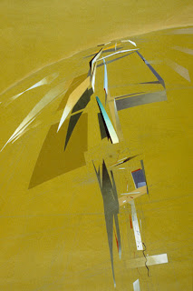
            Hadid’s fire station also explored the relationship of art and architecture, as well as blurred the division line between the two. The project began as a series of abstract paintings by Hadid that were the “conceptual mediator of finding spatial relationships and form (Kroll, 2011).” To me, this means that Zaha Hadid approached the project with an idea of composition that was more artistic in nature than architectural. This shows that Hadid’s conceptions of her forms are completely divorced from what their possible functions would be. The architectural language that Hadid uses comes directly from the paintings. It is thus a language that is derived from the idea that simple, hard edged forms can be composed in such a manner that the space formed with them and around them is complex and expressive. Though as a building the project might not have functioned as a fire station as well as it should have it clearly succeeds in its more grand purpose: being a bold artistic statement of Zaha Hadid’s Deconstructivist ideals.
             All architecture exists in the paradox of what is physically realized and theoretically conceived. Zaha Hadid’s project embraces this idea by truly being the concrete manifestation of abstract theoretical ideas. It rejects the traditional Modernist notions of form and function in favor of a completely personal view of form being generated by an artistic synthesis of philosophy and architecture.


Perspective painting by Hadid, first stage o f design process

Sketch of Hadid's artistic exploration of spatial relationships on the site


Perspective view of the resulting forms and theoretical language

Sources:
Kroll , Andrew. "AD Classics: Vitra Fire Station / Zaha Hadid" 19 Feb 2011. ArchDaily. Accessed 24 Nov 2012. <http://www.archdaily.com/112681>

Redefining Advertisements


Emma Lyne Pouch

           Any successful salesman knows that it isn’t just the product and location that makes a store flourish it’s the advertising. Today’s companies have to go beyond a big sign or a nice ad in the newspaper to be noticed, they must be innovative in a new approach to catch the attention of the buyer. A brand that has recently taken on this challenge and going further than imagined is Prada with their very own virtual campus. These projects use architecture to change the way we experience shopping as well as merging the design elements of fashion and construction. We see this in two different scenarios; one being the Prada flagship store in New York City while the other is a sculptural piece in Marfa, Texas.
            For the first major statement piece, Prada commissioned Rem Koolhaas and his firm OMA to design their flagship store in New York City.  The building was designed to reflect the fashion and couture within. The center of the store is like the valley between two hills; standing there you find a smooth wooden hill on one side and enlarged stairs on the other. The hill contains a fold down element that serves as a stage for shows as well as display during business hours while the stairs can display merchandise or be seating for shows, films or other events taking place within the store. To compliment this design there is a large wall designated for a mural that changes with the new collections.  Another element that complements the rotating fashion designs is the use of technology within the space. Large screens along the walls and small panels hanging around the clothes show pictures and videos that relate to the themes and inspiration of the collection.  Upon the completion of this store, Prada had sparked an interest with the average shopper. Rem Koolhaas successfully created a space that people wanted to interact with and experience for themselves. That is the best kind of advertising, it isn’t a simple commercial or a nice picture that people might consider for a second and then never get around to. This project pulls them into the store and challenges the way the consumer is involved in shopping.
            The second radical move by Prada was commissioning artists Elmgreen and Dragset to create a permanently installed sculpture in Marfa, Texas. They found a comedic side to architecture in placing what is designed to look like a Prada storefront on the highway in the middle of nowhere. They kept the design simple with two large display windows and a nonfunctioning door that allows passersby to view the small collection of Prada shoes and bags chosen by Miuccia Prada herself. This is a second and very different form of advertisement through art and architecture. Instead of sparking interest through fancy modern designs in a big city, they choose the opposite approach in placing a simple, unusable space in a rural area to get people talking on the statement Prada is trying to make. In both approaches Prada is getting their name out there and expanded their art to more than just fashion, this is taking an interest in other ways of expression to showcase what this company is all about. 

Timeless...

by: Francisco G. Zambrano

          Some people consider clothes to be architecture. Before this past lecture on temporary architecture, I would have disagreed with this statement a little. First off clothes are constantly changing every four months, styles come and go in a blink of an eye. The more and more I list the “differences” the more I can see the similarities. Especially when comparing clothes and temporary architecture.

        Simply by looking at the definition of temporary architecture. That which has a short lifespan that allows for experimental techniques to show new ideas. They also help us understand how Architecture can communicate to the world. This description is exactly what fashion is. It is a way that designers and people are able to communicate with the world and try out new techniques of construction, material usage, etc. Most clothes are temporary.

Fig.2 Seattle Space needle
Fig.1 Serpentine Pavilion by Toyo Ito 2002
            Shoot, there is also something that is similar to fashion shows for architecture, the London Pavilions. Every year, an architect is chosen to design a pavilion for Hyatt Park. In these pavilions, architects normally showcase new materials, new ways of construction, new understandings of organization and their way of design, or what they believe is the new “style” of architecture. For the past twelve years, architects have introduced to the world “styles” that have come and gone, but then like in fashion some designs have been made permanent.

Fig.3 Coco Chanel and her LBD
Fig.3 501 Levi jeans
            These pieces of architecture have been thought of as timeless such as the Eiffel Tower, the Glass Palace, the Space Needle in Seattle and the Barcelona Pavilion. These pieces of architecture are like the little black dress of Coco Channel or a pair of 501 Levi Straus jeans. These pieces of architecture and fashion were on the edge of their time and showcased the best of technology and design. They both paved the way for greater pieces and allowed for further advancement in their respective areas. But where as in fashion, the pieces are reproduced, in architecture these pieces remain as one of a kind, truly timeless pieces that lead the way to a better future.

Fig.4 Eiffel Tower leads the way in the modern use of iron construction