4/17/13

The audacity and contradiction of the Plan Obus


    During the period between 1932 and 1942, Le corbusier was working unoffcially and non-commissioned on the Plan Obus that aimed for the city Algier for a long time, he proposed 6 different but very similar projects during this period. Although no part of the projects he proposed were put into construction, it considerably affected his later works and became an influential and most studied case in modern architecture and urban planning.
    However, after I went through the background and details of Plan Obus, I am surprised by his intention and ambition in this project. 
    First of all, I have to admit that this project turned out to be very ambitious or, we can even call itIn audacious. Corbusier envisioned the city Algier as the future capital of African and the connection point of African and mainland Europe. In his master plan for the city it shows that he designed Business center, civic zone, Industrial area, Civic zones, Leisure zones and Gardens and even week-end center.


Master plan of Plan Obus, Le Corbusier.
Source: 4.


Perspective rendering of Plan Obus, Le Corbusier
Source: 1.

What features the most in this design is a long arching elevated Viaduct that contains 14 residential levels beneath it to connect the city center and the suburbs. Even in this rendering photo this elevated highway looks gigantic and formidable. Something cannot be ignored is the fact that the city of Algier was actually divided by the indigenous Arab Casbah community and the colonial European community. The highway that works as an indispensable part in Corbusier's design is actually a bridge spanning over but not directly connected to the Casbah area that offers high speed transportation from above but ignore the poor traffic condition below result from the narrow and complex streets. It is not difficult to read the superiority of French in this Plan and to surmise Le Corbusier's support for the European colonization of Algiers.


The green area represents for Arabian quater, the blue represents for the sea.
    What contradict here is, firstly, from the record it shows Le Corbusier actually chose to stay in the Arabian area which was considered to be very dangerous among the Europeans at that time; What’s more, he really appreciated the way Arabian lives and he expressed this in his books.  He wrote " O inspiring image! Arabs, are there no peoples but you who dell in coolness and quiet, in the enchantment of proportions and savor of a humane architecture?" and he contrasted the European city in which" civilized people are hold up like rats."
    Obviously his affection was not so strongly expressed in his design. Although some areas and buildings were to be put into preserve, the historical Casbah was neglected while the European quarter was ornamented in neoclassical style that represents no connection with the local culture of Algier.


Source:
1.       ʻMachines for livingʼ,Reflections on Le Corbusierʼs Plan Obus (Algiers) & Unité dʼHabitation (Marseilles), Hugh Pouliot. Graduate Journal of Visual and Material Culture
Issue 4 | 2011
3.      <http://www.bidoun.org/magazine/06-envy/blocking-the-casbah-le-corbusiers-algerian-fantasy-by-brian-ackley/
4.      <Le Corbusier, 1938-46> Les Editions d’ Architecture Zurich, 1946 fur Architektur Artemis Zurich Sixieme edition 1971.

Infinite Motion - BIG 8 Building

Infinite Motion- BIG 8 Building
by Victoria Shingleton


Bjarke Ingels Group's 8 Building apartment complex design for Copenhagen, Denmark is a unique solution to maximizing housing and commercial units within an urban environment without compromising privacy, green space, or views.


Commercial units were placed on the ground level so that merchants can have easy access to their store space, and residents above can have privacy and less foot traffic.  The plan of the building is in the shape of an 8 in order to maximize green space and views.  The front corner of the building was brought down to ground level to maximize the amount of sunlight which reaches the apartment units.  It also allows for infinite circulation around the building.  The crossing point in the center of the 8-shape serves as a central atrium and lobby location for the residents.


The shape of the building and its allowance for infinite circulation immediately made me think of the project that my partner, Abby Buckingham, and I have been working on this semester.  Inspired by the Mobius strip and wanting to create a path for continuous motion within a small space, we decided upon the infinity symbol (8 shape) which allows the user to constantly walk through and around the structure.

@infinity concept model - project by Abby Buckingham and Victoria Shingleton
I was very impressed and inspired by how BIG used three dimensional diagramming to organize their space in a way that not only maximizes space but is efficient pragmatically.  Diagramming is such an important tool, and I think it makes perfect sense how site factors alone can determine the shape and orientation of a building.  I believe that it's very important that as we move forward in architecture, we do not allow new technology and innovation in construction and design overtake environmental factors, but that we take advantage of these tools to work with nature.

Flirting with Surrealism: Le Corbusier's Maison de Beistegui Apartment Roof Garden

Flirting with Surrealism: Le Corbusier's Maison de Beistegui Apartment Roof Garden
by Victoria Shingleton


The Beistegui Apartment designed by Le Corbusier stands out as an outlier in his work.  While it exemplifies one of his principles with the roof garden, many fixtures are more decorative and ornate than his typical clean Modern lines, flirting with Surrealism.


The Parisian apartment was commissioned by a wealthy client named Charles de Beistegui who was a collector of surrealist art and liked exaggerated imagery and overstuffed furniture.  However, there are some spaces of the apartment which are surreal without necessarily being influenced by Beistegui, such as the roof garden.  While a roof garden does follow Le Corbusier's five principles of modern architecture, the fanciful furniture, fireplace, and grass "carpet" suggest a surrealist experience.


The purpose of the project was to create a penthouse, not necessarily for living, but for hosting parties.  While the garden was located on a rooftop with wonderful views of well-known Parisian monuments, Le Corbusier designed the garden wall so that it would actually restrict the views from the garden, turning the great monuments into tiny pieces of art sitting on the shelves of his outdoor living room.


The roof garden was comparable in size to a living room, and the walls were approximately five feet tall.


While the apartment itself was lit by candlelight, the backyard was very advanced.  All of the hedges on the rooftop were controlled by hydraulics and could be raised up and down to control the view.


The rooftop garden was also detached from the house and required a separate stair to reach.

The apartment was located in such a central location.  Above, I diagrammed the views from each facade and how the roof garden manipulates the vision of different points.  Each wall has a different monument visible beyond.  Yet, only the tops of each are visible, as if they are trinkets sitting on top of living room shelves.


I cut out just the roof garden which sat on top of the apartment.  Without the fireplace and decorative furniture, the structure appears very modern and fits in well with the rest of Le Corbusier's work.


I found the Beistegui Apartment very interesting in how it differed from Le Corbusier's typical style of architecture, and I wish there was more information available about this design.  However, this is typically omitted from collections of Le Corbusier's works.  Unfortunately, the apartment has since been destroyed, and there are many missing documents, so the most we have to remember Le Corbusier's experiment with surrealism are the black and white photos.

4/16/13

Centre Pompidou: An Urban Catalyst


As I write this, the plaza of Piano's and Rogers' Centre Georges Pompidou is bustling with life; tourists running from La Cathedrale de Notre Dame towards Les Halles and the Louvre, college students taking a cigarette break between classes, native parisians making their way through the sea of visitors, all unassuming of the massive structure that changed the urban landscape of historical Paris.

The Centre Pompidou, or the 'Beaubourg' as parisians and frequent visitors to the city tend to call it, revitalized the former parking lot from a place of urban decline to a center of art and information. This transformation was exactly what President Georges Pompidou had in mind to bring Paris to an powerful position in 20th century architecture. His idea for the Centre lay within the belief that a regular man should have access to information, culture, and the arts. He believed that the city needed to be restored to its former cultural glory and position in the art world.


Richard Rogers and Renzo Piano won the competition in 1969 with an incredible structure and plaza that brought back the Paris of the Impressionists; the Paris renovated by Haussman where it was important to see and to be seen. This new interpretation of urban landscape makes the plaza in front the Centre the place to be. From the plaza you can see the inverted skeleton of the Beaubourg, which allows larger open space on the inside. The walk across the plaza leads you parallel to the the tubular staircase, allowing you to view the iconic outer structure.

The Centre Pompidou has certainly catalyzed circulation through this area and probably will continue to in years to come.


History can be traced

Studying from the 2012 Serpentine Pavilion


“As we dig down into the earth to reach the groundwater, we encounter a diversity of constructed realities such as telephone cables, remains of former foundations or backfills. Like a team of archaeologists, we identify these physical fragments as the remains of the eleven Pavilions built between 2000 and 2011” ~ Herzog & de Meuron and Ai Weiwei, from their Architect's ststement.(http://www.serpentinegallery.org/pavilion2012/pavilion/#architectsstatement)


The 2012 Serpentine Pavilion was designed by Herzog & de Meuron and Ai Weiwei. It is the twelfth commission in the Gallery's annual series,the world first and most ambitious architectural programme of its kind.The design team are responsible for the Beijing National Stadium,which was built for 2008 Olympic Gname,works together again in this project.

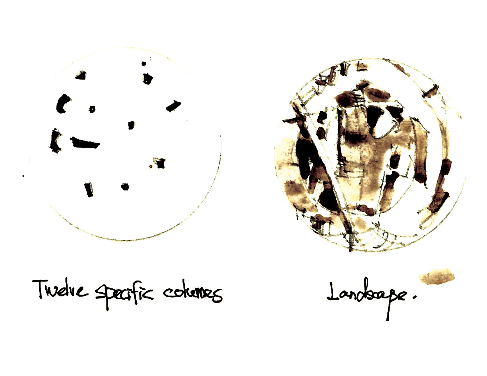
Their path to an alternative solution involves digging down five feet into the soil of the park and incorporate the water underground into their pavilion which they have not expected.What surprised them further is the a diversity of constructed realities, such as telephone cables, remains of former foundations or backfills .Like a archaeologists ,they identify more fragmentsas the remains of the eleven pavilions built between 2000 and 2011. Because of these remaintants,the design team made decisions to design by tracing the hidden history instead of moving it away.

Inspired by the footprints of the previous eleven Pavilions,the designers overlap the previous shapes of the previous eleven Pavilion and extracte the physical fragments of the remains as the foundations ,columes to invent a space combining topography and history. By digging down,the pavilion will invite the vistors neneath the lawn follow the similar circulations and continue to do what the vistors have been doing in the Serpentine Gallery Pavilions over the past eleven years.

The columes extrude from the foundations of each single Pavilion serves as the support system of the
well  which floats a few feet above and helps to collect the rainwater from the sky.The water in the well at the top reflects the park and sky around it and also resembles an archaeological site to invite visitors to trace the history.The pavilion’s interior is clad in cork – a natural material with great haptic and olfactory qualities and the versatility to be carved, cut, shaped and formed. The quality of this interiors materials connects the soil and Pavilion in an continuous way and also illustrated the spirit of Herzog & de Meuron that his dedication to materialization.


4/15/13

Transparency: Casa del Fascio


The Casa del Fascio, designed by Giuseppe Terragni, is an excellent example of a super-monument from the 1930s.  The transparency of the building is a fascinating topic to expound upon.  Built in the Italian rationalist style, Terragni designed Casa del Fascio as an administration building for the Fascist Party under Mussolini and intended for there to be little or no border between the public and fascism through his use of transparency.  For example, large windows surround the conference rooms so that full communication is possible between the public and the people in power. Also, the first level of the front façade opens up so that political rallies could take place properly.  The multi-layered quality of the façade also contributes to the transparency of the structure by creating frames to the outdoors.  In the cuttings shown below, I have chosen to focus on this transparent aspect by demonstrating how the two layers of the façade combine to produce a more welcoming and open feel.


Mountain Dwellings - BIG

Mountain Dwellings


The Mountain Dwellings project in Copenhagen by Bjarke Ingles Group (BIG) consists of apartments above a multi-story park. The parking garage has enough space for 480 cars and there are 80 apartments that are arranged on a slope that resembles a hillside. This project sits directly across from the VM Houses project that BIG completed in 2006.

The Mountain Dwellings were designed to try and combine the luxuries of a backyard with urban density. Therefore, the parking area turned into the base where housing with terraces could be placed so the housing and the parking work together as one building. The structure developed into a concrete “hillside” covered with a layer of housing from 11 stories down to the ground. The apartments need air, light, and views so all the homes also have roof gardens giving the apartments a suburban neighborhood look with gardens flowing over the “hillside.”

The sketch on the left shows the basic organization of the floor plan for the project. The sketch on  the right is of the back of the 'hillside' at its highest point.


I made a model of the general shape of the structure of the Mountain Dwellings. I think that it's a very interesting idea to combine a parking lot and a building by making a group of apartment buildings resemble a landscape, and I think Bjarke Ingles Group was very successful in doing so. The model shows the basic organization of the apartments, and the shape of how the apartments move upwards and backwards up a hillside. It starts at the top with only a few and the row of apartments is longest in the middle, and then it shortens again as it reaches the ground.


4/14/13

ONL's Acoustic Barrier


Perspective


     It isn’t often that you get called to build a sound barrier along a highway that houses a car showroom. ONL took this challenge and ran away with it, designing a continuous mile-long structure that is seamless in its design.


Joint Connection

     The Acoustic Barrier and the “Cockpit” are made as a single structure, a set of individual poles that are cut, numbered, and bolted together. These poles combine to form an organic shape designed with the speed of a passing car. This form was created as a cloud of points with simple connecting beams. As the barrier crawls along the highway, it bends and twists in a way to make the building interesting.

Showroom Interior
  

   In the showroom area, the structure extends up and over the roof providing an immense amount of natural lighting to display the cars inside. This also allows the cars to be seen from all angles, even from across the street.


Night View


     I think that this structure is really interesting how it seems to grow from the landscape. The structure to me is the most interesting part. It seamlessly transitions from the barrier into the cockpit with little differentiation. Seen at night, the cockpit shines, clearly revealing the grid structure, and constantly displaying the luxury cars parked inside.

The Rolex Learning Center - A Monumental Experience of Structure and Light


Interior View
     The Rolex Learning Center in Lausanne, Switzerland is a breathtaking piece of architecture worthy of the title “supermonument”. The building is massive, containing only a single floor comprised of a library, student workspaces, a multipurpose hall, a café, food court, and restaurant, as well as a career center, numerous offices, a bank, and a bookstore. Not only are these spaces contained within the structure, they’re all connected with no visual barriers between the separate spaces.

Floating Structure

     The floor of the building curves up and down, creating a series of hills and plateaus inside, and a series of spaces for use as outdoor patios. This curve makes for an interesting look due to the placement of the structural columns underneath that make the building seem like its weightless. The roof of the structure also follows this curve and has minimal visible supports that make it seem like its floating. Because the roof and the floor are made as two separate units, they had to be designed to be able to adjust to the changing environmental conditions.

Aerial View Showing the Exterior Patios
     The numerous “holes” through the structure create external patio spaces for social interaction, but that’s not all they do. Windows surround the areas and allow light into the central interior spaces. Combined with the light coming in from the exterior glazing, the entire structure becomes naturally lit, reducing the amount of electricity needed to light the building. There is also a system in place to naturally ventilate the space (except for in the Library and the Restaurant).

     Not only is the Rolex Learning Center a supermonument because of its size, but also for its interesting and carefully planned structure, as well as its use of natural light and ventilation.

Night Shot: The roof seems to float on a cushion of light.

Silodam,lifestyle in AMS
Comtemporary house interpretion by MVRDV


Silodam is one of a group of large residential slabs designed by the Dutch architects MVRVD between 1994 and 2007.It is prominently located on Amsterdam’s waterfront. From the distance, its colorful, rectangular form can be easily mistaken for shipping containers reminded of a time when Amsterdam’s port was more flourish as an industrial dock.
House Types


MVRDV’s primary ambition with this project was to offer buyers a great deal of choice in their living arrangement. Despite its simple rectangle shape, the building offers a high degree of diversity in apartment size ,color,orientation and configuration. To give the sense of organization and scale, the building was broken down into four large sections and the apartments were grouped into “neighborhoods” of between four and ten units of the same type. The interesting expression of colors and materials on the facades try to reflect the interior arrangement by giving each neighborhood a different exterior treatment.


MVRDV’s initial plan for Silodam included a variety of communal and public spaces to complement the residential component. Unfortunately, due to financial problems, many of those spaces were removed from the plan. Three notable remnants of that plan still remain. The most impressive one is a large wooden terrace designed for both residents and the public. It can be accessed by climbing the large wooden stairs that pass through corridors of the building.

Another thing I want to illustrated is the facades.The facades gives the sense of shipping containers representating the history context of the olf silodam.The exteriors are sampler of windows and wall materials,details and colors.The basic transparent reflective qualities are established by the use of glass but other materials include aluminum panels, reinforced cement, glass curtain walls, brick and painted steel.The use of bright colors, orange, blue, white , red and black ,reinforce the polychrome imagery and connected with the spirit of MVRDV designs which focus on comtemporary interpretation of housing.


4/13/13


Expansion -Block-Expansion
Development of Potsdamer from the view of city context


Potsdamer Platz is a central point in Berlin with a long history and grand urban aspirations.
The main square and surrounding district were extensively re-developed from 1994 - 1998.
The development was one of Europe’s biggest urban construction projects and was planned
by a team of international architects under the leadership of Renzo Piano.


I am pretty impressed by the development of a Potsdamer Platz over two century.How this
area develops somehow represents the history of human activities .As a architect,our design
shape the interaction between people and surroundings. I am also very interested in the new
urban design of Postdamer Platz by Renzo,how it link the present with the history and how it
connects the city.
Potsdamer Platz is a microcosm of Berlin, its history reflecting the social forces affecting the
city over the past four centuries.This area was first defined in the 17th century when a new city
wall was built to line the western edge of a public square.
By 1831, the Potsdamer Gate area was a tourist center with a railroad station,hotels, and restaurants. With the National Socialist's rise to power,many houses  were demolished to make way for a huge area to house monumental buildings for the Nazi party, state, and businesses.
Even though many houses also destroyed by allied air raids,life quickly came back, with stores and restaurants opening after world war II.
But with the Berlin Wall constructed in August of 1961,separating north-south through Potsdamer
Platz. All the buildings east of the wall were cleared to give border guards open fields.
The fall of Berlin wall in 1990 brought great hope for urban progress and opportunity to connect north and south together.
The urban design by Renzo Piano ,in the end,primarily shaped the new
development.
The most successful truly part of the public areas of the district are two public plazas that site
adjacent to one another at the heart of Potsdamer Plataz. This two piazza points out the main
entrance of underground train station .And the piazza also serves as the space for public ,political
and social activities .
However,I hold the opinion when most paths lead to the covered mall,those buildings serve to
remove people from the actual public spaces into indoor streets.As it is now ,the privatised public
space dominates the area.Except from this ,overall ,it is a successful urban design define the
commercial and entertainment sector of Berlin.