3/14/13

Urban Parasite

When we hear the word parasite we automatically think of a gross insect that sustains itself by drawing life from other human forms. However, Korktnie Stuhlmacher defined parasite quite differently. He applied the concept of a parasite to pre-existing buildings to create more space without the additional systems needed for the sustenance of the building. With this P.A.R.A.S.I.T.E. project, he used infill or unused spaces of existing buildings and their water and heating systems to create more space. The parasite also adds a bit more color to the grungy Rotterdam factory.

The thought that this small dwelling was prefabricated and built in 4 four days is something wonderful to consider for urban areas that have speedy population growth and lack of space. These things could virtually go anywhere and can use the existing systems in the host building. My question is, why isn't there a boom of these parasite dwellings all around growing cities?


Simplicity at its Finest

Each of the summer pavilions of the Serpentine Gallery have been unique in addressing the conditions of the Kensington Gardens. As an architecture student, it is inspiring to see the vast array of ideas that have come to exist in this area, one after another. No matter if you think each one is successful or not, there is something to be learned from every installation. That being said, while studying these pavilions, I found one of the most interesting projects to be the structure designed by the SANAA firm in 2009. While this pavilion does not have the most interesting qualities, I feel that it contains a depth that is not found at surface level.
SANAA uses the idea of reflection to make a statement. While the abundance of this material does certainly have a bold effect on the space, reflective material, in my opinion, is a common approach to the concept of blending landscape and architecture. The use of this material does not seem to be successful in the way the architects intended. Instead of reflecting the landscape and surroundings, it only reflects the ground beneath the canopy. However, apart from the materiality, I think SANAA is very conscious of the purpose the pavilion: it is a pavilion. The firm creates this type of architecture in its simplest form, making a very powerful statement. They created a shelter from overhead weather conditions that is integrated with its surroundings, all the while providing people a place to gather. Architecture is sometimes overdone and excessive. SANAA is backing away from that notion, showing us that it is sometimes very simple. The organic shape also goes along with the idea of playing off of the landscape.
In this model, I want to show the effect of the reflective canopy. Though it is meant to reflect the scenery around the pavilion, it is only effective in reflecting what is directly below the roof. I think this pavilion makes many strong statements, but this is not one of them.


Wohlfahrt-Laymann Dwelling: Exterior/Interior Reversed


The Wohlfahrt-Laymann house is a residence near Frankfurt am Main in Germany. The home was designed by Meixner Schluter Wendt Architekten for Jurgen und Juliane Wohlfahrt-Laymann. Construction began in 2005 and was completed in 2006. The original site had a 1930s house already built there, and rather than demolishing this traditional “country cottage,” the architects decided to use it and integrate the home into their design. This was no mere renovation of an existing structure: this was a total envelopment and penetration of the “country cottage.” A rectangular structure was built over and around the entire cottage, as if a historical relic had been found and needed protection. The cottage went from an interior and exterior structure to existing entirely as interior.

                I was interested by this unusual relationship between interior and exterior which occurs within the project. The facades of the cottage, formerly protecting the chambers within, become part of the chambers themselves. A front door no longer marks the threshold between interior and exterior, but instead becomes a portal from one room to another. I immediately wanted to recreate this “house in a box” with a paper cutting. I made a few sketches which I transferred into cut files, then made the cuts and folded them into place. The result is a stereotypical image of a house, made into 3 dimensions, and then literally enveloped inside 3 walls of paper.
                The image of a little house inside a long, shadowy rectangle is striking in itself, but the bottom view of the cut-footprint is the most intriguing aspect of the model. It gives an idea of what the interior of this interior home would feel like, almost like looking at a doll’s house (where there is also no exterior).


Natural Architecture

Architecture is created for viewing. It's an inhabitable form of art. Architects design structures for the aesthetic appeal as well as its functional use. So, what happens when a building must be built, but cannot be seen? When architecture becomes invisible, is it really architecture anymore?
I'mlostinParis is a very intriguing projects that straddles the line between architecture and landscape. The private residence was designed by the radical architect R&Sie(n), who took a very literal approach to green architecture. So literal in fact, that it confuses the public. However, François Roche, principal architect of R&Sie(n), asks, "Do we want nature to be domesticated and purely sympathetic and predictable, or do we want nature which brings some aspect of fear or danger or psycho-repulsion?"


In this cutting, I want to explore the entities of architecture and nature. Though I'mlostinParis is camouflaged to the public, it is no doubt still considered architecture. So what qualifies it? When landscape is manipulated to act in a certain way, we have architecture. The architecture may seem invisible to us, because it is not architecture in its ordinary state. However, landscaping is its own form of design. So it seems that in reality, there is no line dividing architecture from landscape. 

Here I want to show how plants can be manipulated to serve as wall, floor, and ceiling. This is landscape architecture in a very pure sense. However, we all know that landscape architecture includes gardens, lawns, and any environment where the fauna is manipulated in an aesthetic way. Therefore, landscape is architecture. So where do we draw the line? Is a mowed lawn considered architecture? I think the line is drawn between nature that is planned and tamed and nature that occurs naturally. Therefore, architecture is indeed designed. It is not a natural thing, though nature is manipulated to become architecture.

“Cities. Architecture and Society”---Convertible city,interaction between past,present and future.

. With the population grows rapidly,more than half of the world’s population lives in cities.Urban life is characterized by interaction of economical,social,geographical,political and creative progresses of transformation.Compared with the expanding of cities in Asia,the form of Europe city is largely determined by history.The restructuring of industrial society as well as  changes challenges architects and urban planner in Germany and also in Europe.Meeting these challenges means discovering new ways for interaction between past,present and future.

I was first impressed by this picture.For the first time the pavilion extends its space by means of an additional staircase structure leading from the main hall to the roof level.These element refine the Germany pavilion as a transitory space and alive the unused roof as an palce for communication,offering wonderful perspectives.By this way of design,the German pavilion serves not only as cspace for the exhibits, but becomes an exhibit in its own right. The superimposition of the historic edifice with the temporary structure becomes a landmark of the building.


Another project surprising me is the Rucksack House Ort .This light and empty cube offers a way of improving housing quality on an individual basis.While being insides a private space,one has the impression of floating outside .Fold structure and a multitude of built-in windows insides provides extra space with natural light and beautiful viewpoints.The box is suspended from steel cables but prominently placed and structurally engineered,anchored to the roof or to the facade of the existing building.It is a visual sign and alive the idea of self-built tree house,but we can get new space by a simple,clear and understandable method.

What I chose to do my cuttings and analysis on, was the great contrast of this structure with the buildings connecting with it .For the first pavilion,I am trying to show the great contrast between past and present .For the second cube house,I will show how convenient it is to constructed in different conditions .


Those sketch shows my personal understanding of cases.Concerning the great urbanism in Chinese,I design a small project inside the traditional existing house in Chinese.A bubble with a platform on the top,the contrast between the volumes dissolve the present and past and give the traditional architecture a new life.The second drawings indicate the interiors of the cube house(Rucksack House) and my concept design of this structure.


"The Crown" MVRDV Didden Addition


The MDRDV addition for the Didden family in Rotterdam is a very interesting project. I like the bold contrast between the solid blue modules and the original brick apartment building.  It looks as though it was just placed on top of the original structure, which I think is the point. The monochromatic quality of the blue and the lack of varied material allows for the structure to be completely apparent.  The design is extremely fundamental and seems to be purely utilitarian with the lack of detail or decoration.  The plan of the space is designed in such a way as to optimize the rooftop area with tables, benches, outdoor showers, and of course, the private modules of the bedrooms. After doing some research, comments refer to the addition as a mini-village on top of the monumental building, with all of these accessible areas right outside their doorstep. It is a logical and practical solution to the need for more space. The simplicity creates such a contrast to the original building, which is what I think connects the two. It is not trying to be like the original or blend in with it just because it is an addition. This is a beautiful concept.  I chose to cut out the basic form of the both the original textured building and the new addition in order to emphasize the simplicity of the new and contrast of the two. 


'The Liberation of the Box'- 2002 Serpentine Pavilion

Geometry is one of the simplest yet most complex ways to shape any concept in architecture. Out of every pavilion that we perused, a white, aluminum box with polygonal cut-outs caught my eye. The way the lines intersected to create solids and voids made me want to know why it was made the way it was. It is exactly what impressed me about Toyo Ito's and Arup's Serpentine pavilion in 2002.
Ito and Balmond used one basic shape: the square. By using the square and constructing a simple algorithm they created a magnificent space. They optimized light, the site and created a pleasant atmosphere for a summer's day promenade through Hyde Park. To clearly understand the duplicity of the square as a simple and complex geometric foundation, I did some sketches and studies of my own.


The Hidden Home

Francois Roche and r&sie, "I am Lost in Paris," 2007
Courtney Smith

The first thing that caught my attention during our lecture on collaborative architecture was Cedric Price's diagram on six uses of existing buildings.  Reduction, addition, insertion, connection, expansion, and the typical demolition.  Six options in total, yet the most common in our culture seems to be demolition.  Why is it that American culture tends to tear buildings (and existing landscapes) to the ground and restart entirely.  During my time in Genoa I have been able to many buildings in which architecture was built on top of an existing structure to compensate for needed space.  This sketch to me embodied the entire lecture. 
Cedric Price's "Six Uses of Existing Buildings"

I selected one of this methods, connection, and chose a work based on this principle.  I was fascinated with Francois Roche with R&Sie's "I am Lost in Paris" and the way in which the structure was connected with the surrounding buildings.  

Since the main goal of the project was to avoid blocking or hiding the existing garden, designers Francois Roche and R&Sie created an invisible house, one covered entirely in ferns.  The facade of the house was inspired by the green wall work done by Patrick Blanc, designer of the living wall at the Caixa Forum in Madrid.  What fascinated me by the home was the intricate system which divides the plants and irrigation system from the actual walls of the home.  Unlike the Caixa Forum wall, the home features two independent walls.  The first wall functions as the framework to hold the ferns and the individually-blown, glass beakers which provide light for the interior of the home.  The second wall is the structure and insulation of the home.  The negative space between the two walls is small, but a usable space like a hidden walkway.  Beyond the series of walls, a garden connects the home with the surrounding residencies.  

While the structures or not physically connected through the use of a walkway, ramp, or even shared door, they are all very connected.  The all share the garden space, thus a physical connection.  More abstractly, the home functions as a beautiful view for the surrounding buildings and thus connects the two spaces. 

The model shows the system of walls.  The outermost wall is a grid system in which the ferns and glass beakers are inserted.  Over time as the ferns continue to grow and fill, the wall will become more solid. The innermost wall is solid with a few large windows to bring sunlight into the home.  As seen in the model a very defined space existing between the two walls creating a unique indoor-outdoor space.


Constructing Algorithms

Constructing Algorithms: Toyo Ito's 2002 Serpentine Pavilion
by Victoria Shingleton

Our first studio project sophomore year involved creating an algorithm and following it throughout the two dimensional and three dimensional construction of our project.  While at first, wrapping my head around the concept of an algorithm was difficult, once I understood that it was just the process of following rules, I realized that was one of the simplest yet easiest ways to design - follow an algorithm.  An algorithm tells you what to do - it creates your design, and you just continue to let it lead you throughout the design process.  So when I learned that Toyo Ito's 2002 Serpentine Pavilion was created using an algorithm, I knew I wanted to further explore the process.

DSC_3662

The algorithm is created by starting with a square.  The next square is slightly smaller and rotated clockwise, and the pattern continues with smaller squares.

Serpentine Pavilion

Then comes the solid and void algorithm.  Ironically, it's a method that I used to use when creating drawings on Paint as a small child - only the corners can touch, and everything else is "painted" void.  The void begins with the square in the middle, and the edges void outwards.

DSC_3659


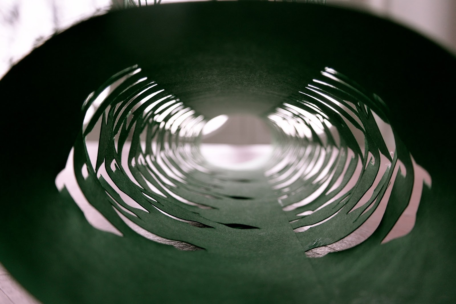
Unfortunately, my model illustrating the algorithm was not quite so successful.  I blame this on cutter troubles and my miniature scale.  However, you can still begin to see how solid and void begin to create a three dimensional space.


DSC_3661

How did Toyo Ito get this to stand?  I was determined to find out.  I went back to the drawing board and realized that in order to create one piece, instead of a bunch of different pieces that came apart, I would need to offset the lines.


DSC_3685

I then had one solid piece that still had the solid and void relationship created by the algorithm.

DSC_3688

I folded down the sides to create a three-dimensional structure, similar to Toyo Ito's 2002 Serpentine Pavilion.

DSC_3690

I loved how such a beautiful, complex-looking structure could be created from a simple algorithm.  This algorithm produced not only solid/void relationships, but also created an entirely new formula for light and shadow.

DSC_3691

The Artist and the Architect

The 2007 Serpentine Gallery Pavilion is one of the projects that I thought was very interesting, in both good and bad ways.  One of the reasons I chose to analyze this particular work is because it was completed by a joint effort from an architect, Kjetil Thorsen, and an artist, Olafur Eliasson.  After doing some research on the pair, I learned that Thorsen, who is a co-founder of the Snohetta firm, is quite artistically influenced in his architectural designs, and Eliasson has a keen sense of the spatial qualities about art.  This combination is unique in the fact that the final results offer a balance between artistic details and spatial aspects from both the artist and the architect.  I like the transition of space from outdoors to indoors with the use of the ramp, creating a gradual movement indoors, and the detail of the twisted wires, providing a porous partition between the inside and outside. (shown in the model I created) This slit that moves around the whole structure and opens up into the larger space inside further enhances this transitional aspect.  I very much like the movement of space in general, however I do think that this structure does not fully represent my idea of a pavilion specific to this site. Compared to the other Serpentine Gallery Pavilions, this one is the most “building-like”. There does not seem to be much connection with the surroundings, which I think should be an integral part in designing a pavilion. 


3/13/13

The House of the Future: Disconnecting Form and Function


                The 1956 House of the Future by Alison and Peter Smithson was one of several residential designs built for Daily Mail’s Ideal Home Exhibition in London. Participants were asked to create a home fit for life in the year 1980. The Smithson team created a home made up of rooms built from a single mold of plastic, suggesting the possibility for mass production and efficient assembly. The rooms boasted the ultimate modern conveniences: all-electric appliances, remote controlled television and lights, central heating, and even a self cleaning bathroom. A major element of the design which particularly interested me was the integration of all aspects of the home into the walls and floor of the plastic body. This raised several questions in my mind regarding the space required to house these integrated systems, the rise of “modern” being equated to “streamlined,” and the contemporary tendency for form not to follow function.

                I was inspired by one image from the original exhibition of the House of the Future which showed two of the model inhabitants (whose “futuristic” costumes seem not to have come into being as the future became the present) situated in front of a wall of shelves built into the plastic structure. With that image in mind, I sketched out designs for a paper-cut model of a triple section-cut corner of a “modern” room, much like the ones found in the House of the Future


This room shows what could be the corner of a bedroom, with a space for a bed sunk into the floor and various shelves and a wardrobe built into the walls. I kept the walls and ceiling section cut in order to view the interstitial space between the interior walls of the bedroom and the exterior walls of the house. I found that a large amount of space is wasted in this manner. In order to optimize this wasted space, a “modern minded” architect would have to pay very close attention to filling every interstitial space to the brim, and leaving no hidden square foot untouched.
                The stylistic quality of the House of the Future is in keeping with the desire to hide or contain all items of function in order to create a clean, streamlined aesthetic. It is simple enough to deduce that this want of order arose from mass production of goods, huge advancements in industrial design, and the mechanization of daily home life. Yet how does all of this apply to the widely accepted architectural mantra of “form ever follows function?” I think that today, that mantra is no longer valid in the majority of technological and design success. Take a look at any iPhone and you will inevitable fail to deduce its function by its mere form. The Smithson’s House of the Future is no exception.

Legal/Illegal


Manuel Herz's Legal/Illegal


In 2004 Manuel Herz did a project in Cologne, Germany that he called Legal/Illegal.  It was built in a neighborhood called Bayenthal, where a strict masterplan was devised that builders were expected to stick to.  The project was built in a very tight space between two other existing homes.  The basic form of the structure was taken directly from the building restriction limits that were set by the government. Herz used terraces on each level to step the building back in order to meet the volume limit of the site.  One could consider this the “legal” aspect of the project, since Manuel made an attempt here to completely follow the rules of the neighborhood.

There is a second volume of the project which can be considered the “illegal” part of the structure.  The floor area inside of this second volume exceeds the maximum area allowed in the rules of the masterplan.  It is a free formed body that twists its way around an existing arch to help complete the building.  Manuel Herz even disregarded fire regulations when it came to this structure.  It is also covered in a bright red polyurethane coating, something that was most definitely frowned upon by German planning law.  Since this second volume ignores much of the rules laid out in the masterplan for Bayenthal, it is therefore considered the “illegal” part of the structure. 


Section showing the contrasting volumes of the building


One thing I found very interesting about this project was that the rule breaking was not kept a secret at all.  Manuel Herz and his team explicitly laid out all of the irregularities of the project from the very beginning.  They even decided to use their meetings with the authorities about the project as inspiration for the overall concept of the structure.  The building was meant to be completely different from its surroundings, and was surprisingly accepted by the community and by the German planning division for this neighborhood.

Contrasting colors and forms

Contrasting colors and forms


What I chose to do my cuttings and analysis on, was the stark contrast of this structure with the buildings that surround it.  The first thing one would probably notice upon looking at this project is the fact that it is a bright red building among a bunch of white and grey buildings.  When you look a little closer there are a lot more things about the building that stand out from its surroundings.  The random patterns of windows is one of the most noticeable things.  Also the fact that it is not simply a rectangular form is interesting.  It is a very irregular form adding interest to the building.  

Irregularity among simplicity

Irregular window patterns